Can't get legend to appear in ggplot

I keep trying to get a legend to show up on my plot for the color but nothing is showing up. Any advice would be great:

# example data:
> dput(head(total_org))
structure(list(Sample = c("T0", "Aer 4hr", "Aer 8hr", "Aer 24hr", 
"Aer 28day", "Ana 4hr"), Percent = c(0.3, 3.15, 4, 2.37, 16.27, 
0.98), stdev = c(0, 0.75, 0.63, 1.63, 3.54, 0.6)), row.names = c(1L, 
3L, 4L, 5L, 6L, 7L), class = "data.frame")

# ggplot code

ggplot(total_org,aes(x=factor(Sample,level=c("T0","Aer 4hr","Ana 4hr",
                                            "CA 4hr","Aer 8hr","Ana 8hr",
                                            "CA 8hr","Aer 24hr","Ana 24hr",
                                            "CA 24hr","Aer 28day","Ana 28day",
                                            "CA 28day")),
                    y=Percent))+
  geom_col(position=position_dodge(),fill="#FD8F6F")+
  labs(y="% of Dry Matter by Mass")+
  scale_x_discrete(labels=c("T0","A\n4h","An\n4h","CA\n4hr",
                            "A\n8hr","An\n8hr","CA\n8hr","A\n24hr",
                            "An\n24hr","CA\n24hr","A\n28day","An\n28day","CA\n28day"))+
  geom_errorbar(aes(ymin=Percent-stdev,
                    ymax=Percent+stdev),
                position=position_dodge())+
  theme_classic()+
  theme(axis.title.x=element_blank(),legend.title=element_blank(),
        legend.text =element_text(size=15),axis.title.y=element_text(size=15),
        legend.position="bottom",axis.text.x=element_text(size=15),
        axis.text.y=element_text(size=12),
        panel.grid.major.y=element_line(color=1,size=0.5,linetype=2),
        panel.grid.minor.y=element_line(color="black",size=0.25,linetype=3))

I had it working for a bit, but I changed the order of the data being presented and now it isn't working anymore. Any advice would be great, thanks.
Ggplot will only give you legends for declarations you make in aes() mappings, if you fix anything, like colour of fill, without aes then, no legend/guide

So I just want it to fill as one solid color in this case. I'm not sure what to set the fill to. I'm going to be combining it with other figures that will have additional colors and I want to do a common legend, but I need this one to have a legend that I can include. I tried putting fill=Percent, but that's a continuous variable so it doesn't work. The legend I want to say "Total Organic Acid" with this particular color

I think you need to look into colour palettes.

Have a look at ggplot2 colors : How to change colors automatically and manually? for a quick introduction to the use of colour palettes.

So I know how to change the color, that isn't the problem. The problem is that I need a legend to appear

Misread the issue. If I understand the issue you cannot have one colour and a legend. You need a colour = Sample or fill = Sample to generate a lengend as far as I ab amanre

ggplot(total_org,aes(x=factor(Sample,level=c("T0","Aer 4hr","Ana 4hr",
                                             "CA 4hr","Aer 8hr","Ana 8hr",
                                             "CA 8hr","Aer 24hr","Ana 24hr",
                                             "CA 24hr","Aer 28day","Ana 28day",
                                             "CA 28day")),
                     y=Percent))+
  geom_col(position=position_dodge(), aes(fill=Sample))+
  labs(y="% of Dry Matter by Mass")+
  scale_x_discrete(labels=c("T0","A\n4h","An\n4h","CA\n4hr",
                            "A\n8hr","An\n8hr","CA\n8hr","A\n24hr",
                            "An\n24hr","CA\n24hr","A\n28day","An\n28day","CA\n28day"))+
  geom_errorbar(aes(ymin=Percent-stdev,
                    ymax=Percent+stdev),
                position=position_dodge())+
  theme_classic()+
  theme(axis.title.x=element_blank(),legend.title=element_blank(),
        legend.text =element_text(size=15),axis.title.y=element_text(size=15),
        legend.position="bottom",axis.text.x=element_text(size=15),
        axis.text.y=element_text(size=12),
        panel.grid.major.y=element_line(color=1,size=0.5,linetype=2),
        panel.grid.minor.y=element_line(color="black",size=0.25,linetype=3))
  
total_org <- structure(list(Sample = c(
  "T0", "Aer 4hr", "Aer 8hr", "Aer 24hr",
  "Aer 28day", "Ana 4hr"
), Percent = c(
  0.3, 3.15, 4, 2.37, 16.27,
  0.98
), stdev = c(0, 0.75, 0.63, 1.63, 3.54, 0.6)),
row.names = c(
  1L,
  3L, 4L, 5L, 6L, 7L
), class = "data.frame")


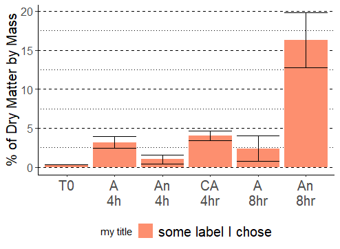
ggplot(total_org, aes(
  x = factor(Sample, level = c(
    "T0", "Aer 4hr", "Ana 4hr",
    "CA 4hr", "Aer 8hr", "Ana 8hr",
    "CA 8hr", "Aer 24hr", "Ana 24hr",
    "CA 24hr", "Aer 28day", "Ana 28day",
    "CA 28day"
  )),
  y = Percent
)) +
  geom_col(position = position_dodge(),
           mapping=aes(fill = "some label I chose")) +
  labs(y = "% of Dry Matter by Mass") +
  scale_fill_manual(values=c("some label I chose"= "#FD8F6F"), 
                    guide=guide_legend(title="my title")) +
  scale_x_discrete(labels = c(
    "T0", "A\n4h", "An\n4h", "CA\n4hr",
    "A\n8hr", "An\n8hr", "CA\n8hr", "A\n24hr",
    "An\n24hr", "CA\n24hr", "A\n28day", "An\n28day", "CA\n28day"
  )) +
  geom_errorbar(
    aes(
      ymin = Percent - stdev,
      ymax = Percent + stdev
    ),
    position = position_dodge()
  ) +
   theme_classic() +
  theme(
    axis.title.x = element_blank(),
    legend.text = element_text(size = 15), axis.title.y = element_text(size = 15),
    legend.position = "bottom", axis.text.x = element_text(size = 15),
    axis.text.y = element_text(size = 12),
    panel.grid.major.y = element_line(color = 1, size = 0.5, linetype = 2),
    panel.grid.minor.y = element_line(color = "black", size = 0.25, linetype = 3)
  )

image

1 Like

This topic was automatically closed 21 days after the last reply. New replies are no longer allowed.

If you have a query related to it or one of the replies, start a new topic and refer back with a link.