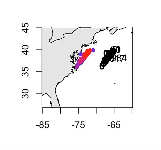
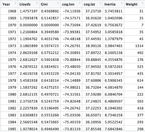
Trying to make a plot of weighted locations for each year. I have attached my code to make the plot below. An issue that I've been having is labelling the density "bubbles" within the plot properly. It is not imperative that I include all of the years in my data on the plot as it goes from 1968-2017. But I would like to have at least 3, ie 1968, 1984, 2017. I have also attached my data table. Perhaps this is an easier fix than I assume...
par(mfrow=c(1,1))
yrinc<-c(fluke$Year==1968,1984,2017)
map("world", fill=T, col="gray90",xlim = c(-85,-60),ylim=c(27,45))
map.axes()
yrs<-unique(fluke$Year)
resolution<- 101
points(cog.lat~cog.lon, data=indices.df, pch=16,
       col=colorRampPalette(c("blue","red"), space="Lab")(resolution)
       [as.numeric(cut(1968:2017, breaks=seq(1968,2017, length.out=resolution+1),
                       include.lowest=T))],
       text(x=indices.df$cog.lon,y=indices.df$cog.lat,labels=yrinc, pos = 4, offset =2 ))

