I'm having trouble controlling how my legend looks.
This is my ggplot:
p <- ggplot(data = plotthis, aes(x = age, y = nfl, group = diagnosis, linetype = diagnosis)) +

scale_linetype_manual(values = line_types) +

geom_line(aes(y=lwr)) +

geom_line(aes(y=upr)) +

geom_ribbon(aes(ymin = lwr, ymax = upr, fill = diagnosis), alpha = 0.5) +

scale_fill_manual(values = fill_colors) +

scale_color_manual( values = line_colors) +

geom_smooth(aes(color = diagnosis), method=lm, se=FALSE, size = 0.5) +

geom_point(aes(x=input$patient_age, y=input$patient_nfl), colour="blue") +

ylab(ylab) + #show x axis label

xlab(xlab) + #show y axis label

theme_minimal()

ggplotly(p) #use that in renderPlotly

})
The data looks like (first 10 lines):
id;nfl;age;sex;diagnosis

1;11.2;56;f;SCD

2;14.5;57;m;SCD

3;34.6;63;f;SCD

4;9.04;40;m;SCD

5;10.3;53;f;SCD

6;20.1;67;f;Psy

7;19.1;65;m;Psy

8;95.8;59;m;FTD

9;9.7;53;f;SCD
The scale_xxx_manual commands get their values from as few lists that looks like this one:
line_types <- c(

"SCD" = "solid",

"AD" = "dashed",

"FTD" = "dashed",

"DLB" = "dashed",

"VaD" = "dashed",

"Psy" = "dashed"

)

fill_labels <- c(

"SCD" = "SCD",

"AD" = "AD",

"FTD" = "FTD",

"DLB" = "DLB",

"VaD" = "VaD",

"Psy" = "Psy"

)
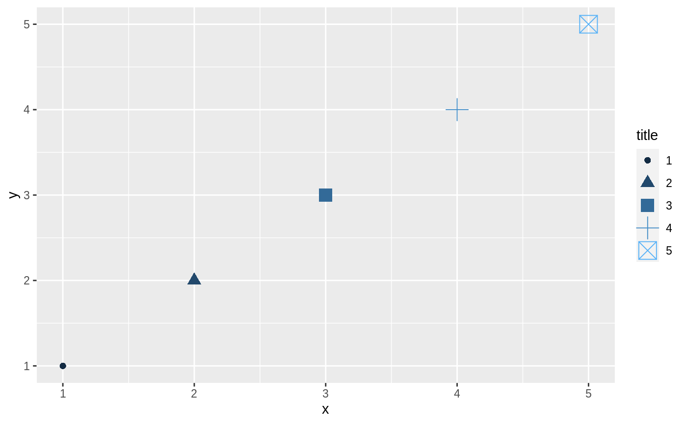
Now I get two legends items, one for the linetype and one for the fill. Plus the labels in the legend are composites of the aes values used. So instead of just: SCD the label says: (SCD, 1, NA)
I've tried adding <guide=FALSE> in the scale_line_manual to get rid of the linetype legend items. Did not work.
I've tried adding the <guides=(linetype=FALSE)> type of commands. Nope did not work either.
I've tried adding the <labels=fill_labels> to the scale_fill_manual to override the labels in the fill legend items. Won't work again!
Obviously I'm missing something! I would like to remove legend items so I'm left with just one and I want to use my own labels in the legend.
Thanks! Step 1: Check!
That enables me to override the legend title and merge them.
Now: how do I change the label names of the legend items?
And: how do I create a label icon which shows both fill and linetype and color?
Yeah you would say so, but adding the line:
guides(colour = guide_legend("mytitle"), fill = guide_legend("mytitle"), linetype = guide_legend("mytitle"))
to my ggplot does change the title to "mytitle", but still only shows the linetype and fill separately.
For clarity just the main lines from my ggplot:
p <- ggplot(data = plotthis, aes(x = age, y = nfl, group = diagnosis)) + #init the plot object and (aestatically) map (aes) the data to internal variables x and y

#prediction interval

geom_line(aes(y=lwr, linetype = diagnosis)) + #draw lower prediction interval line - remove linetype here and set to ggplot aes to also change the regres linetype

geom_line(aes(y=upr, linetype = diagnosis)) +

geom_ribbon(aes(ymin = lwr, ymax = upr, fill = diagnosis), alpha = 0.5) +

geom_smooth(aes(color = diagnosis), method=lm, se=FALSE, size = 0.5) +

#overrides

scale_color_manual(values = line_colors) +

scale_linetype_manual(values = line_types) +

scale_fill_manual(values = fill_colors) +

#layout

guides(colour = guide_legend("mytitle"), fill = guide_legend("mytitle"), linetype = guide_legend("mytitle")) +

theme_minimal()

ggplotly(p)
Plus I still can't find a method that lets me change the legend's labels.
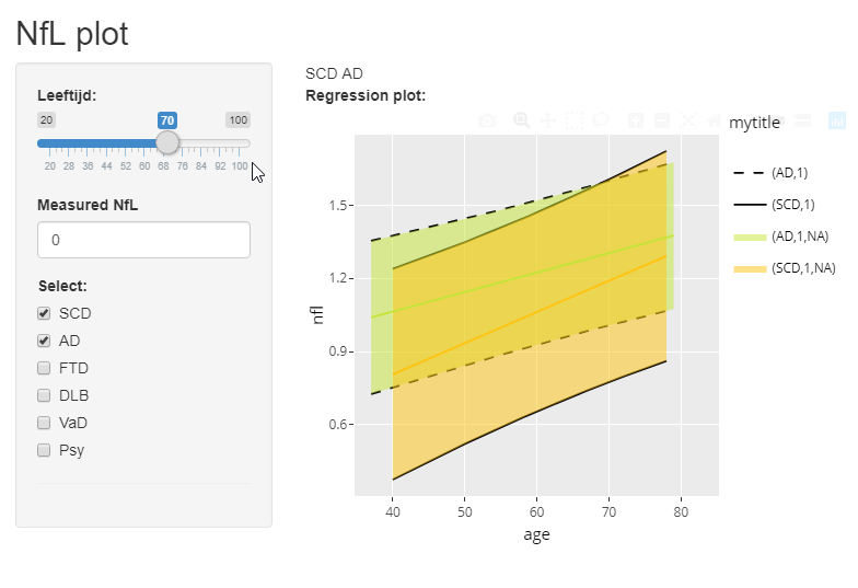
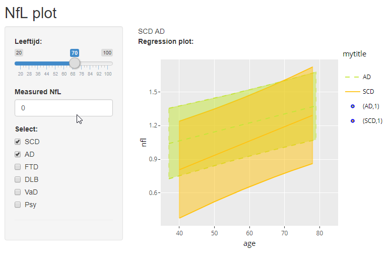
I've included the graph (using Shiny) as it is now
presumable you would want a single (AD,1) both black dashed line and they greenish fill.
I think the issue is that you have this NA attribute as part of the shaded fill that doesn't align with the line definition.
Is that something you can explore ?
Yes just one legend item per category. Plus I would like to control the text of the labels so that they say: AD instead of (AD,1).
Yeah the shaded (ribbon) is a prediction interval (different column) and the center line is the regression line (over the x-y data).
The thing is that I would like to control the upr & lwr linetypes separate from the linetype and color of the central line. So I've not included the linetype and color in the ggplot aes() but put the linetype in the geom_line aes() to control the upper and lower linetype. Then used the color aes() in the geom_smooth to set the color of the regression line equal to the ribbon fill area.
So I want to keep this granular control, but the legend just won't cooperate!
If I drop both the color and linetype (along with the fill that's already there) in the ggplot main aes(), the legend comes out like: