Cannot plot spline regression with ggplot

I have a time series data for neighbourhood and crime rate per year (example below).

Neighbourhood  year  rate
      1        2009  43.5   
      1        2010  34.7
      1        2011  40.8
      2        2009  28.9
      2        2010  33.8
      2        2011  24.4
      .           .     .
      .           .     .

I applied spline regression by group (for each neighbourhood) by using plyr and ggplot. Both show plots for each Neighbourhood but does not show the model line (spline curve)

library(ggplot2)
require(stats)

# First try:
#  run spline regression by groupe: (for each Neighbourhood)

models <- dlply(crime_df, "Neighbourhood", function(crime_df) 
  lm(formula = crime_df$rate ~ bs(crime_df$year, 6 )))

#Extract coefficients
ldply(models, coefficients)


# get a plot for each neighbourhood 

d_ply(crime_df, "Neighbourhood", transform, plot(year, rate, main = unique(Neighbourhood), pch= 19)) 
lines(crime_df$year, fitted(models)) # to put spline curve on these plots but does not work:

# Second try:

#  run spline regression by groupe: (for each Neighbourhood) by using tidy
# I used geom_smooth to plot the model (spline curve) but did not work

crime_df %>%
  ggplot(aes(x = year, y = rate, group = Neighbourhood)) +
  geom_point(color = palette_light()[[2]]) +
  geom_smooth(method = lm, formula = crime_df$rate ~ splines::bs(crime_df$year, 6), se = FALSE) +
  labs(title = "spline") + 
  theme_tq() +
  facet_wrap(~ Neighbourhood, scale = "free_y", ncol = 3) +
  scale_x_date(date_labels = "%Y")
geom_smooth does the regression internally and then plots the results of the internally calculated predictions. To plot the results of a regression model you've created outside of ggplot, generate predicted values and then use geom_line (or geom_point if you want points) to plot the predictions. For example:

To let geom_smooth do the work:

crime_df %>%
  ggplot(aes(x = year, y = rate, group = Neighbourhood)) +
    geom_point(color = palette_light()[[2]]) +
    geom_smooth(method = lm, formula = y ~ bs(x, 6), se=FALSE) +
    labs(title = "spline") + 
    theme_tq() +
    facet_wrap(~ Neighbourhood, scale = "free_y", ncol = 3) +
    scale_x_date(date_labels = "%Y")

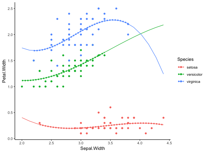
Since I don't have your data, here's a complete example using the built-in iris data frame. I've also used functions from the tidyverse to operate by group, as plyr is an older package that I haven't used in a long time.

First, generate the models:

library(tidyverse)
library(splines)  
  
# Generate a model for each Species
models = iris %>% 
  split(iris$Species) %>% 
  map(~lm(Petal.Width ~ bs(Sepal.Width), data=.x))

Now, plot model predictions with geom_line. We'll also show the raw data, as well as the geom_smooth results for comparison. Note that I've generated predictions for each group using the full range of the overall data, but you can also tweak the code to predict only with the range of the data for a given group.

Note that the formula for geom_smooth, always uses the generic y and x on the left- and right-hand sides, respectively, rather than specific column names. This is because geom_smooth always operates one whatever columns you've provided as the x and y aesthetics.

# Get Sepal.Width values at which we want predictions
newdat = data.frame(Sepal.Width=seq(min(iris$Sepal.Width), max(iris$Sepal.Width), length=20)) 

model.predictions = map_df(models, ~cbind(newdat, Petal.Width=predict(.x, newdat)),
       .id="Species") 

ggplot(iris, aes(Sepal.Width, Petal.Width, colour=Species)) +
  # Show raw data
  geom_point() +
  # Compare internal geom_smooth calculations with our models
  geom_smooth(size=1.5, linetype="11", se=FALSE, formula=y ~ bs(x), method="lm") +
  # Plot model predictions
  geom_line(data=model.predictions) +
  theme_classic()

Rplot

This topic was automatically closed 21 days after the last reply. New replies are no longer allowed.