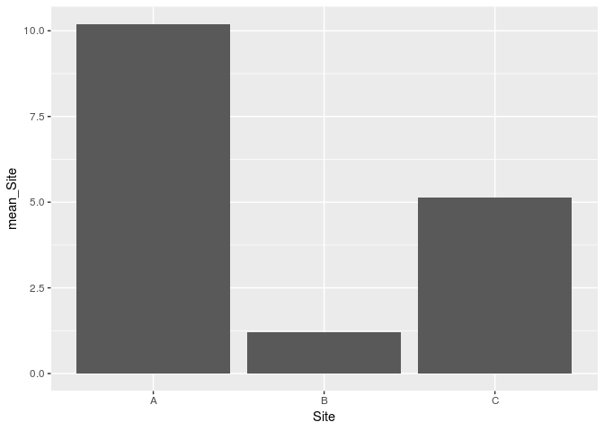
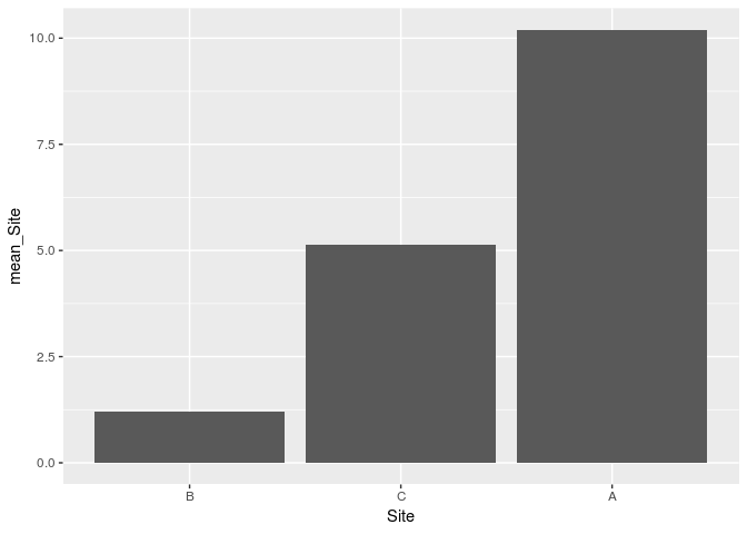
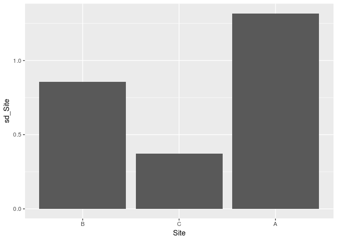
I am making a number of figures to illustrate trends in diversity data across seven different sites that I surveyed. I used one landscape-level characteristic (the amount of non-agricultural land in a 2-km radius) as a "master variable" to determine the order that I'd like to compare all of the sites against each other. Now I want to create a number of plots that reflect different diversity metrics of these seven sites, but have the x-axis in the same order as the first plot for easy comparison.
So one diversity plot might be:
#Creating ISI figure
nISI_summary<-anovadata %>%
  group_by(Site) %>%
  summarise(mean_ISI= mean(nISI),
            sd_ISI= sd(nISI),
            n_ISI= n(),
            se_ISI= sd(nISI)/sqrt(n()))

nISIPlot<-ggplot(nISI_summary, aes(Site, mean_ISI))+
  geom_col(color= "gray20", fill="cornsilk3")+
  geom_errorbar(aes(ymin=mean_ISI-se_ISI, ymax=mean_ISI+se_ISI), width=0.2)+
  geom_text(label=c("d","ab","abcd","a","bcd","cd","abc"), aes(y=mean_ISI+se_ISI, x=Site),
            vjust=-0.5, size=5)+
  ylim(0, 3.5)

nISIfigure<-nISIPlot + labs(y="Mean ISI ± SE", x="Site")

nISIfigure + theme(axis.title.x = element_text(size=14, face = "bold", vjust = -0.5),
                 axis.title.y = element_text(size=14, face = "bold", vjust = 0.5),
                 axis.text.x = element_text(size=12),
                 axis.text.y = element_text(size=12))
Where "nISI" is the diversity metric I am testing. My data are sorted in the source file by site, according to the order I determined with my first figure, but when I create this plot in R, the x-axis gets sorted automatically in alphabetical order.
Is there a way to custom-sort the x-axis to match the custom order I want? I know there are "factors" in ggplot that can be used to apply sorting rules to the axes but due to the transformed nature of the factors I am plotting (i.e. I'm plotting a summary of statistics of the variables in the data, not the variables themselves), I don't know if I can apply a factor without screwing up the statistical calculations within the code. Any help would be greatly appreciated!