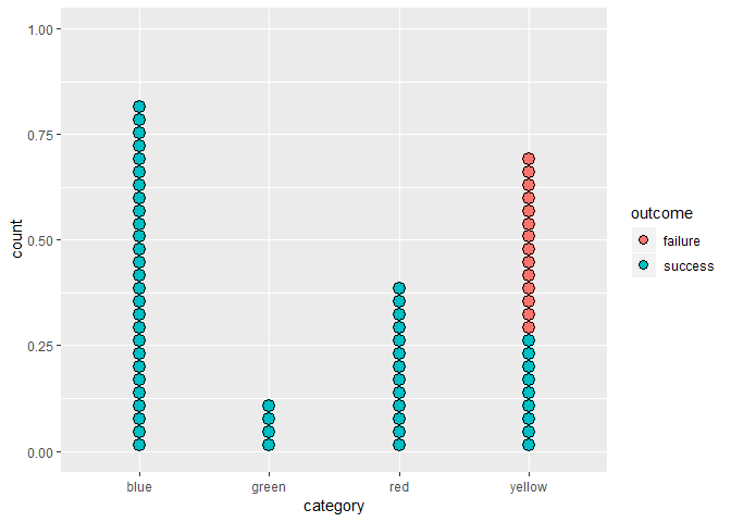
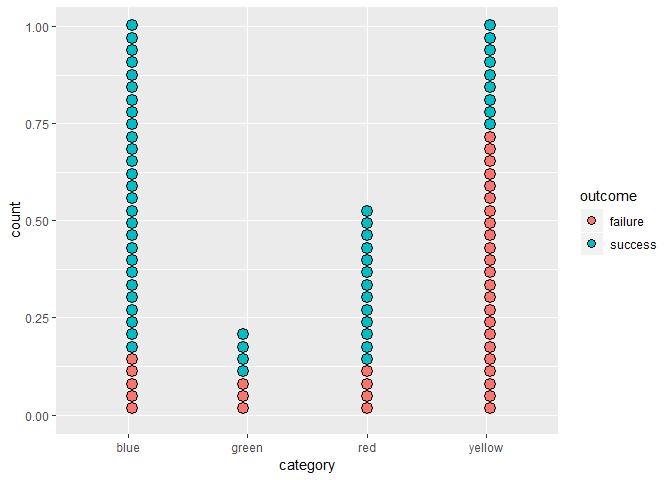
Hey everyone, I've been asked to find an interesting way to represent some data of counts and proportions I've been given. Because there are few categories and some of the proportions are zero, I think it would be less interesting to use a barplot and more interesting to use a dotplot, where each dot is a case shaded according to the outcome and the categories are laid out horizontally.
It's my first time using geom_dotplot, and although I'm happy with the basic result (shown below in the reprex), I'd really like the dots in each factor level (or bin) to not stack upward in a single column. These are large counts (upward of several hundred in a couple of cases), and it would make more sense to break each column up into several. Is there any way to do this with the options in geom_dotplot, or would I essentially need to fudge this by faceting along my factor and calculating a faux 'column' variable in my rows to force them to stack horizontally?
library(tidyverse)
#> Warning: package 'ggplot2' was built under R version 3.5.1
#> Warning: package 'dplyr' was built under R version 3.5.1
library(magrittr)
#>
#> Attaching package: 'magrittr'
#> The following object is masked from 'package:purrr':
#>
#>     set_names
#> The following object is masked from 'package:tidyr':
#>
#>     extract

# here's the kind of data i've been given:
count_data = tribble(
  ~ category, ~ success, ~ total,
  "red",      13,        17,
  "blue",     27,        32,
  "yellow",   9,         32,
  "green",    4,         7)

# put the successes and failures in a long format
count_data %<>%
  mutate(failure = total - success) %>%
  select(category, success, failure) %>%
  gather(key = outcome, value = count, success, failure) %T>%
  print()
#> # A tibble: 8 x 3
#>   category outcome count
#>   <chr>    <chr>   <dbl>
#> 1 red      success    13
#> 2 blue     success    27
#> 3 yellow   success     9
#> 4 green    success     4
#> 5 red      failure     4
#> 6 blue     failure     5
#> 7 yellow   failure    23
#> 8 green    failure     3

# dotplot requires 1 row = 1 observation, so i'm going to
# replicate the rows according to the counts:
count_data %<>%
  group_by(category, outcome) %>%
  expand(count = seq(1:count)) %>%
  select(-count) %T>%
  print()
#> # A tibble: 88 x 2
#> # Groups:   category, outcome [8]
#>    category outcome
#>    <chr>    <chr>
#>  1 blue     failure
#>  2 blue     failure
#>  3 blue     failure
#>  4 blue     failure
#>  5 blue     failure
#>  6 blue     success
#>  7 blue     success
#>  8 blue     success
#>  9 blue     success
#> 10 blue     success
#> # ... with 78 more rows

# now to dotplot. i like this plot, but i'd prefer to not have each bin extend
# upward in *one* column. can i have the bins laystack upward in blocks of
# several columns?
count_data %>%
{
  ggplot(.) +
    geom_dotplot(aes(x = category, fill = outcome))
}
#> `stat_bindot()` using `bins = 30`. Pick better value with `binwidth`.

Created on 2018-09-24 by the reprex package (v0.2.0).
Thanks everyone!
EDIT: I'm already taking a look at this plot and realising that it's not plotting what I think it's plotting—the failures aren't showing up in any category but the last. I'm thinking maybe I don't have my head around how to use this geom properly! Any guidance here from folks who've used it before would be very appreciated ![]()

 , but if I were doing it all over again I’d use hrbrmstr’s)