Hello All,
I am trying to add a rose diagram of wind speed on top of an aerial base map. I am stumped thus far because the method for making a rose diagram is to use coord_polar() on a geom_histogram(). However, the use of a polar coordinate system is incompatible with using a geographically referenced base map as is done with ggmap. Does any one have as solution to either: 1) use two coordinate systems on one plot, 2) have a different method for making a rose diagram that does not require coord_polar(), or 3) some awesome idea I have not tried yet?
Thanks!
map with wind speed and direction

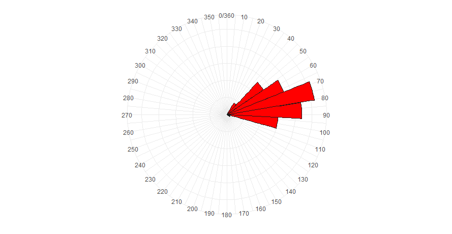
rose diagram of wind speed histogram
Reproducible example:
 library("sf")
library("ggplot2")
library("ggmap")
library("tidyr")
library("dplyr")

####### functions #########
# functions to convert speed and direction to geographic coordinates
speed2u<-function(s,d){
  u <- -s * sin(d * pi/180)
  return (u)
}
speed2v<-function(s,d){
  v <- -s * cos(d * pi/180)
  return (v)
}
########################

####### Data Simulation and Cleaning ###
# create fake data set
dataset <- data.frame(id = seq(1,300,1),
                      wind_speed = rnbinom(300,5,0.25),
                      wind_dir   = rnorm(300,0,20)-108)

# location of wind sensor (lat, long)
sensor_loc <- c(39.9524, -75.1636)
# transform data
dat <- dataset %>%
  mutate(wind_u      = speed2u(wind_speed, wind_dir),
         wind_v      = speed2v(wind_speed, wind_dir),
         lng         = sensor_loc[2],
         lat         = sensor_loc[1],
         xend        = lng + wind_u * 0.00015,
         yend        = lat + wind_v * 0.00015) %>%
  mutate(wind_to     = case_when(wind_dir <= 180 ~ wind_dir+180,
                                 wind_dir > 180  ~ wind_dir-180))
# create sf object from sensor location
sensor_sf <- data.frame(lng = sensor_loc[2], lat = sensor_loc[1]) %>%
  st_as_sf(., coords = c("lng","lat"), crs = 4326)
# retrieve basemap with ggmap
base_map = get_map(location = unname(st_bbox(st_buffer(sensor_sf, 0.005))),
                   source = "google", maptype = "hybrid")

###### Make plots
# plot individual wind speed observations on map
ggmap(base_map) +
  geom_segment(data = dat, aes(x=lng, y=lat, xend=xend, yend=yend, color = wind_speed)) +
  geom_sf(data = sensor_sf, inherit.aes = FALSE, color = "black", size = 3) +
  scale_color_viridis_c(option = "A", name = "wind speed (mph)") +
  labs(x = NULL, y = NULL) +
  theme(rect = element_blank(),
        axis.text = element_blank(),
        axis.title = element_blank(),
        axis.ticks.length = unit(0, "pt")
  )
# Plot rose diagram
ggplot(dat, aes(x = wind_to)) +
  coord_polar(theta = "x", start = 0, direction = 1) +
  geom_histogram(fill = "red", color = "gray10", bins = 30) +
  scale_x_continuous(breaks = seq(0, 360, 10), limits = c(0, 360)) +
  theme_minimal() +
  theme(
    axis.text.y = element_blank(),
    axis.title = element_blank())