Bull Ranking Animated with Plotly
Author: Simon Woodward
Affiliation: DairyNZ Ltd, New Zealand
Experience: Working with Shiny for 1+ years
Category: Other
Keywords: plotly, animation, dropbox
The Breeding Worth Tool
Thank you for the opportunity to enter our Breeding Worth Tool in the 2020 RStudio Shiny Contest!
- Link to the Breeding Worth Tool on Shinyapps.io
- Link to the Breeding Worth Tool on Github
- Link to the Breeding Worth Tool on RStudio Cloud
- Link to Breeding Worth on www.dairynz.co.nz
The purpose of the tool
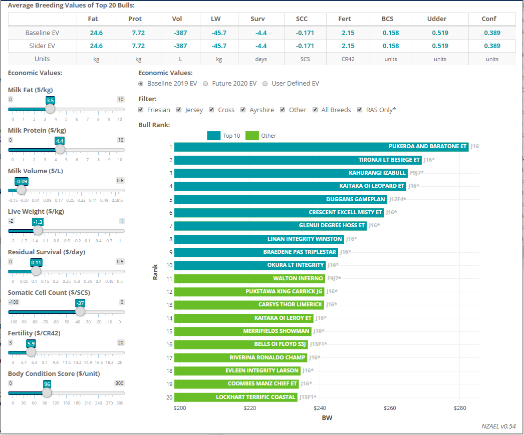
The Breeding Worth Tool was developed to help dairy farmers assess the relative worth of bulls for breeding, depending on changes to the predicted economic values of genetic traits such as milk fat and protein production, susceptibility to mastitis (somatic cell count) and fertility. The tool ranks registered bulls based on their overall breeding worth (BW) under current (2019) or predicted (2020) economic values for these traits (estimated using an external economic model). The user can also apply filters to the bulls, or manually adjust the economic values of individual traits using sliders. Changes in bull BW and ranking are shown dynamically using animation of the bar chart. The individual bars also include hyperlinks to individual bull detail pages such as the one in this link.
How it works
The main challenge was animating the plotly bat chart. The built-in animations provided by R-plotly do not allow interactive easing. Also, the dataset contains 1200 bulls; plotting all of these would make the animation very slow.
These problems were solved as follows.
Interactive easing was achieved by manually constructing the original plotly object using do.call(add_trace, prepend( new_trace_list, list(my_plotly))) and then interactively adding new frames to the plotly object using plotlyProxyInvoke(my_proxy, "animate", ...). This required understanding the complex nested list structure of plotly data.
Handling the large data set was achieved by manually adding and removing bulls to the plot below the x-axis. This involved maintaining a rolling dataframe of the plotted bulls (including bulls previously plotted, that had dropped below the x-axis, and could be be replaced with bulls from the master data list that were about to enter the plot from below the x-axis). This created the illusion of animating the entire dataset.