Hello RStudio Community!!
Someone have any idea, how plot a graph like this example? I want to do a graph with phylum: family and genus, using with genus the same colors as phylum. It's used Deseq2 package? Or another one?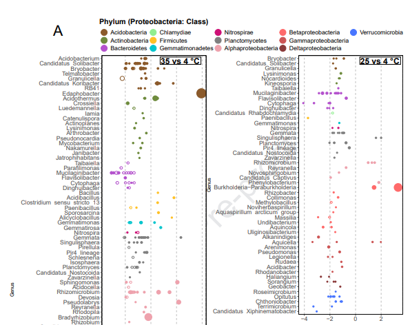
Thanks so much,
Jessy
Hello RStudio Community!!
Someone have any idea, how plot a graph like this example? I want to do a graph with phylum: family and genus, using with genus the same colors as phylum. It's used Deseq2 package? Or another one?
Thanks so much,
Jessy
I am unaware of what Deseq2 can do for ploting. I can suggest you some conceptual steps you can follow.
For genus label,
This topic was automatically closed 21 days after the last reply. New replies are no longer allowed.
If you have a query related to it or one of the replies, start a new topic and refer back with a link.