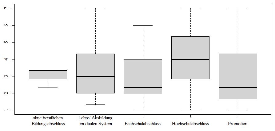
I tried setting up a boxplot with quite some long label names. I had to create some line breaks to make them fit.
It looks a bit odd now, as I am unable to remove the ticks on the x-axis. Any idea how I can remove these (tried several things, but nothing seemed to work properly) or alternatively move the labels down a bit.
I tried it a sneaky way by adding an additional line break before the actual text, but there doesn't seem to be enough space below the x-axis and thus that didn't help either.
#> Please don't mind the German naming
boxplot(HO01_GD~SD12, data=WW, names=c("ohne beruflichen\n Bildungsabschluss", "Lehre/ Ausbildung\n im dualen System", "Fachschulabschluss", "Hochschulabschluss", "Promotion"))
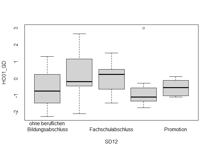
Do you happen to know if there is a way to have x-axis and y-axis set up independently?
E.g. one with and one without ticks? I didn't find anything in ?par for this. I know how to format the intervals for one axis, but was unable to fully remove them for the x-axis.
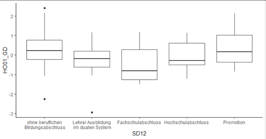
Oh and not saying you have to, but you can also consider using ggplot2 which tends to do a better job for nice-looking graphics. But that does require learning a whole new plotting system with its own set of options.
Thank you ever so much!
I tried to stay away from ggplot2, as I guess I would mess everything up...
But the solution with taking away the axes and then re-plotting them works perfectly!
Thank you!