I think the Wilkinson dotplot with its density representation is the primary usecase that this geom was intended to support; I'm just guessing that the secondary usecase of a conventional histogram type chart where the bar is seperated out into dots; is the victim of the Wilkinson dotplot bias vis how the function is set up with its defaults etc.
You are looking for this sort of thing I think ?
library("ggplot2")
d <- data.frame(ab = c("a", "a", "a", "a",
"b", "b", "b", "b"),
value = c(1, 2, 3, 5,
1, 2, 4, 5)
)
d |>
ggplot(aes(x = value, fill = ab)) +
geom_dotplot(binwidth = 2,
stackgroups = TRUE,
method="histodot",
dotsize = .3,
origin = 0)
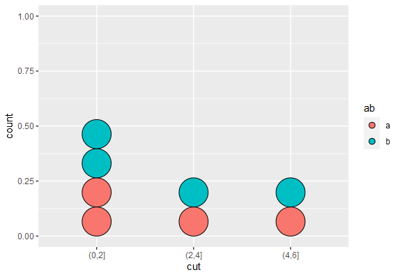
#explicit cuts
d$cut <- cut(d$value,breaks = c(0,2,4,6))
d |>
ggplot(aes(x = cut, fill = ab)) +
geom_dotplot(stackgroups = TRUE,
method="histodot",
dotsize = .3,binwidth = 1)
first :
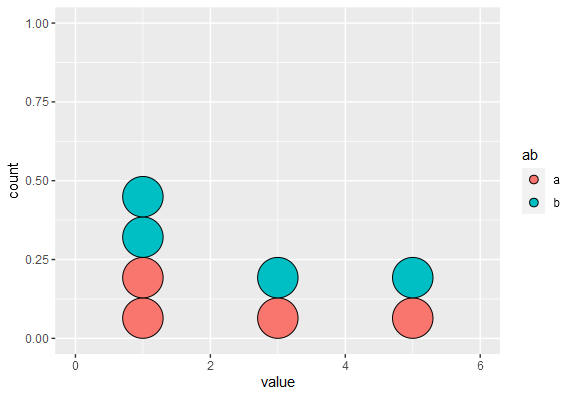
second :