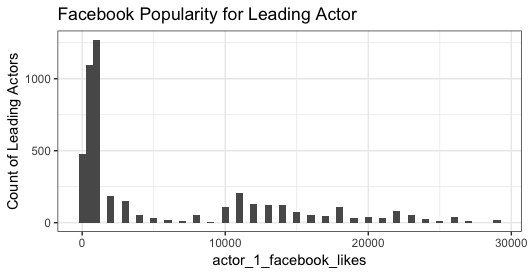
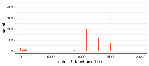
The data are actually multimodal (and right skewed) and the log transformation doesn't change the multimodal-ness. For example, in this untransformed histogram, in addition to the peak centered at 1,000 likes, note the peak at 11,000 likes, plus smaller peaks at higher values of likes. The log transformation just reduces the skew of the distribution:
library(tidyverse)
theme_set(theme_bw())

ggplot(movie_select %>% filter(actor_1_facebook_likes < 30000), aes(actor_1_facebook_likes)) +
  geom_histogram(binwidth=500) +
  labs(y="Count of Leading Actors",title="Facebook Popularity for Leading Actor")
Or, rather than binning the data, look at direct counts of each discrete value of actor_1_facebook_likes:
ggplot(movie_select, aes(actor_1_facebook_likes)) +
  geom_bar(width=100, fill="tomato") +  # Large width, otherwise bars are to thin to be visible
  coord_cartesian(xlim=c(0,2e4))
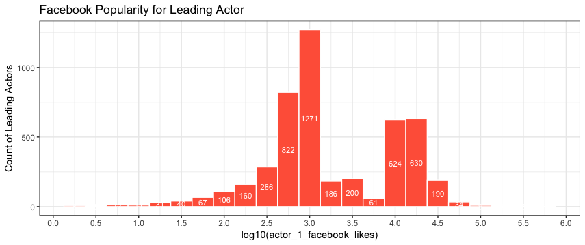
As for the number of counts for the bin centered at log10=3: The binwidth is denominated on the log scale with binwidth=0.25. That particular bin ranges from 2.875 to 3.125. Now transform that back to unlogged values to see the range of the bin on the scale of the data:
bin = 10^c(2.875, 3.125)
bin
[1]  749.8942 1333.5214
Now count the number of data values within that range:
sum(between(movie_select$actor_1_facebook_likes, bin[1], bin[2]), na.rm=TRUE)
[1] 1,271
Compare this with your plot, but with bin counts added:
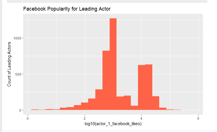
ggplot(movie_select, aes(log10(actor_1_facebook_likes)))+
  geom_histogram(fill="tomato",binwidth=.25, colour="white") +
  stat_bin(binwidth=.25, geom="text", aes(label=..count.., y=0.5*..count..), colour="white", size=3) +
  labs(y="Count of Leading Actors",title="Facebook Popularity for Leading Actor") +
  scale_x_continuous(breaks=seq(0, 6, 0.5))
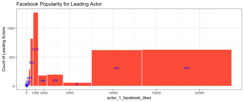
Here's what the logged bins look like on the scale of the data:
bins = 10^(seq(-1,4.3,0.25) + 0.125)

ggplot(movie_select %>% filter(actor_1_facebook_likes < 30000),
       aes(actor_1_facebook_likes)) +
  geom_histogram(fill="tomato", breaks=bins, colour="white") +
  stat_bin(breaks=bins, geom="text",
           aes(label=..count.., y=0.5*..count..), colour="blue", size=3) +
  labs(y="Count of Leading Actors",title="Facebook Popularity for Leading Actor") +
  scale_x_continuous(breaks=c(0,1000,2000,seq(5000,25000,5000)))