Basic ggplot - categorical x-axis

I'm having a hell of a time with what feels like a fairly basic plot. I'm just trying to get a super-basic look at some data before I begin real analysis. I'm trying to get my data plotted with a simple bar chart, with Country along the x-axis and percent on the y.

Here's the head() table for my data.

Country             percent
Algeria	         6.520605e-07			
Cabo Verde	     9.423077e-05			
Swaziland	     4.881890e-04			
Botswana	     4.694836e-04			
Namibia	         3.836207e-03			
Sao Tome	     8.947368e-02	

I've looked it up and tried a few things but I cannot for the life of me figure out how to get it to recognize Country as something it can and should put as my predictor.
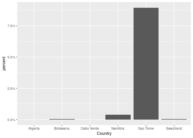
Is this what you mean?

library(ggplot2)
library(scales)

# Sample data on a copy/paste friendly format
sample_df <- data.frame(
  stringsAsFactors = FALSE,
           Country = c("Algeria","Cabo Verde",
                       "Swaziland","Botswana","Namibia","Sao Tome"),
           percent = c(6.520605e-07,9.423077e-05,
                       0.000488189,0.0004694836,0.003836207,0.08947368)
)

ggplot(sample_df, aes(x = Country, y = percent)) +
    geom_col() +
    scale_y_continuous(labels = percent_format())

Created on 2020-03-19 by the reprex package (v0.3.0.9001)

If you need more specific help, please provide a proper REPRoducible EXample (reprex) illustrating your issue.

Yes, thank you so much!

This topic was automatically closed 7 days after the last reply. New replies are no longer allowed.