data.frame(
   row.names = c("9","8","7","3","6","13","14","12",
                 "5","11","1","2","4","10"),
   patientid = c(9, 8, 7, 3, 6, 13, 14, 12, 5, 11, 1, 2, 4, 10),
      change = c(45, 23, 20, 15, 15, 0, 0, -5, -15, -15, -20, -20, -20, -66)
Above is my code for dataframe - Waterfall_plot
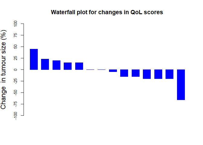
I enter the following to get a nice waterfall plot
o <- order(Waterfall_plot$change, decreasing=TRUE,na.last=NA)
Waterfall_plot <- Waterfall_plot[o,]


barplot(Waterfall_plot$change, col="blue", border="blue", space=0.5, ylim=c(-100,100), main = "Waterfall plot for changes in QoL scores", ylab="Change  in tumour size (%)", cex.axis=1.2, cex.lab=1.4)
To give me a nice waterfall plot. However, I want the ticks to be -100, - 75, - 50, - 25, 0 , 25, 50, 75, 100, rather than the current -100, -50, 0, 50, 100. I am unable to do this. Can someone please help?
Many thanks
