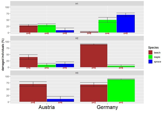
Hello, I've tried to create a grouped barplot with ggplot. I was quite sucessfull, but there's an issue, I'm unable to fix: I want to have the categories in the fill-argument been shown in a specific order (default alphabetical order is ok) and missing values represented by gaps. Also all bars should have the same width. In my case: I have the percentage of damaged trees within different species height classes and countries. In some contries not all species ocurred in all height classes, therefore they couldn't have been damaged. I was sucessfull in fixing the problem with the different width of the bars in these cases, but not representing missing values by gaps. Also the errorbars were spread all over the place (I used the argument position=position_dodge2(width = 0.9, preserve = "single")). I know that missing values could be confused with zero, so I've labelled each bar with the sample size. In case you are wondering, I posted a similar question before:) with a similar dataset. Has anybody an idea? I have attached the code below, maybe it becomes more understandable what I'm struggling with by running it.
library(tidyverse)

#creating suitable data
data <- data.frame(species = factor(c("beech","maple","spruce","beech","maple","spruce","beech","maple","spruce","beech","maple","beech","spruce","beech","maple")),
                   Heightclass = factor(c("H1","H1","H1","H1","H1","H1","H2","H2","H2","H2","H2","H3","H3","H3","H3")),
                   country=factor(c("Austria", "Austria","Austria","Germany","Germany","Germany","Austria","Austria","Austria","Germany","Germany","Austria","Austria","Germany","Germany")),
                   mean=c(28,30,10,3,50,70,40,10,14,90,6,70,12,68,89),
                   se=c(4,5,8,2,10,7,9,5,7,2,4,9,10,8,2),
                   ntext=c("n=5","n=5","n=5","n=5","n=4","n=5","n=5","n=4","n=5","n=5","n=5","n=5","n=4","n=3","n=3"))
data

#Attemting plotting
data%>%
  ggplot(aes(x = country, y = mean,fill=species)) +
  geom_bar(stat="identity",position="dodge",colour="white")+
  geom_errorbar( aes(x=country, ymin=mean-se, ymax=mean+se),colour="black",  position=position_dodge(.9))+
  labs(x = "", y = "damaged individuals (%)") +
  scale_fill_manual("Species", values = c("beech"="brown","maple"="green","spruce"="blue"))+
  geom_text(aes(label = ntext,y=-2),position=position_dodge(.9),colour="red",fontface="bold",size=3) +
  ylim(-2,100)+
  facet_wrap(~Heightclass,nrow = 3)+
  theme(axis.text.x = element_text(color = "black", size = 20))

