Hi there,
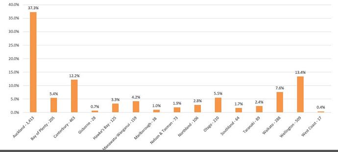
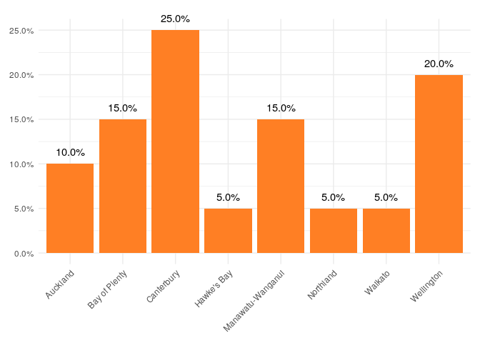
I am trying to create a bar plot using ggplot2 in R studio so that it looks like the following snapshot:
I would like to create a bar plot of the variable called "Region" where it plots the the different levels of the Region variable on the x-axis and the percentage on the y-axis.
I have created a variable "Region_Percentage" which you can see from the R code creates a table of the different levels of the Region variable in percentages.
Using gglpot2, I tried to then create the bar plot of the variable "Region_Percentage" as it already has the percentages calculates but it hasn't worked.
I have tried to create a reprex below:
head(Dataset1, 20)[c('Region')]
#> Error in head(Dataset1, 20): object 'Dataset1' not found

data.frame(
      Region = as.factor(c("Wellington", "Bay of Plenty", "Bay of Plenty",
                           "Manawatu-Wanganui", "Auckland", "Wellington",
                           "Canterbury", "Northland", "Canterbury", "Canterbury",
                           "Canterbury", "Wellington", "Hawke's Bay",
                           "Bay of Plenty", "Waikato", "Manawatu-Wanganui", "Canterbury",
                           "Wellington", "Auckland", "Manawatu-Wanganui")),
      Region = as.factor(c("Wellington", "Bay of Plenty", "Bay of Plenty",
                           "Manawatu-Wanganui", "Auckland", "Wellington",
                           "Canterbury", "Northland", "Canterbury", "Canterbury",
                           "Canterbury", "Wellington", "Hawke's Bay",
                           "Bay of Plenty", "Waikato", "Manawatu-Wanganui", "Canterbury",
                           "Wellington", "Auckland", "Manawatu-Wanganui"))
)
#>               Region          Region.1
#> 1         Wellington        Wellington
#> 2      Bay of Plenty     Bay of Plenty
#> 3      Bay of Plenty     Bay of Plenty
#> 4  Manawatu-Wanganui Manawatu-Wanganui
#> 5           Auckland          Auckland
#> 6         Wellington        Wellington
#> 7         Canterbury        Canterbury
#> 8          Northland         Northland
#> 9         Canterbury        Canterbury
#> 10        Canterbury        Canterbury
#> 11        Canterbury        Canterbury
#> 12        Wellington        Wellington
#> 13       Hawke's Bay       Hawke's Bay
#> 14     Bay of Plenty     Bay of Plenty
#> 15           Waikato           Waikato
#> 16 Manawatu-Wanganui Manawatu-Wanganui
#> 17        Canterbury        Canterbury
#> 18        Wellington        Wellington
#> 19          Auckland          Auckland
#> 20 Manawatu-Wanganui Manawatu-Wanganui

Region <- as.factor(Dataset1$Region)
#> Error in is.factor(x): object 'Dataset1' not found
table(Region)
#> Error in table(Region): object 'Region' not found
Region_T <-table(Region)
#> Error in table(Region): object 'Region' not found
round(100 * prop.table(Region_T),digit = 1)
#> Error in prop.table(Region_T): object 'Region_T' not found
Region_Percentage <-round((prop.table(Region_T)*100),1)
#> Error in prop.table(Region_T): object 'Region_T' not found
Region_Percentage
#> Error in eval(expr, envir, enclos): object 'Region_Percentage' not found

library(ggplot2)
#> Warning: package 'ggplot2' was built under R version 3.6.1
ggplot (data= Dataset1, aes(x= Region_Percentage)) +
  geom_bar() +
  labs (x = Region, title = "Regional demographics of data set")
#> Error in ggplot(data = Dataset1, aes(x = Region_Percentage)): object 'Dataset1' not found
Any help is greatly appreciated.
Thank you:-)

