Hi Daisy,
It's a lot easier to help you if you provide a proper reproducible example:
FAQ: What's a reproducible example (reprex) and how do I create one?
You can format code properly by containing it in backticks (```).
# here is an example
iris %>%
    count(Species)
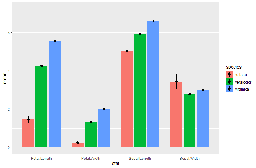
As I can't copy-paste a screenshot, I'll use iris.
library(tidyverse)

df = iris |>
  pivot_longer(where(is.numeric), names_to = "stat") |>
  group_by(species = Species, stat) |>
  summarise(mean = mean(value), sd = sd(value))

ggplot(df, aes(x = stat, y = mean, ymax = mean+sd, ymin = mean-sd, fill = species)) +
  geom_col(position = position_dodge2(width = .8), width = .8) +
  geom_pointrange(position = position_dodge2(width = .8), width = .8)
I can't read your screenshot very well, but your y-axis scale is all bunched up because you've specified the breaks in scale_y_continuous. They'll be less bunched up if you change that argument. If you just want your axes to be between 0 and 100, I'd write something like
+ coord_cartesian(ylim = c(0,100))