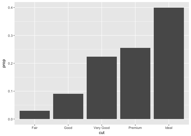
This is silly, but I can't for the life of me figure out how to add data labels to this simple plot. Nothing that I've tried in geom_text works, hoping someone can help out. Thanks.
ggplot(diamonds)+
geom_bar(aes(cut, y = ..prop.., group = 1))+
geom_text(???)
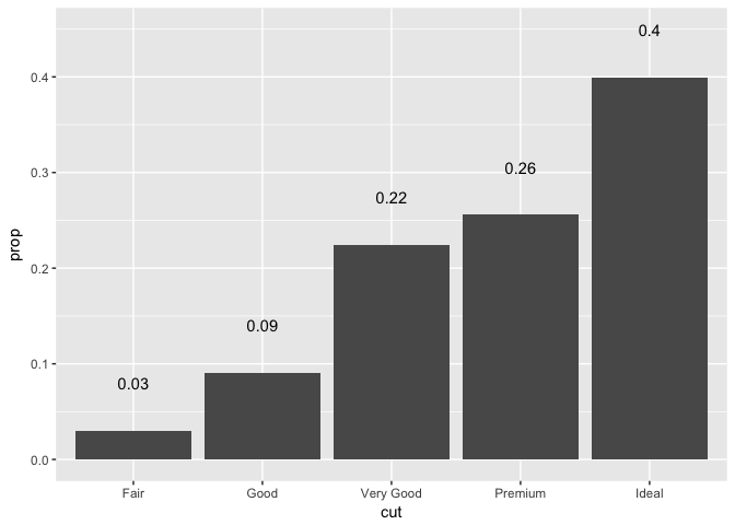
jrlewi's approach (creating/calculating a data frame, and using geom_col), is the the only one i know of.
To get a better understanding about ggplot2: Does anybody know a soloution to this problem without calculating the number of cases in each group from the values in the data? i. e., using geom_bar (values in the data) instead of geom_col (number of cases in each group)
Sorry, mara, for not being clear enough. jrlewi's approach is working perfectly fine, and indeed, that's how I was doing it myself until now. What I am intrested in, is whether there is another - more convenient (less code) - way of doing it, by letting ggplot2 do the calculations for the proportions (and not doing it manually or with other functions).
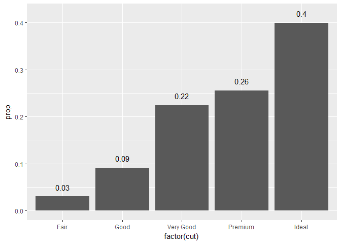
library(ggplot2)

ggplot(diamonds, aes(factor(cut), y = ..prop.., group = 1)) +
  geom_bar() +
  geom_text(stat = "count",
            aes(label = round(..prop.., 2), y = ..prop.. + 0.02))
Btw: In my previous attempts to solve this problem, I forgot to change the stat argument in geom_text to "count" and therefore got the error "Error in FUN(X[[i]], ...) : object 'prop' not found"
I forgot that the default value for stats is "identity".