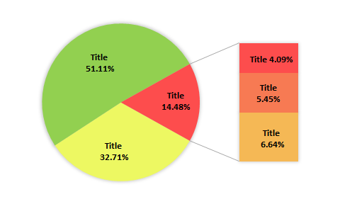
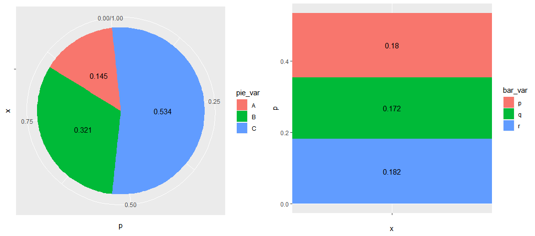
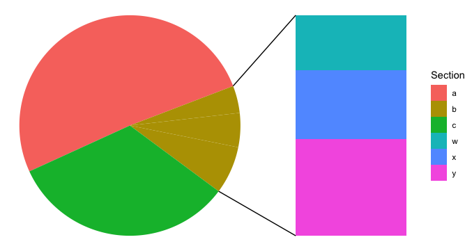
This seemed like an interesting problem. I'm sure there are functions and packages out there that will do a lot of this work, but I reinvented a few wheels just because I wanted explore how to put things together. The result is some working code. It's ugly, a little chaotic, but functional. Hopefully it helps you put together a solution that fits your needs.
First, you will need to run all of this code in your session
#--------------------------------------------------------------------
# Source in all of these functions together.
#
# CONTENTS ----------------------------------------------------------
#
# dual_chart - Master function. It will combine two charts and either
#              print the plot object, or return the two plots in a list
#              where they can be further customized.
# dual_chart_combine - Does the work of putting the two plots side by side.
# dual_chart_pie - Construct the pie chart.
# dual_chart_bar - Construct the bar chart.


# dual_chart --------------------------------------------------------
# Master function. It will combine two charts and either
# print the plot object, or return the two plots in a list
# where they can be further customized.

dual_chart <- function(data, primary_variable, level_for_detail,
                       secondary_variable,
                       ncol = 2, nrow = 1, ...,
                       plot = TRUE){
  plots <- list(pie = dual_chart_pie(DF,
                                     primary_variable,
                                     level_for_detail),
                bar = dual_chart_bar(DF,
                                     primary_variable,
                                     level_for_detail,
                                     secondary_variable))

  if (plot){
    dual_chart_combine(plots$pie,
                       plots$bar,
                       ncol = ncol,
                       nrow = nrow,
                       ...)
  } else {
    plots
  }
}


# dual_chart_combine ------------------------------------------------
# Does the work of putting the two plots side by side.

dual_chart_combine <- function(pie_chart, bar_chart,
                               ncol = 2, nrow = 1, ...){
  gridExtra::grid.arrange(
    grobs = list(pie_chart, bar_chart),
    ncol = ncol,
    nrow = nrow
  )
}


# dual_chart_pie ----------------------------------------------------
# Construct the pie chart

dual_chart_pie <- function(data, primary_variable, level_for_detail){
  require(dplyr)
  require(ggplot2)

  # Frequency and Relative Frequencies of the data
  primary_summary <-
    data %>%
    group_by_at(primary_variable) %>%
    summarise_at(primary_variable,
                 .funs = list(n = function(x) sum(!is.na(x)))) %>%
    mutate_at("n",
              .funs = list(p = function(x) x / sum(x)))

  # Determine the radian shift.
  # This allows us to place the level_for_detail on the right side of the
  #   pie chart, with the slice of the pie centered over the pi/2 position.
  # label_position determines the y-coordinate for the proportion label.
  cum_freq <- c(0, cumsum(primary_summary$p))
  radian_position <- cum_freq * 6.283

  radian_shift <- numeric(length(cum_freq) - 1)
  names(radian_shift) <- primary_summary[[primary_variable]]

  label_position <- numeric(length(cum_freq) - 1)

  for (i in seq_along(radian_shift)){
    radian_shift[i] <- mean(radian_position[c(i, i+1)])
    label_position[i] <- mean(cum_freq[c(i, i + 1)])
  }

  # Make the pie chart
  ggplot(data = primary_summary,
         mapping = aes_string(y = "p",
                              fill = primary_variable)) +
    geom_bar(width = 1,
             stat = "identity",
             mapping = aes(x = "")) +
    geom_text(mapping = aes_string(y = "1 - label_position",
                                   label = "p"),
              x = 1) +
    coord_polar("y",
                start = pi / 2 + radian_shift[level_for_detail])
}

# dual_chart_bar ----------------------------------------------------
# Construct the bar chart

dual_chart_bar <- function(data, primary_variable, level_for_detail,
                           secondary_variable){
  secondary_summary <-
    data %>%
    group_by_at(c(primary_variable, sub_variable)) %>%
    summarise_at(sub_variable,
                 .funs = list(n = function(x) sum(!is.na(x)))) %>%
    ungroup() %>%
    mutate_at("n",
              .funs = list(p = function(x) x / sum(x))) %>%
    filter_at(primary_variable, any_vars(. %in% level_for_detail))

  # label_position determines the y-coordinate for the proportion label.
  cum_freq <- c(0, cumsum(secondary_summary$p))

  label_position <- numeric(length(cum_freq) - 1)

  for (i in seq_along(label_position)){
    label_position[i] <- mean(cum_freq[c(i, i + 1)])
  }

  # Make the bar plot
  ggplot(data = secondary_summary,
         mapping = aes_string(y = "p",
                              fill = sub_variable)) +
    geom_bar(width = 1,
             stat = "identity",
             mapping = aes(x = "")) +
    geom_text(mapping = aes_string(y = "max(cum_freq) - label_position",
                                   label = "p"),
              x = 1)
}
Once that's all in there, you can get the crude plot with
dual_chart(DF, "pie_var", "C", "bar_var")


