library(ggplot2)

## Data
df <- data.frame(
zipcode=c("10001","10002","10003","10004","10005","10006","10007","10008","10009","10010"),
 black= c(2,3,4,6,7,8,9,11,13,15),
 white = c(6,8,12,14,15,16,14,14,14,22),
 population = c(11,22,33,44,55,66,77,88,99,100),
 female = c(5,11,32,22,31,21,44,11,22,14),
cluster = c("1","2","3","2","2","1","3","3","3","1"))
print(df)

> print(df)
   zipcode black white population female cluster
1    10001     2     6         11      5       1
2    10002     3     8         22     11       2
3    10003     4    12         33     32       3
4    10004     6    14         44     22       2
5    10005     7    15         55     31       2
6    10006     8    16         66     21       1
7    10007     9    14         77     44       3
8    10008    11    14         88     11       3
9    10009    13    14         99     22       3
10   10010    15    22        100     14       1
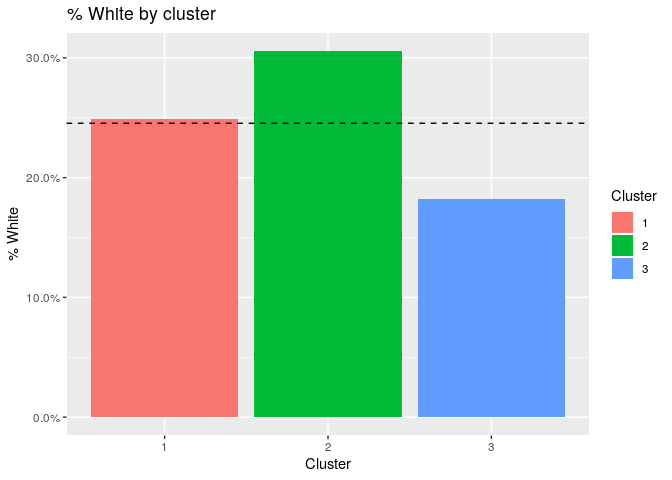
I am trying to make a bar chart of %white by cluster, where %white = white/population.
For this example, there would be 3 vertical bars ( one for each cluster) and a horizontal dotted line for the overall average of white population.
It seems like it should be simple, but I can't get it to work.
cluster 1 is 24%
cluster 2 is 30.5%
cluster 3 is 18%
overall average is 23% (horizontal dotted line)