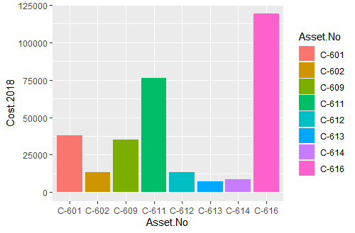
ca<-ggplot(data=cranes_cost,aes(x =Asset.No, y =Cost.2018,fill=Asset.No))
ca+ geom_bar(stat="identity")

I need to show the cost year 2019 and 2020 in the same chart ,I have three different variables of cost .
ca<-ggplot(data=cranes_cost,aes(x =Asset.No, y =Cost.2018,fill=Asset.No))
ca+ geom_bar(stat="identity")

I need to show the cost year 2019 and 2020 in the same chart ,I have three different variables of cost .
library(tidyverse)
(madeupdf <- data.frame(asset=letters[1:6],
                       cost.2018 = (1:6) * 123,
                       cost.2019 = ((1:6) +5) *100))

(pl <- pivot_longer(madeupdf,
                   cols=starts_with("cost"),
                   names_to = "cost_year",
                   values_to = "cost_value"))

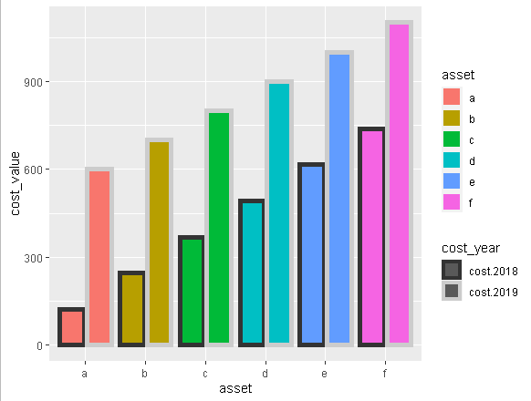
ggplot(data=pl,aes(x =asset, y =cost_value,fill=asset,color=cost_year)) +
  geom_col(position = position_dodge2(),size=2) +
  scale_color_grey()

This topic was automatically closed 7 days after the last reply. New replies are no longer allowed.
If you have a query related to it or one of the replies, start a new topic and refer back with a link.