Hello @bragks!
I'm glad you found my answer useful!
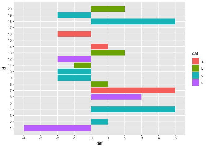
Labelling each side using manual annotations
For labelling each side of the X-axis, my first thought was to use manual annotations with the annotate() function from ggplot2. However, I found this finicky because you have to add extra space at the top of your plot in order to fit the extra text labels. It's certainly possible, but I thought that the second solution I came up with was more elegant.
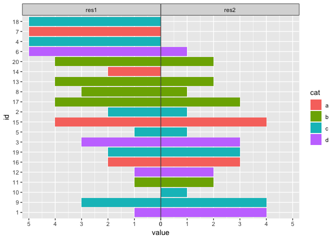
Labelling each side using facets
I realized that we have the values res1 and res2 in a column called result_name thanks to our gather() operation. This means that we can leverage facets in ggplot2. Here's a summary of the changes I made to adapt the code posted above:
- You facet the plot using the
result_name column we created in our gather operation using facet_grid(~ result_name, scales = "free_x").
- The
scales = "free_x" argument ensures that the X-axis scales of each facet are not forced to be the same across the facets. In other words, it allows each facet to "fit" the data it contains.
- Because facets are shown alphabetically by default, I decided to convert
res1 to a negative scale instead of res2. Alternatively, you could convert the result_name column to a factor and use fct_relevel() to set res2 as the first level.
- In order to "collapse" the facets together (i.e. eliminate the gap between the two vertical bars), we need to do two things:
- We eliminate the gap between facets using
theme(panel.spacing.x = unit(0, "pt")).
- We eliminate the gap between the bars from the barplot and the edge of the plot using
scale_y_continuous(expand = c(0, 0)).
- One issue that's introduced by setting
expand = c(0, 0) in scale_y_continuous() is that there is no space "above" the bars, which makes the plot feel a bit claustrophobic.
- Normally, there are a few solutions to this (e.g.
expand_limits() or expand_scale() from ggplot2), but most of them don't work here.
- Instead, I had to add
geom_blank(aes(y = value * 1.05)) to account for the fact that value contains a mix of positive and negative values.
- The
1.05 value is simulating the default behaviour of the expand argument for scale_x_continuous() (see help).
- To emphasize the facet titles/strips, I added the following to the theme:
strip.background = element_rect(colour = "black").
- I also set
colour = "black" for geom_hline() for consistency.
Display only positive values on X-axis
While I was improving the labelling, I also made a small tweak so that the X-axis displays positive values on each side (instead of negative values on one side). For this, here's what I changed:
Example
library(ggplot2)
library(tibble)
library(forcats)
library(dplyr, warn.conflicts = FALSE)
library(tidyr)

set.seed(1)

dframe <- tibble(id = 1:20,
                 res1 = sample(0:5, 20, replace = TRUE),
                 res2 = sample(0:5, 20, replace = TRUE),
                 diff = res1-res2,
                 cat = sample(c("a", "b", "c", "d"), 20, replace = TRUE))

dframe <- mutate(dframe,
                 id = as.factor(id),
                 id = fct_reorder(id, diff),
                 res1 = -res1)

dframe <- gather(dframe, result_name, value, res1, res2)

breaks <- -6:6
names(breaks) <- abs(breaks)

ggplot(dframe, aes(x = id, y = value, fill = cat)) +
  geom_col() +
  geom_hline(yintercept = 0, colour = "black") +
  geom_blank(aes(y = value * 1.05)) +
  coord_flip() +
  facet_grid(~ result_name, scales = "free_x") +
  scale_y_continuous(breaks = breaks, labels = names(breaks),
                     expand = c(0, 0)) +
  theme(panel.spacing.x = unit(0, "pt"),
        strip.background = element_rect(colour = "black"))
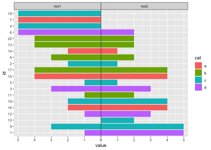
Created on 2018-10-28 by the reprex package (v0.2.1)