Hello everyone,
I am currently trying to plot a boxplot with a break in the y-axis. So far, without success. Here is my example code:
library(data.table)
library(ggplot2)

dt <- data.table(Month = character(), Value = numeric()) #create empty table

#some example values for 3 groups
dt <- rbind(dt, data.table(Month = "October", Value = c(runif(30, min=1, max=10), 34, 51, 58)), fill=T)
dt <- rbind(dt, data.table(Month = "November", Value = c(runif(30, min=1, max=10), 42, 54, 66)), fill=T)
dt <- rbind(dt, data.table(Month = "December", Value = c(runif(30, min=1, max=10), 25, 65, 87)), fill=T)

#box plot
png(paste0('boxplot example.png'), width = 2600, height = 2600)
par(xpd = F, #define margins
    mar = par()$mar + c(10,12,7,7),
    mgp = c(3,4,0))

plot <- ggplot(dt, aes(x=dt[,Month], y=dt[,Value])) +  #give data
  geom_boxplot(fill="gray", size=3, outlier.size = 6) + #create boxes
  labs(title="", x="", y = "Value") + #add axis lables
  scale_y_continuous(breaks=seq(0, 100, 10), limits = c(0,100)) + #determine axis limits and ticks

 #some visual tweaks
  theme(plot.margin = unit(c(5,5,5,5), "cm"),
        axis.text = element_text(size = 80),
        axis.title = element_text(size = 80),
        plot.title = element_text(size = 100, face = "bold", hjust = 0.5),
        axis.text.x = element_text(hjust = 1.05, angle = 45),
  )

print(plot)
dev.off()
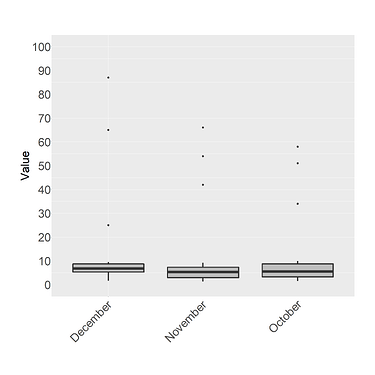
It should create a simple boxplot like this:
And here you can see the two problems that bother me:
- Since there are some outliers far from the average values, the boxes are very small and it is not very visually appealing. Therefore, I would like to add a y-axis break (lets say at a value of 15) and add a more compressed y-axis scale ranging from 15-100 above. In the end, the boxes should cover about ~50% of the entire plot area.
- For some reason, the data is getting sorted alphabetically on the x-axis. But i would like to keep the original order as in the data.table. (so that the months are in correct order)
Someone knows good solutions for these two problems?
Best regards,
Eike
