I'm working on some self study and am unable to replicate a plot provided in the solutions.
pacman::p_load(tidyverse, fable, fpp3, feasts)
aus_livestock %>%
  filter(State == "Victoria") %>%
  model(SNAIVE(Count)) %>%
  forecast(h = "5 years") %>%
  autoplot(aus_livestock)
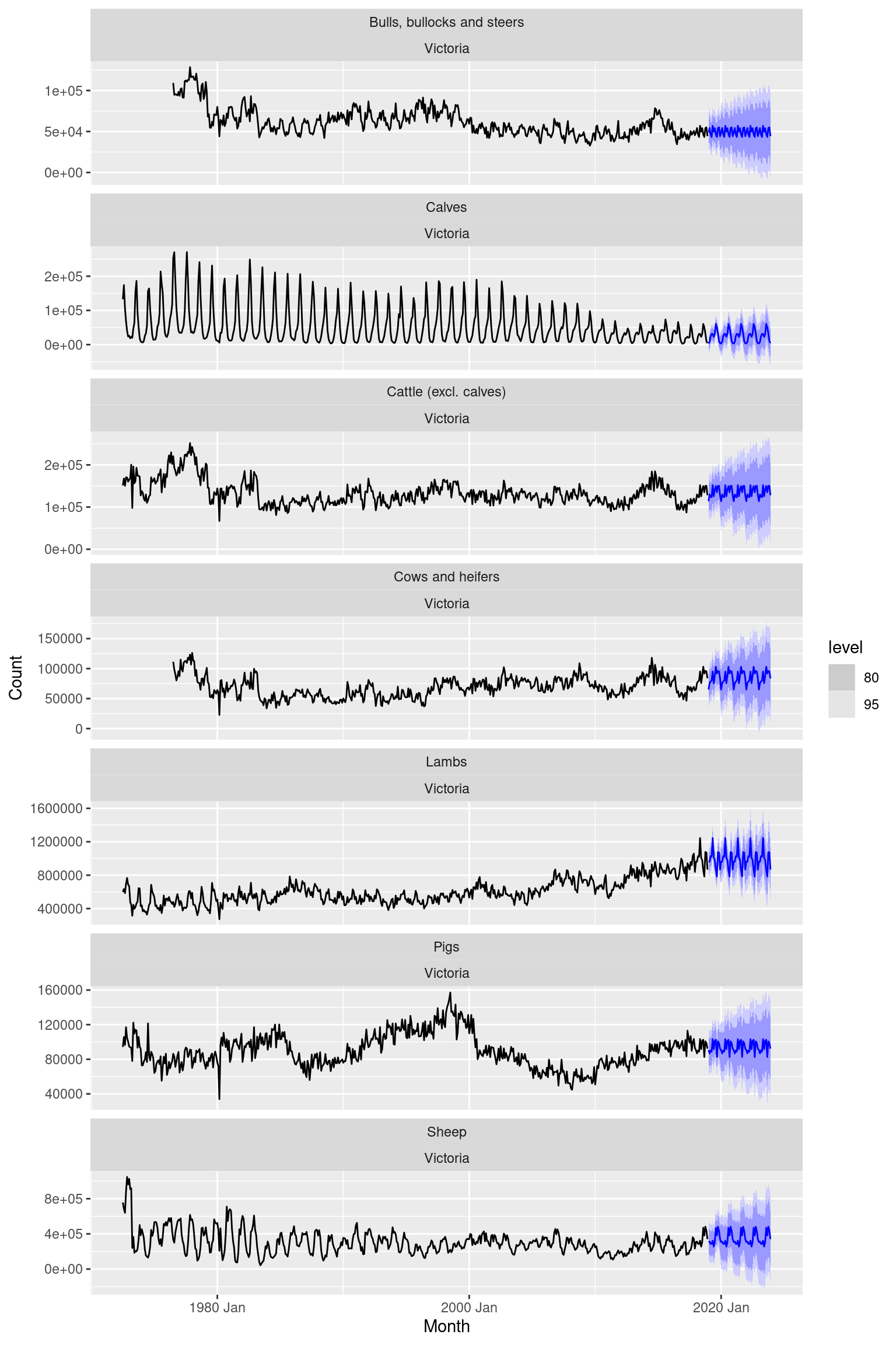
The above block is expected to return a plot looking like this:
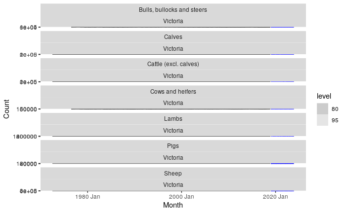
But when I try this block I get this!
Why does my plot render differently and how can I mimic the textbook solutions plot?