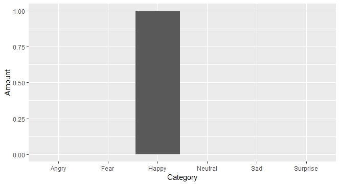
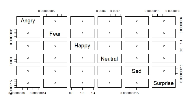
plot() is part of R's base graphics system. It is designed to guess what type of plot you want based on the class of object you pass to it (you can override some of these guesses by using its many parameters, or by using some of the other base plotting functions to build up your own plots). When you pass plot() a data frame without any other instruction, you get the result of the plot.data.frame() method. Here's what its documentation says:
This is intended for data frames with numeric columns. For more than two columns it first calls data.matrix to convert the data frame to a numeric matrix and then calls pairs to produce a scatterplot matrix. This can fail and may well be inappropriate: for example numerical conversion of dates will lose their special meaning and a warning will be given.
For a two-column data frame it plots the second column against the first by the most appropriate method for the first column.
So the upshot is that what you see above was plot()'s best guess based on the data frame it received. It's meant to be a matrix of scatterplots, plotting every variable against every other variable. Of course, since your data frame only has one value for each variable, it doesn't make a lot of sense!
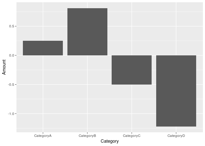
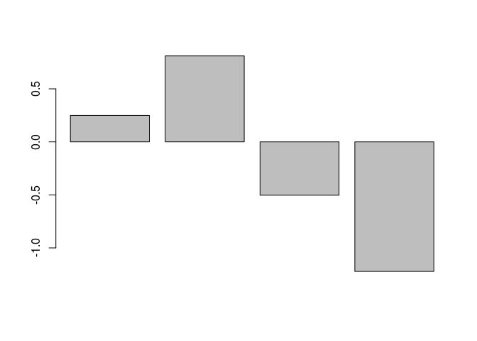
If you go back to the ggplot2 code you tried before and make sure you're using it with a "long" format data frame, it should give you something more sensible (a bar plot). (The way to predictably get that in the base graphics system is to use barplot()):
library(tidyverse)

# Let's call the data frame you got from converting your list
# the "wide" format:
dfr_wide <- as.data.frame(
  list(
    CategoryA = rnorm(1),
    CategoryB = rnorm(1),
    CategoryC = rnorm(1),
    CategoryD = rnorm(1)
  )
)

# And we'll call the `gather`-ed version the "long" format:
dfr_long <- gather(dfr_wide, key = "Category", value = "Amount")

dfr_wide
#>   CategoryA CategoryB  CategoryC CategoryD
#> 1  0.249787 0.8104117 -0.5028831 -1.221933
dfr_long
#>    Category     Amount
#> 1 CategoryA  0.2497870
#> 2 CategoryB  0.8104117
#> 3 CategoryC -0.5028831
#> 4 CategoryD -1.2219327

# ggplot likes long-format data!
# See: https://tidyr.tidyverse.org/articles/tidy-data.html
ggplot(data = dfr_long, aes(x = Category, y = Amount)) +
  geom_bar(stat = "identity")
# So does base `barplot()`
barplot(dfr_long$Amount)
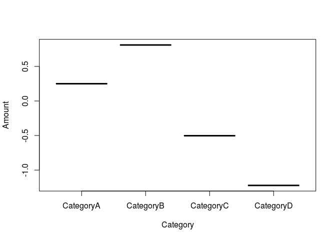
# To get something sensible from `plot(dfr_long)`, the Category variable
# needs to be defined as a factor
dfr_long$Category <- factor(dfr_long$Category)
plot(dfr_long)
Created on 2018-11-25 by the reprex package (v0.2.1)
One more tiny note: In case it's not clear, you can pass anything you want (or nothing at all!) to the key and value parameters of gather() — all those parameters are doing is setting the names of the resulting columns in the new data frame. See the documentation for gather() to learn more.


 And I know how it feels when you're struggling through something and you just need answers
  . But it's not a great idea to nudge people for more help — it tends to come across as demanding, no matter how it's meant.
