I've worked through time-series forecasting models and have mostly relied on Hyndman, R.J., & Athanasopoulos, G. (2021) Forecasting: principles and practice , 3rd edition, OTexts: Melbourne, Australia. Forecasting: Principles and Practice (3rd ed) (last accessed on February 20, 2023).
I'm testing models such as ETS, ARIMA, and vector autoregression. I've created a hypothetical where I assume I have only the first [12] months of time-series data and I forecast for months [13-24] based on the actuals for months [1-12]. I generate simulation paths for months [13-24], and distributions thereof. I then compare those forecasted simulation paths/distributions for months [13-24] with the actual data for months 13-24 in order to assess forecast reasonableness. Results using ETS and ARIMA have been fine, with some minor adjustment such as using logs.
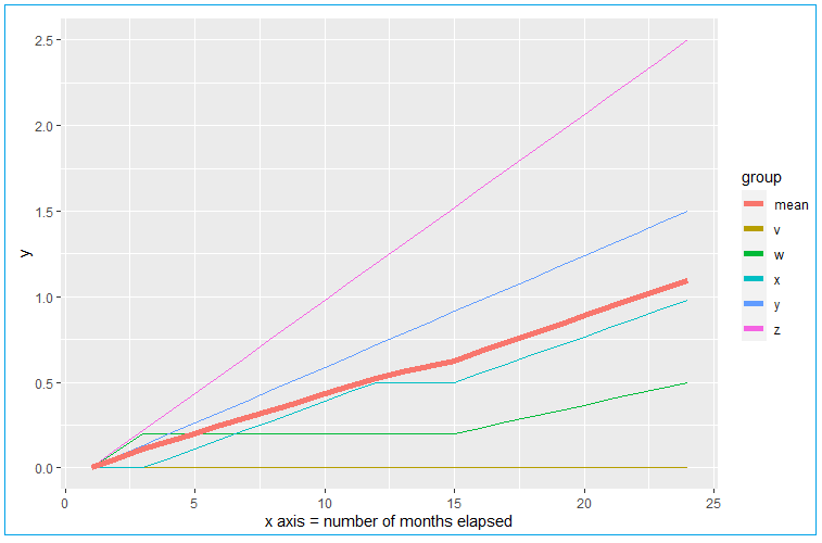
However, these traditional time-series forecasting methods analyze/forecast essentially a single-line, depicted as the heavier trend line in the below image using my example data and labeled mean. In my data, that heavier trend line is simply an average of many underlying elements with disparate trends. The below is a simplified example of my actual data for the sake of post replicability and all of my actual curves take the form of nice smooth logarithmic functions. In the below example, there are elements v, w, x, y, and z, and their mean is mean in the example data frame. But the trends of the underlying elements in my actual data do look like this example data in terms of dispersion around the mean. Values never fall below zero.
For time-series forecasting such as for this form of example data, are there any other methods I should be considering, that take into account the additional information I have at hand for the many underlying elements? (In my actual data I have 48 months and 60,000 + elements trending over those 48 months).
Code to generate the above:
library(ggplot2)

DF <- data.frame(
  mo = 1:24,
  v = c(rep(0,24)),
  w = c(0,0.1,rep(0.2,12),seq(0.2,0.5,length.out=10)),
  x = c(0,0,seq(0,0.5,length.out = 10),0.5,0.5,seq(0.5,0.98,length.out = 10)),
  y = seq(0, 1.5, length.out = 24),
  z = seq(0, 2.5, length.out = 24)
)

DF$mean <- rowMeans(DF[,2:6])

DF_reshape <- data.frame(
  x = DF$mo,
  y = c(DF$v, DF$w, DF$x,DF$y,DF$z,DF$mean),
  group = c(rep("v", nrow(DF)),
            rep("w", nrow(DF)),
            rep("x", nrow(DF)),
            rep("y", nrow(DF)),
            rep("z", nrow(DF)),
            rep("mean", nrow(DF))
            )
  )

ggplot(DF_reshape, aes(x, y, col = group)) +
  geom_line() +
  geom_line(data = filter(DF_reshape,group == "mean"), linewidth = 2) +
  labs(x = "x axis = number of months elapsed")
Referred here by Forecasting: Principles and Practice, by Rob J Hyndman and George Athanasopoulos
