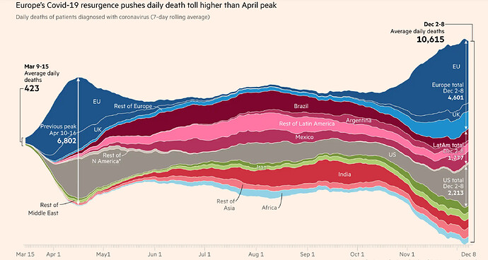
The Financial Times has a really attractive area plot-esque chart showing the growth in total COVID cases by country. Part of what I like is that it doesn't just grow upwards from the x axis; it floats kind of freely in space. Is there a way to do that in ggplot?
The easiest way would be to use the streamgraph package:
alternatively you could add some offset to the existing plot.
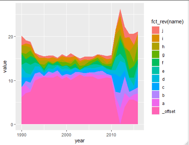
This offset should be 1/2 of the summed up intensity at each x position relative to the maximium of the summed up intensities. For example at the first position the offset is quite high, at the 3rd point from behind it's zero.
The offset can be added as additional area under all other points, and filled with no colour (or set to full transparency) so it dissappears.
library(tidyverse)

# some demo data
data = data.frame(
  year = rep(seq(1990, 2016), each =10),
  name = rep (letters[1:10], 27),
  value = c(sample(seq(0,2.5,0.001), 30),
            sample(seq(0,1,0.001), 180),
            sample(seq(0,4,0.001), 60)
            ))

# adding an offset
data2 = data %>%
  group_by(year) %>%
  summarise(summed_up = sum(value)) %>%
  # calculate the offset as half of the value relative to the maximum of the sum.
  mutate(max_sum = max(summed_up)) %>%
  mutate(name = "_offset",
         value = ((max_sum - summed_up)/2)) %>%
  select(year, name, value) %>%
  bind_rows(data)   # add to existing dataset

ggplot(data2, aes(x = year, y = value, fill = fct_rev(name))) +
  geom_area()
You may want to check the ggstream package: https://github.com/davidsjoberg/ggstream
Haha, okay this is a lot easier! 
This topic was automatically closed 21 days after the last reply. New replies are no longer allowed.
If you have a query related to it or one of the replies, start a new topic and refer back with a link.

