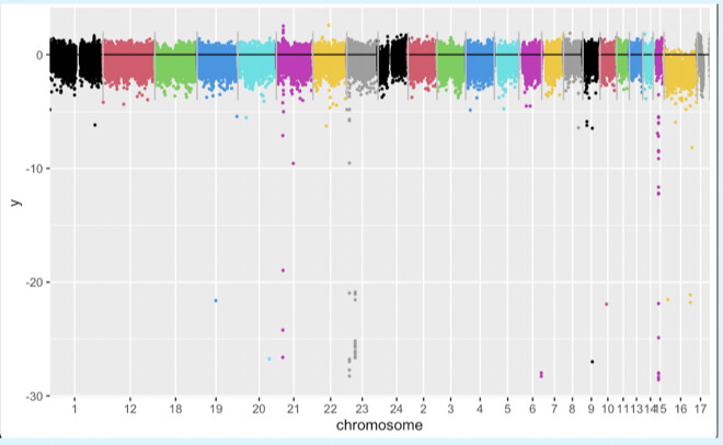
I want to plot a series of genes from 24 chromosomes and want to use the start position of each gene as X-axis, log2 ratio as Y-axis, but label the X-axis with chromosome numbers. To do that, I add the max gene start position of one chromosome to the following chromosome. For example, chromosome 2 gene start position all become its original postion plus the max start postion of chromsome 1, chromosome 3 start positions all become their original position plus the max start position of chromosome2, and so on. In this way, all gene start positions are in order of smallest to greatest. They are then used as X-axis for plotting.
The problem is feeling like the plot didn't plot out data as I expected, I want it to plot out from chr1, chr2, chr3 ...chr24.
Here is the output I got:

pos <- df1 %>%
  group_by(chromosome) %>%
  summarize(avg = round(mean(start))) %>% pull(avg)

t1 <- df1 %>% group_by(chromosome) %>% summarize(avg=max(start)) %>% pull(avg)
ggplot(df1) +
  annotate("point", x=df1$start, y=df1$log2, size=0.5, color=df1$chromosome) +
  annotate("segment", x=0, xend=max(df1$start), y=-0, yend=0,color="black")+
  annotate("segment", x=t1, xend=t1, y=-4, yend = 2, color = "grey")+
  scale_x_discrete(limits = pos, labels=unique(df1$chromosome) +
  labs(x = "chromosome") +
  ylim(c(-30,3))
Can anyone have any suggestions what may go wrong with my codes?
Your help is greatly appreciated.
Best,
Lim
