I got help the other day dealing with ggplotly dates show as 19 thousand series of numbers.
Now, I want to animate this chart with a new column or columns with each additional days. Here is the code from the other post with only frame=activity_date now in the geo_column aes.
library(tidyverse)
library("lubridate")
library(plotly)
library(htmlwidgets)
library("reprex")


turtle_activity_gtm <-  read_csv("https://www.dropbox.com/s/7ubvhajvkhx53kc/mpt_act_rep_cum_fc_cum_nest.csv?dl=1")
#Above file has cumulative false crawls and cumulative nests added along with proper date formats.

start_date <- ymd("2022-04-15")
end_date <- ymd("2022-10-31")

ggstatic <-  turtle_activity_gtm |> filter(activity=="N") |>
  group_by(activity_date, species) |>
  summarize(N = n()) |>
  ggplot() +
  geom_col(aes(x = activity_date, y = N, fill = species, frame=activity_date),
           na.rm = TRUE,
           position = position_dodge2(preserve = "single")) +
  scale_x_date(breaks = c(seq.Date((start_date), (end_date),
                                   by = '10 days'), end_date),
               date_labels = "%m/%d",
               date_minor_breaks = "1 day",
               limits = c( start_date, end_date),
               expand = c(0,0))

ggplotly(ggstatic)
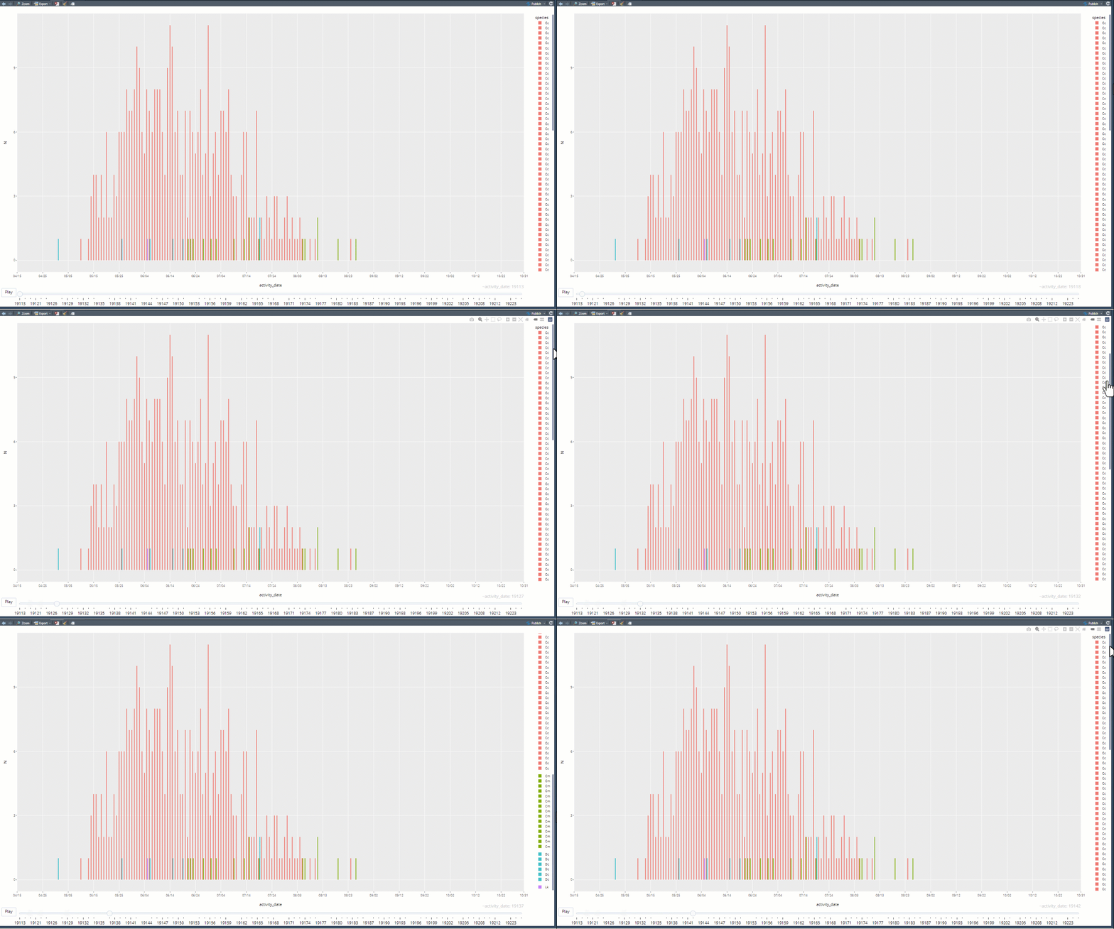
Below is a short screen capture of the partial animation where all columns are present with each day. I manually scroll the legend as it progresses. Yeah, there are those pesky days from the being of 1970 present. But right now, I am more interested in get the plot to grow with each successive day.

Thanks,
Jeff