Helle everyone,
I am trying to present some data within a stacked barplot. The data is devided into subgroups, which I would like to represent in the plot accordingly. To do so, I applied the method that is suggested here:
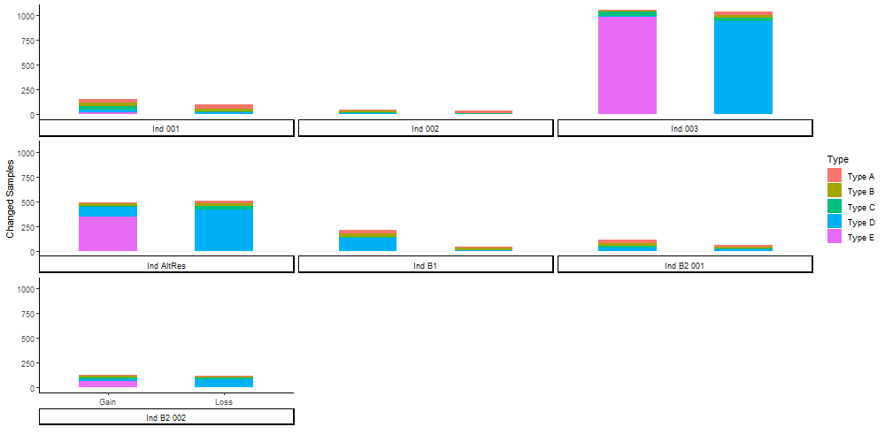
If I try to apply it to my data, it however looks like this:
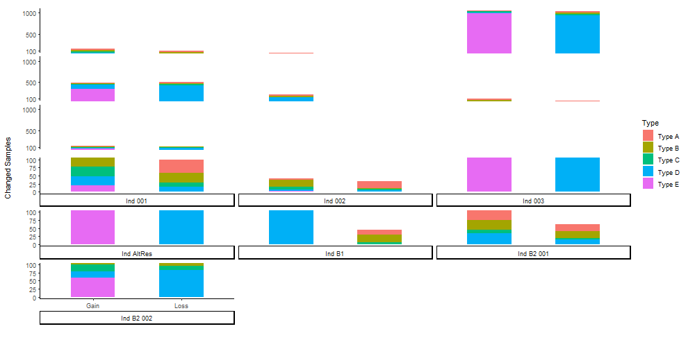
So the bars are seperated over three lines of plots, all with their own y-axis etc. Furthermore, the gain/loss subgroups are only presented at the last plot in the third line. To make data visually more appealing, I usually use the ggbreak function. Here it make the problem only worse:
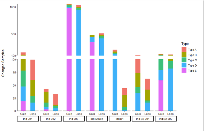
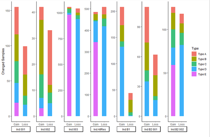
My Question: Is there a way to align all bars into one row, so that they are actually in one figure instead of 3? I already tried to use the position_dodge argument within aes(). However, it does not seem to go well with stacked bars.
Bonus Question: I noticed that using ggbreak at a certain y-value (in the example it is 100) still leads values below that y-value to be plotted after the break (so in the exmaple you can see values plotted for >100 that are actually below 100). Anybody know why that is and how to prevent it?
Here is my Code:
library(ggplot2)
library(ggbreak) #for the axis break
#get data
cData <- structure(list(Individual = c("Ind 001", "Ind 002", "Ind 003",
"Ind B2 001", "Ind B2 002", "Ind B1", "Ind AltRes", "Ind 001",
"Ind 002", "Ind 003", "Ind B2 001", "Ind B2 002", "Ind B1", "Ind AltRes",
"Ind 001", "Ind 002", "Ind 003", "Ind B2 001", "Ind B2 002",
"Ind B1", "Ind AltRes", "Ind 001", "Ind 002", "Ind 003", "Ind B2 001",
"Ind B2 002", "Ind B1", "Ind AltRes", "Ind 001", "Ind 002", "Ind 003",
"Ind B2 001", "Ind B2 002", "Ind B1", "Ind AltRes", "Ind 001",
"Ind 002", "Ind 003", "Ind B2 001", "Ind B2 002", "Ind B1", "Ind AltRes"
), Change = c("Gain", "Gain", "Gain", "Gain", "Gain", "Gain",
"Gain", "Gain", "Gain", "Gain", "Gain", "Gain", "Gain", "Gain",
"Gain", "Gain", "Gain", "Gain", "Gain", "Gain", "Gain", "Gain",
"Gain", "Gain", "Gain", "Gain", "Gain", "Gain", "Gain", "Gain",
"Gain", "Gain", "Gain", "Gain", "Gain", "Loss", "Loss", "Loss",
"Loss", "Loss", "Loss", "Loss", "Loss", "Loss", "Loss", "Loss",
"Loss", "Loss", "Loss", "Loss", "Loss", "Loss", "Loss", "Loss",
"Loss", "Loss", "Loss", "Loss", "Loss", "Loss", "Loss", "Loss",
"Loss", "Loss", "Loss", "Loss", "Loss", "Loss", "Loss", "Loss"
), Type = c("Type A", "Type A", "Type A", "Type A", "Type A",
"Type A", "Type A", "Type B", "Type B", "Type B", "Type B", "Type B",
"Type B", "Type B", "Type C", "Type C", "Type C", "Type C", "Type C",
"Type C", "Type C", "Type D", "Type D", "Type D", "Type D", "Type D",
"Type D", "Type D", "Type E", "Type E", "Type E", "Type E", "Type E",
"Type E", "Type E", "Type A", "Type A", "Type A", "Type A", "Type A",
"Type A", "Type A", "Type B", "Type B", "Type B", "Type B", "Type B",
"Type B", "Type B", "Type C", "Type C", "Type C", "Type C", "Type C",
"Type C", "Type C", "Type D", "Type D", "Type D", "Type D", "Type D",
"Type D", "Type D", "Type E", "Type E", "Type E", "Type E", "Type E",
"Type E", "Type E"), Value = c(39L, 5L, 12L, 36L, 7L, 35L, 10L,
38L, 21L, 7L, 28L, 19L, 31L, 28L, 31L, 9L, 40L, 11L, 21L, 10L,
5L, 28L, 4L, 16L, 35L, 20L, 132L, 97L, 19L, 3L, 981L, 0L, 59L,
0L, 345L, 40L, 21L, 40L, 21L, 11L, 13L, 35L, 30L, 3L, 25L, 21L,
11L, 24L, 20L, 13L, 4L, 36L, 4L, 14L, 6L, 35L, 16L, 5L, 939L,
16L, 82L, 1L, 419L, 0L, 0L, 0L, 0L, 0L, 0L, 0L)), row.names = c(NA,
-70L), class = "data.frame")
#plot
png(paste0('Plot.png', sep=''), width = 1000, height = 500)
par(xpd = F,
mar = par()$mar + c(10,12,7,7),
mgp = c(3,4,0))
ggplot(cData, aes(fill=Type, y=Value, x=Change, width =0.5)) +
geom_bar(position="stack", stat="identity") + #plot stacked bars
scale_y_break(breaks = c(100,100), scales = 1, ticklabels = c(100,500,1000), space = 0.1, expand = TRUE) + #axis break
facet_wrap(~Individual, strip.position = "bottom")+ #arrange subgroups
theme_classic()+
theme(strip.placement = "outside")+
labs(x = "", y = "Changed Samples") #axis lables
dev.off()


