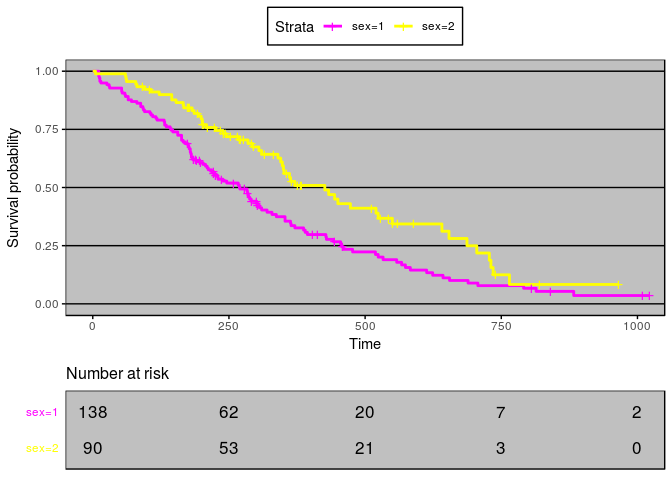
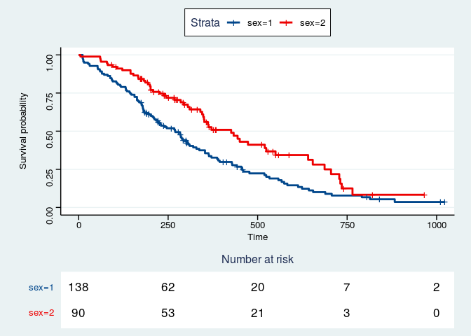
It is traditional, in plotting survival curves, to have a table under the survival plot listing numbers at risk at intervals corresponding to the tick times on the plot. I have found code that lines up plots with similar x ticks and code that lines up tables with similar column names. But I haven't found how to aline an at.risk table with the x ticks on a plot. The following code generates a plot and a table. I want to be able to align the table columns with the x-axis ticks.
Thanks in advance for any suggestions how I can accomplish this.
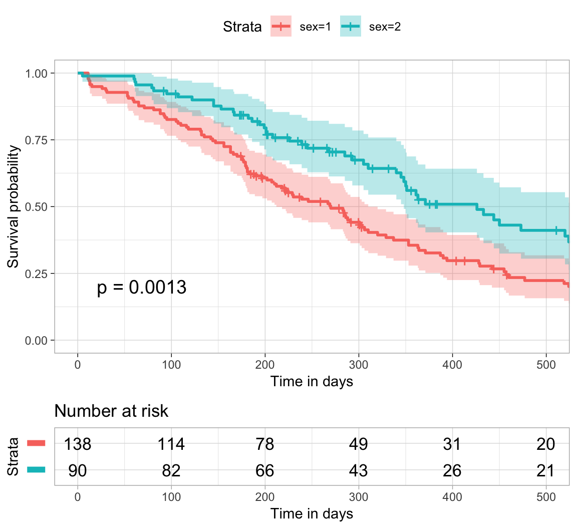
Thanks, mara, for the suggestion. Unfortunately the journals that I use wouldn't accept the style of graphics found in survminer. Any suggestions about how I can figure out how the survminer folks managed this? I need to make it work for the style of figure my target journal is expecting.
How far off is the default ggsurvplot output from the rules you have to comply with? Have you looked into the customization options survminer already has? Colors, font sizes, etc can all be changed with arguments to ggsurvplot() or to the underlying theme_survminer() and theme_cleantable(). See:
But the theming is also compatible with the usual ggplot2 methods, so there's not very many limits to what you can do. Some silly examples...