Align statistical letters

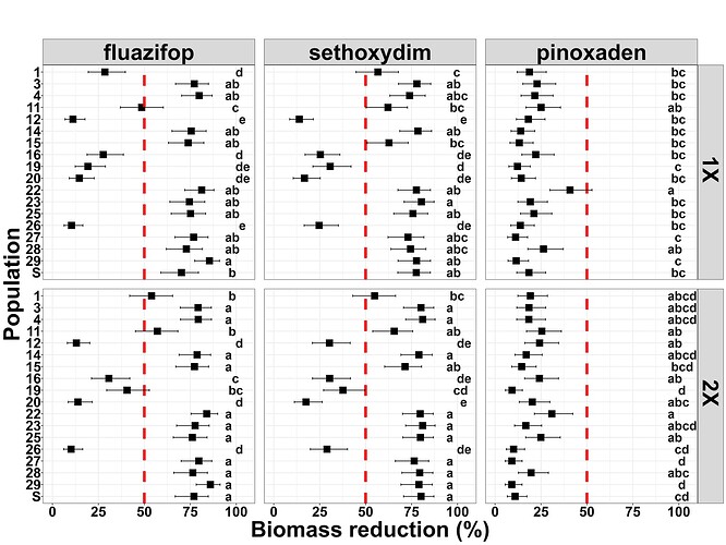
I'm trying to align the letters of my statistical analysis in the plot.

Here is my code:

pd = position_dodge(0.4)

ggplot(cld_trtdosepop,
aes(x = pop,
y = response*100,
#color = pop,
label = .group)) +

geom_point(shape = 15,
size = 5,
position = pd) + facet_grid(dose ~ trt) +

geom_hline(yintercept=50, size = 2, linetype="dashed", color = "red") +

geom_errorbar(aes(ymin = asymp.LCL100,
ymax = asymp.UCL
100),
width = 0.2,
size = 0.5,
position = pd) + ylim(0, 105) +
theme_bw() +
theme(plot.title = element_text(face = "bold", hjust = 0.5, size = 38, colour = "black"),
axis.title = element_text(face = "bold", size = 35, colour = "black"),
axis.text.x = element_text(size = 22, colour = "black", face = "bold"),
axis.text.y = element_text(size = 22, colour = "black", face = "bold",
margin = margin(t = 2, b = 2, unit = "cm")),
legend.title = element_text(size = 35, face = "bold"),
legend.text = element_text(face = "bold", size = 35),
strip.text = element_text(face = "bold", size = 35, colour = "black"),
panel.spacing = unit(1.0, "lines")) +

ylab("Biomass reduction (%)") + xlab("Population") + coord_flip() +
ggtitle ("",
subtitle = "") +

geom_text(aes(label = .group, hjust = 0, y=92), # put letters at 92% on the Y-axis (right edge after flip)
size = 7,
fontface = "bold",
color = "black") +
ggsave("Biomass reduction square dot_tukey.jpeg", width = 16, height = 12, units = "in", dpi = 500)

Here is the outcome:

Any idea on how to fix it?
None at the moment but it is rather hard to troubleshoot with no example data. We really need some sample data.

A handy way to supply data is to use the dput() function. Do dput(mydata) where "mydata" is the name of your dataset. For really large datasets probably dput(head(mydata, 100). Paste it here between

```

```

As @jrkrideau suggests, it would be best to share a selection of your data if possible, but in the meantime, my first guess is that there may be space characters in your labels.

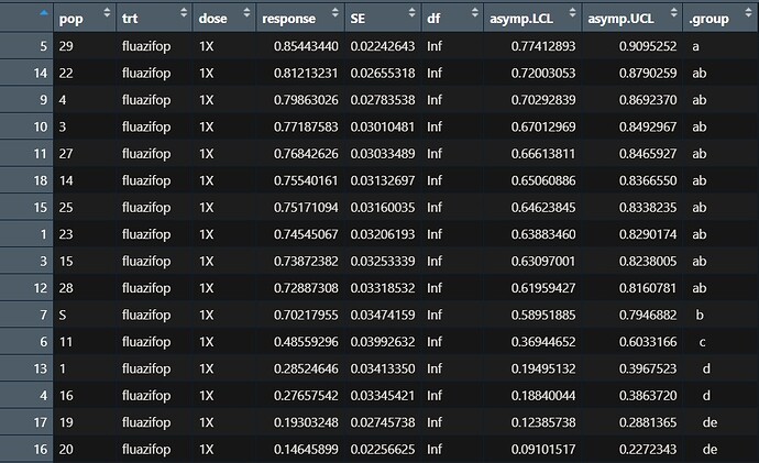
That is correct. The colum ".group" where has the letters from the statistical analysis have space characters. Is it possible to fix it? I've attached a photo with of the dataset for reference.

A screenshot is virtually useless here. We really need some usable data.

Probably the best way to supply data is to use the dput() function. Do dput(mydata) where "mydata" is the name of your dataset. For really large datasets probably dput(head(mydata, 100). Paste it here between

```

```

This gives us an exact copy of your data.

The advice about using dput() is good. In the meantime, I wonder if you might be able to use str_pad() to add spaces and pad all the entries in .group to the same length. Might also need to be sure a fixed width font is being used.

Since the ggplot() code left-justifies the text (hjust = 0), just removing all the space characters with str_trim() would work, too, without requiring a monospace font — unless the goal is to have all the letters line up vertically, too.

1 Like