Hello,
I need some help with highcharter if possible. As you will see I have a very basic df which is adequate to represent the problem with.
What I need help with:
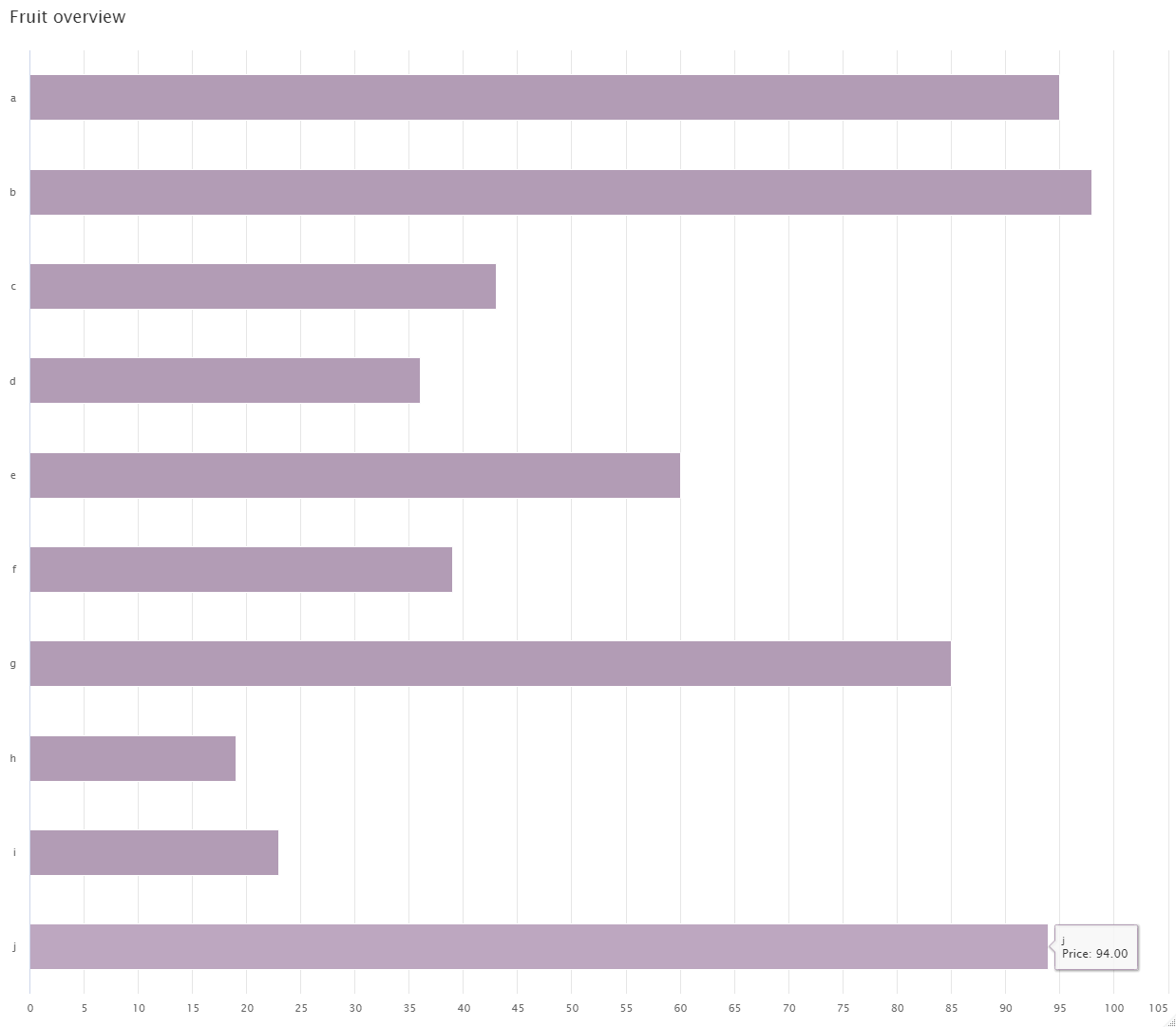
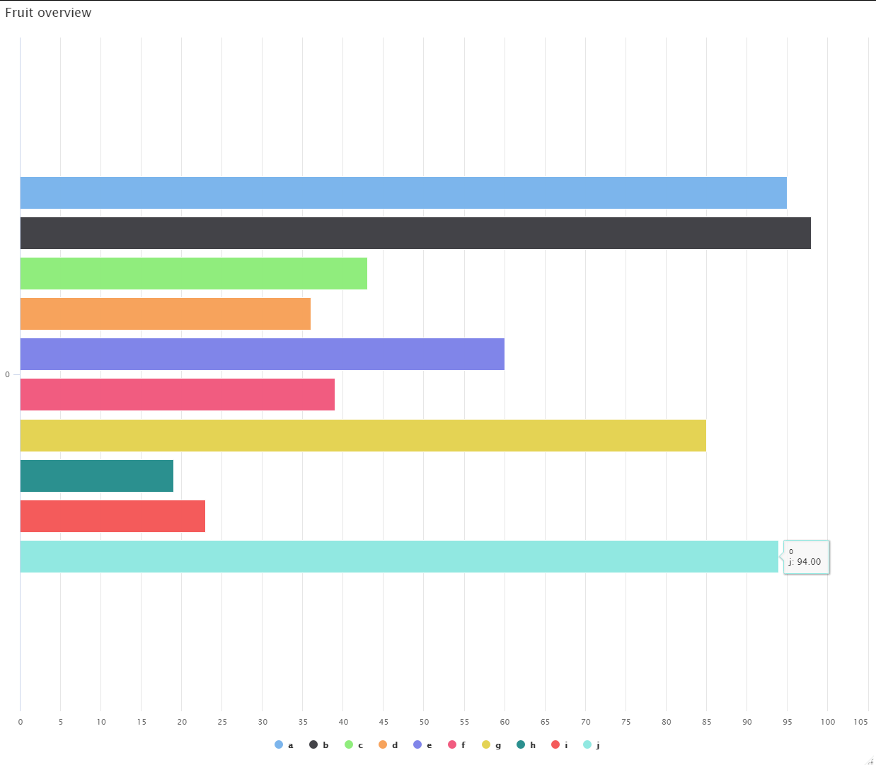
- I essentially want the tool tip from chart1 to reflect in that way in chart2
- I want the y axis to label the fruits in chart2 as we have in chart1
- I want the bars in chart2 to be spread out like they are in chart1
- I want to remove the 0 that persists on the y axis
Any help would be great!
library(tidyverse)
library(highcharter)
#> Warning: package 'highcharter' was built under R version 4.1.1
#> Registered S3 method overwritten by 'quantmod':
#>   method            from
#>   as.zoo.data.frame zoo
#> Highcharts (www.highcharts.com) is a Highsoft software product which is
#> not free for commercial and Governmental use

df <- data.frame(
  fruit = letters[1:10],
  price = sample(1:100,10)
)

chart1 <-
highchart() %>%
  hc_chart(type = "bar") %>%
  hc_xAxis(categories = df$fruit) %>%
  hc_add_series(name="Price", data= df$price, color = "#B29CB5", showInLegend = FALSE) %>%
  hc_tooltip(pointFormat = "<p>{point.series.name}: {point.y:.2f} <br></p>",
             shared=TRUE) %>%
  hc_title(text="Fruit overview", align="left")

chart1

chart2 <-
highchart() %>%
  hc_add_series(
    data = df,
    type = "bar",
    hcaes(y = price,
          group = fruit),
    showInLegend = TRUE,
  ) %>%

  hc_tooltip(title = "Fruit overview",
             pointFormat = "<p>{point.series.name}: {point.y:.2f} <br></p>",
             shared=FALSE) %>%
  hc_title(text="Fruit overview", align="left")

chart2
Created on 2021-09-02 by the reprex package (v2.0.0)
chart1
chart2

