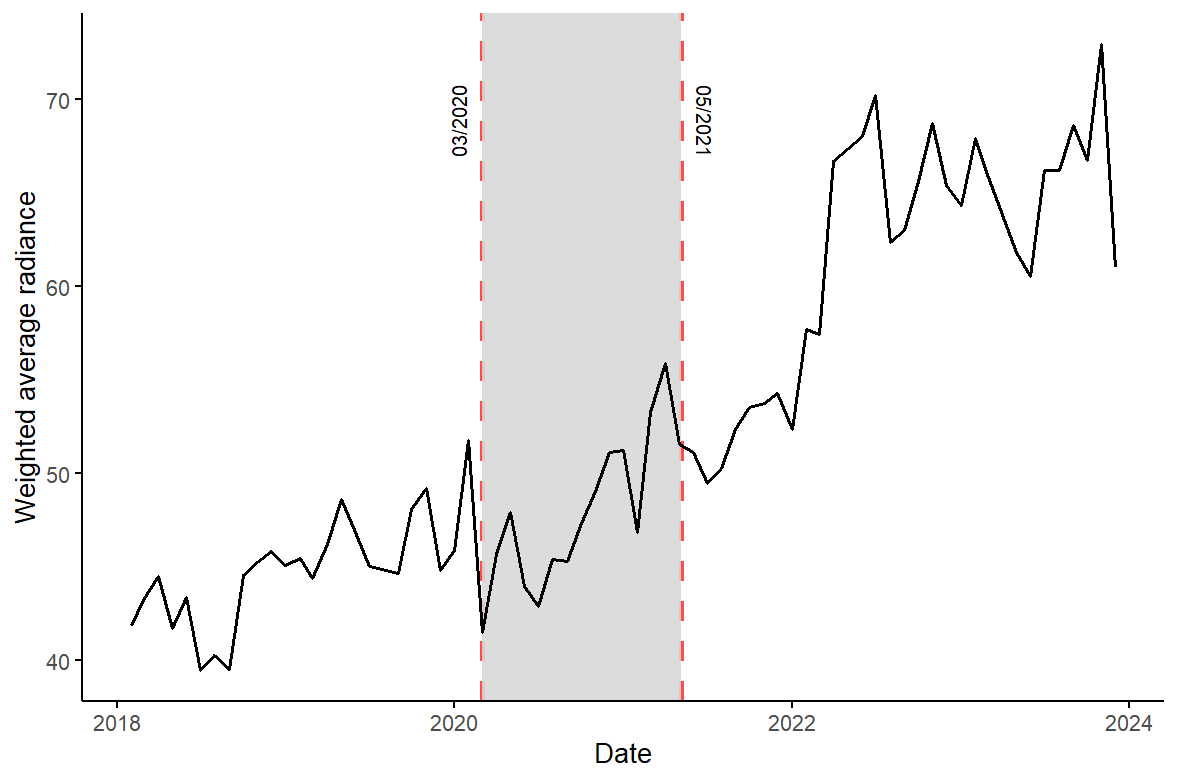
I create this plot using ggplot2
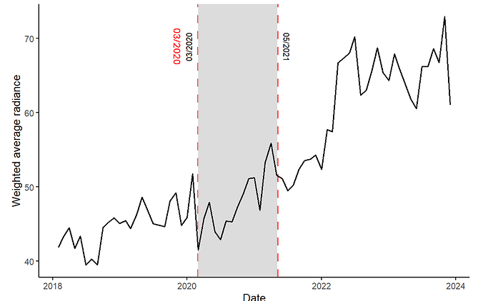
I want the text next to the left vertical red line to show the date in the same order as the text in the red vertical line, that is, 03/2020. The desired output should be:
Here is the code:
library(ggplot2)

ggplot(data = ddf_long, aes(x = date, y = value)) +
  # vertical lines first (so they appear behind the data line)
  geom_vline(xintercept = vertical_dates, linetype = "dashed", color = "red", alpha = 0.7, size = 1.5) +
  # shaded area between vertical lines
  geom_rect(aes(xmin = vertical_dates[1], xmax = vertical_dates[2],
                ymin = -Inf, ymax = Inf), fill = "lightgrey", alpha = 0.05) +
  geom_line(color = "black", size = 1) +
  theme_minimal() +
  theme(plot.caption = element_text(hjust = 0)) +
  labs(x = "Date",
       y = "Weighted average radiance") +
  theme_minimal(base_size = 15) +
  theme(
    panel.grid = element_blank(),
    axis.line = element_line(color = "black", size = 0.7),
    panel.border = element_blank(),
    axis.ticks = element_line(color = "black")
  ) +
  # rotated text labels
  annotate("text", x = vertical_dates[1], y = Inf, label = "03/2020", vjust = -1, hjust = 2, angle = 90) +
  annotate("text", x = vertical_dates[2], y = Inf, label = "05/2021", vjust = -1, hjust = -1, angle = -90)

