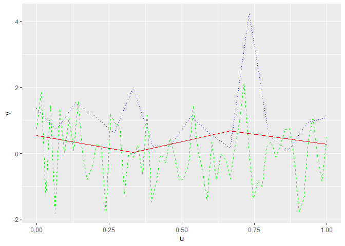
Hi, I am trying to add multiple sets of data onto the same plot. My data sets on the X range from 0 to 1, but the Y varies. The issue I'm running into is that each set of data are not the same length. I would like to have each set of data to have its own color as well.
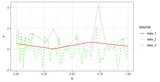
You can stack your data sets into a single "long" data frame, which will then require only one call to geom_line() and automate the creation of a legend marking the data source for each line. I've also added code to manually set the colors and line types in case you want to change them from the default values. The code below uses @Yarnabrina's sample data.
library(tidyverse)
theme_set(theme_bw())

# Stack the three data frames into a single "long" data frame
#  and pipe it into ggplot
map_df(paste0("data_", 1:3) %>% set_names(), get, .id="source") %>%
  ggplot(aes(u, v, colour=source, linetype=source)) +
    geom_line() +
    scale_colour_manual(values=c("red","blue","green")) +
    scale_linetype_manual(values=c("solid","dotted","dashed"))