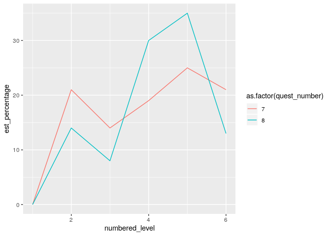
Hey all, I'm trying to have these three graphs on one plot and have no idea where to start. I'm using survey data that I found where quest_number is the question number that i'm looking at and i want each line to be the specified demographic. On each plot I put the response level on the x-axis and the percentage that gave that response on the y- axis. I would appreciate any guidance
  survey %>%
  filter(quest_number == "1", demo_breakdown == "age_18_34" ) %>%
  ggplot()+
  geom_line(mapping = aes(x = numbered_level, y = est_percentage))
  survey %>%
    filter(quest_number == "1", demo_breakdown == "age_35_64" ) %>%
    ggplot()+
    geom_line(mapping = aes(x = numbered_level, y = est_percentage))
  survey %>%
    filter(quest_number == "1", demo_breakdown == "age_35_64" ) %>%
    ggplot()+
    geom_line(mapping = aes(x = numbered_level, y = est_percentage))