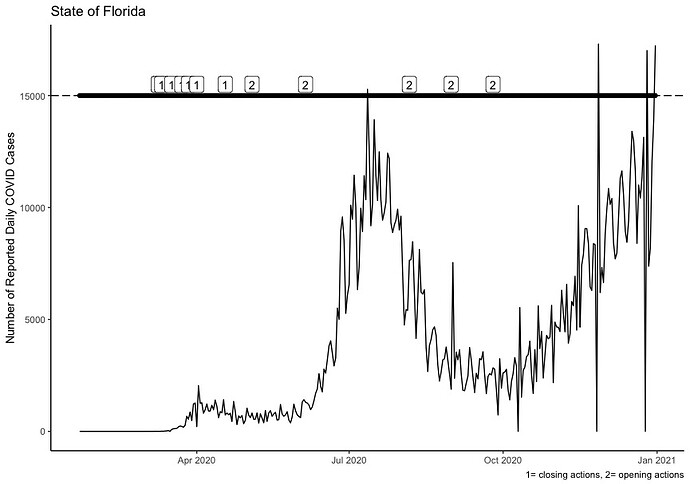
I have 3 piece of data that I need to layer onto one plot. The first time series layer is coded: p<-ggplot(MI_FL_Data, aes(realdate, FLday))+geom_line() The next layer adds two geom_hlines at yintercept=15000 and 17000 respectively. This layer is coded: q<-ggplot(MI_FL_Data, aes( realdate, FL_Actions))+geom_point(na.rm = TRUE) The final layer plots the points based on a categorical variable FL_Actions at the yintercept produced in the second code. This code is: r<-ggplot(MI_FL_Data, aes(realdate, FLday))+geom_hline(data = MI_FL_Data %>% filter(FL_Actions == 1), aes(yintercept = 15000), linetype=5, na.rm=TRUE)+ geom_hline(data = MI_FL_Data %>% filter(FL_Actions == 2), aes(yintercept = 17000), linetype=1, na.rm=TRUE))
Now I need to layer each of these saved vectors on top of each other in one graph. When I use the code: ggplot(MI_FL_Data, aes(realdate, FLday))+geom_hline(data=r)+geom_point(data=r) I get an error: data must be a data frame, or other object coercible by fortify() , not an S3 object with class gg/ggplot. I thought by saving each layer it would be fairly simple to just add them together. Any advice? I'm a bit of a novice with ggplot but what I want to do seems fairly intuitive so I'm stumped.
Here is the dput: dput(head(MI_FL_Data, 30))
structure(list(Date = c("1/22/20", "1/23/20", "1/24/20", "1/25/20",
"1/26/20", "1/27/20", "1/28/20", "1/29/20", "1/30/20", "1/31/20",
"2/1/20", "2/2/20", "2/3/20", "2/4/20", "2/5/20", "2/6/20", "2/7/20",
"2/8/20", "2/9/20", "2/10/20", "2/11/20", "2/12/20", "2/13/20",
"2/14/20", "2/15/20", "2/16/20", "2/17/20", "2/18/20", "2/19/20",
"2/20/20"), Date2 = c("1/22/20", "1/23/20", "1/24/20", "1/25/20",
"1/26/20", "1/27/20", "1/28/20", "1/29/20", "1/30/20", "1/31/20",
"2/1/20", "2/2/20", "2/3/20", "2/4/20", "2/5/20", "2/6/20", "2/7/20",
"2/8/20", "2/9/20", "2/10/20", "2/11/20", "2/12/20", "2/13/20",
"2/14/20", "2/15/20", "2/16/20", "2/17/20", "2/18/20", "2/19/20",
"2/20/20"), Date3 = c("1/22/20", "1/23/20", "1/24/20", "1/25/20",
"1/26/20", "1/27/20", "1/28/20", "1/29/20", "1/30/20", "1/31/20",
"2/1/20", "2/2/20", "2/3/20", "2/4/20", "2/5/20", "2/6/20", "2/7/20",
"2/8/20", "2/9/20", "2/10/20", "2/11/20", "2/12/20", "2/13/20",
"2/14/20", "2/15/20", "2/16/20", "2/17/20", "2/18/20", "2/19/20",
"2/20/20"), FLORIDA = c(0, 0, 0, 0, 0, 0, 0, 0, 0, 0, 0, 0, 0,
0, 0, 0, 0, 0, 0, 0, 0, 0, 0, 0, 0, 0, 0, 0, 0, 0), FLday = c(0,
0, 0, 0, 0, 0, 0, 0, 0, 0, 0, 0, 0, 0, 0, 0, 0, 0, 0, 0, 0, 0,
0, 0, 0, 0, 0, 0, 0, 0), MICHIGAN = c(0, 0, 0, 0, 0, 0, 0, 0,
0, 0, 0, 0, 0, 0, 0, 0, 0, 0, 0, 0, 0, 0, 0, 0, 0, 0, 0, 0, 0,
0), MIday = c(0, 0, 0, 0, 0, 0, 0, 0, 0, 0, 0, 0, 0, 0, 0, 0,
0, 0, 0, 0, 0, 0, 0, 0, 0, 0, 0, 0, 0, 0), FL_Actions = c(NA_real_,
NA_real_, NA_real_, NA_real_, NA_real_, NA_real_, NA_real_, NA_real_,
NA_real_, NA_real_, NA_real_, NA_real_, NA_real_, NA_real_, NA_real_,
NA_real_, NA_real_, NA_real_, NA_real_, NA_real_, NA_real_, NA_real_,
NA_real_, NA_real_, NA_real_, NA_real_, NA_real_, NA_real_, NA_real_,
NA_real_), MI_Actions = c(NA_real_, NA_real_, NA_real_, NA_real_,
NA_real_, NA_real_, NA_real_, NA_real_, NA_real_, NA_real_, NA_real_,
NA_real_, NA_real_, NA_real_, NA_real_, NA_real_, NA_real_, NA_real_,
NA_real_, NA_real_, NA_real_, NA_real_, NA_real_, NA_real_, NA_real_,
NA_real_, NA_real_, NA_real_, NA_real_, NA_real_), realdate = structure(c(18283,
18284, 18285, 18286, 18287, 18288, 18289, 18290, 18291, 18292,
18293, 18294, 18295, 18296, 18297, 18298, 18299, 18300, 18301,
18302, 18303, 18304, 18305, 18306, 18307, 18308, 18309, 18310,
18311, 18312), class = "Date")), row.names = c(NA, -30L), class = c("tbl_df",
"tbl", "data.frame")) Note: the FL_Actions and MI_Actions columns do not have 1 2 coding because policies were not created until March
Here is the tibble from another date range: A tibble: 22 x 10 Date Date2 Date3 FLORIDA FLday MICHIGAN MIday FL_Actions MI_Actions realdate <chr> <chr> <chr> <dbl> <dbl> <dbl> <dbl> <dbl> <dbl> <date> 1 3/6/20 3/6/20 3/6/20 3 0 0 0 NA NA 2020-03-06 2 3/7/20 3/7/20 3/7/20 7 4 0 0 NA NA 2020-03-07 3 3/8/20 3/8/20 3/8/20 10 3 0 0 NA NA 2020-03-08 4 3/9/20 3/9/20 3/9/20 13 3 0 0 1 NA 2020-03-09 5 3/10/20 3/10/20 3/10/20 15 2 0 0 NA 1 2020-03-10 6 3/11/20 3/11/20 3/11/20 24 9 2 2 1 NA 2020-03-11 7 3/12/20 3/12/20 3/12/20 30 6 3 1 NA NA 2020-03-12 8 3/13/20 3/13/20 3/13/20 45 15 22 19 NA NA 2020-03-13 9 3/14/20 3/14/20 3/14/20 64 19 35 13 NA NA 2020-03-14 10 3/15/20 3/15/20 3/15/20 100 36 45 10 NA NA 2020-03-15
Finally, I was provided another code possibility on StackOverflow:
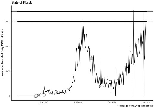
ggplot(MI_FL_Data, aes(realdate, FLday)) + geom_line()+ geom_label(data=MI_FL_Data, aes(label=FL_Actions), nudge_x = 0.50, nudge_y=.25, size=2, na.rm=TRUE)+geom_point(aes(realdate, 17000),na.rm = TRUE) + geom_point(aes(realdate, 15000), na.rm = TRUE) + geom_hline(data = MI_FL_Data %>% filter(FL_Actions == 1),aes(yintercept = 15000), linetype=5, na.rm=TRUE) +geom_hline(data = MI_FL_Data %>% filter(FL_Actions == 2),aes(yintercept = 17000), linetype=1, na.rm=TRUE)+labs(x=NULL, y="Number of Reported Daily COVID Cases", title="State of Florida",caption="1= closing actions, 2= opening actions")+theme_classic()
This code produces this image and as you can see, the 1 2 codes are on the timeseries line and not the geom_hlines where I need them.

