Adding labels to ends of ggplot lines of differing lengths

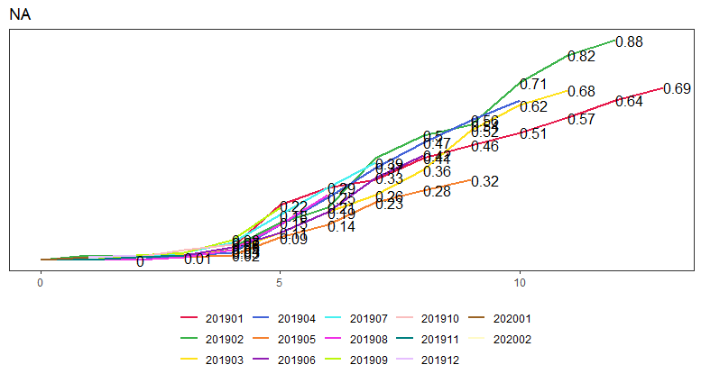
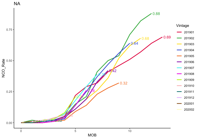
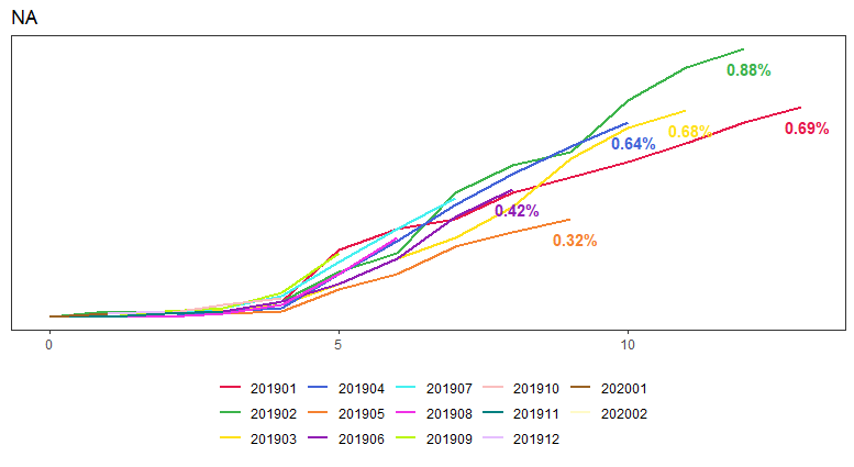
Does anyone know a quick way or programmatic way to add labels to the last point on 1) all the lines and/or 2) a pre-specified group of lines, for example, the longest 3 lines?

I tried geom_dl but that doesn't see to work.

library(directlabels)
library(tidyverse)
library(reprex)
library(RODBC)
library(patchwork)

structure(list(Vintage = structure(c(1L, 1L, 1L, 1L, 1L, 1L, 
1L, 1L, 1L, 1L, 1L, 1L, 1L, 1L, 2L, 2L, 2L, 2L, 2L, 2L, 2L, 2L, 
2L, 2L, 2L, 2L, 2L, 3L, 3L, 3L, 3L, 3L, 3L, 3L, 3L, 3L, 3L, 3L, 
3L, 4L, 4L, 4L, 4L, 4L, 4L, 4L, 4L, 4L, 4L, 4L, 5L, 5L, 5L, 5L, 
5L, 5L, 5L, 5L, 5L, 5L, 6L, 6L, 6L, 6L, 6L, 6L, 6L, 6L, 6L, 7L, 
7L, 7L, 7L, 7L, 7L, 7L, 7L, 8L, 8L, 8L, 8L, 8L, 8L, 8L, 9L, 9L, 
9L, 9L, 9L, 9L, 10L, 10L, 10L, 10L, 10L, 11L, 11L, 11L, 11L, 
12L, 12L, 12L, 13L, 13L, 14L), .Label = c("201901", "201902", 
"201903", "201904", "201905", "201906", "201907", "201908", "201909", 
"201910", "201911", "201912", "202001", "202002"), class = "factor"), 
    MOB = c(0L, 1L, 2L, 3L, 4L, 5L, 6L, 7L, 8L, 9L, 10L, 11L, 
    12L, 13L, 0L, 1L, 2L, 3L, 4L, 5L, 6L, 7L, 8L, 9L, 10L, 11L, 
    12L, 0L, 1L, 2L, 3L, 4L, 5L, 6L, 7L, 8L, 9L, 10L, 11L, 0L, 
    1L, 2L, 3L, 4L, 5L, 6L, 7L, 8L, 9L, 10L, 0L, 1L, 2L, 3L, 
    4L, 5L, 6L, 7L, 8L, 9L, 0L, 1L, 2L, 3L, 4L, 5L, 6L, 7L, 8L, 
    0L, 1L, 2L, 3L, 4L, 5L, 6L, 7L, 0L, 1L, 2L, 3L, 4L, 5L, 6L, 
    0L, 1L, 2L, 3L, 4L, 5L, 0L, 1L, 2L, 3L, 4L, 0L, 1L, 2L, 3L, 
    0L, 1L, 2L, 0L, 1L, 0L), NCO_Rate = c(0, 0, 0, 0.02, 0.05, 
    0.22, 0.29, 0.32, 0.41, 0.46, 0.51, 0.57, 0.64, 0.69, 0, 
    0.02, 0.01, 0.01, 0.05, 0.15, 0.21, 0.41, 0.5, 0.54, 0.71, 
    0.82, 0.88, 0, 0.01, 0.02, 0.02, 0.04, 0.11, 0.19, 0.26, 
    0.36, 0.52, 0.62, 0.68, 0, 0, 0, 0.02, 0.03, 0.14, 0.25, 
    0.37, 0.47, 0.56, 0.64, 0, 0, 0, 0.01, 0.02, 0.09, 0.14, 
    0.23, 0.28, 0.32, 0, 0, 0.01, 0.02, 0.05, 0.11, 0.19, 0.33, 
    0.42, 0, 0, 0.01, 0.03, 0.07, 0.18, 0.29, 0.39, 0, 0, 0, 
    0.01, 0.04, 0.14, 0.26, 0, 0, 0.02, 0.03, 0.08, 0.21, 0, 
    0, 0.01, 0.04, 0.06, 0, 0, 0.01, 0.02, 0, 0.01, 0.02, 0, 
    0.01, 0)), row.names = c(NA, -105L), class = "data.frame")

ggplot(data=curves, aes(x=MOB, y = NCO_Rate, group = Vintage)) +
  geom_line(aes(colour = Vintage), size=1) +
  labs(title = "NA") +
  theme_bw() +
  theme(legend.position = "bottom", 
        legend.direction = "horizontal",
        legend.title = element_blank(),
        panel.grid.major = element_blank(),
        panel.grid.minor = element_blank(),
        panel.background = element_blank(),
        axis.title = element_blank(),
        axis.ticks.y = element_blank(),
        axis.text.y = element_blank()) +
  scale_color_manual(values=c("#e6194b", "#3cb44b", "#ffe119", "#4363d8", "#f58231", 
              "#911eb4", "#46f0f0", "#f032e6", "#bcf60c", "#fabebe", 
              "#008080", "#e6beff", "#9a6324", "#fffac8")) +
  geom_dl(aes(label=NCO_Rate), method="last.points")

For example, having all the labels is just too much noise, so I'd like to have just the right-most end points labelled.

You can filter the data within geom_text to keep only the row with the highest MOB value within each Vintage. The plot is still pretty cramped though:

colors = c("#e6194b", "#3cb44b", "#ffe119", "#4363d8", "#f58231", 
           "#911eb4", "#46f0f0", "#f032e6", "#bcf60c", "#fabebe", 
           "#008080", "#e6beff", "#9a6324", "#fffac8")

ggplot(data=curves, aes(x=MOB, y = NCO_Rate, colour = Vintage)) +
  geom_line(aes(), size=1) +
  labs(title = "NA") +
  theme_classic() +
  scale_color_manual(values=colors) +
  geom_text(data=. %>% 
              arrange(desc(MOB)) %>% 
              group_by(Vintage) %>% 
              slice(1), 
            aes(label=NCO_Rate), 
            position=position_nudge(0.1), hjust=0, show.legend=FALSE)

2 Likes

Sweet! I never even thought about data manipulation within the geom_text data= statement....very cool.

This is exactly what I was looking for. Now I need to figure out how to keep the labels on only a few of the lines rather than on all of them.

Thanks again @joels!

You can use filtering to determine which vintages to plot in geom_text. For example, to keep even-month vintages:

data=. %>% 
  arrange(desc(MOB)) %>% 
  group_by(Vintage) %>% 
  slice(1) %>% 
  filter(as.numeric(as.character(Vintage)) %% 2 == 0)
1 Like

ahhh - makes sense. So I can just filter or restrict to the 2 or 4 vintages I want to label. Thanks!

Final code - still going to experiment with changing some of the colors.

library(directlabels)
library(tidyverse)
library(reprex)
library(RODBC)
library(patchwork)

curves <- structure(list(Vintage = structure(c(1L, 1L, 1L, 1L, 1L, 1L, 
1L, 1L, 1L, 1L, 1L, 1L, 1L, 1L, 2L, 2L, 2L, 2L, 2L, 2L, 2L, 2L, 
2L, 2L, 2L, 2L, 2L, 3L, 3L, 3L, 3L, 3L, 3L, 3L, 3L, 3L, 3L, 3L, 
3L, 4L, 4L, 4L, 4L, 4L, 4L, 4L, 4L, 4L, 4L, 4L, 5L, 5L, 5L, 5L, 
5L, 5L, 5L, 5L, 5L, 5L, 6L, 6L, 6L, 6L, 6L, 6L, 6L, 6L, 6L, 7L, 
7L, 7L, 7L, 7L, 7L, 7L, 7L, 8L, 8L, 8L, 8L, 8L, 8L, 8L, 9L, 9L, 
9L, 9L, 9L, 9L, 10L, 10L, 10L, 10L, 10L, 11L, 11L, 11L, 11L, 
12L, 12L, 12L, 13L, 13L, 14L), .Label = c("201901", "201902", 
"201903", "201904", "201905", "201906", "201907", "201908", "201909", 
"201910", "201911", "201912", "202001", "202002"), class = "factor"), 
    MOB = c(0L, 1L, 2L, 3L, 4L, 5L, 6L, 7L, 8L, 9L, 10L, 11L, 
    12L, 13L, 0L, 1L, 2L, 3L, 4L, 5L, 6L, 7L, 8L, 9L, 10L, 11L, 
    12L, 0L, 1L, 2L, 3L, 4L, 5L, 6L, 7L, 8L, 9L, 10L, 11L, 0L, 
    1L, 2L, 3L, 4L, 5L, 6L, 7L, 8L, 9L, 10L, 0L, 1L, 2L, 3L, 
    4L, 5L, 6L, 7L, 8L, 9L, 0L, 1L, 2L, 3L, 4L, 5L, 6L, 7L, 8L, 
    0L, 1L, 2L, 3L, 4L, 5L, 6L, 7L, 0L, 1L, 2L, 3L, 4L, 5L, 6L, 
    0L, 1L, 2L, 3L, 4L, 5L, 0L, 1L, 2L, 3L, 4L, 0L, 1L, 2L, 3L, 
    0L, 1L, 2L, 0L, 1L, 0L), NCO_Rate = c(0, 0, 0, 0.02, 0.05, 
    0.22, 0.29, 0.32, 0.41, 0.46, 0.51, 0.57, 0.64, 0.69, 0, 
    0.02, 0.01, 0.01, 0.05, 0.15, 0.21, 0.41, 0.5, 0.54, 0.71, 
    0.82, 0.88, 0, 0.01, 0.02, 0.02, 0.04, 0.11, 0.19, 0.26, 
    0.36, 0.52, 0.62, 0.68, 0, 0, 0, 0.02, 0.03, 0.14, 0.25, 
    0.37, 0.47, 0.56, 0.64, 0, 0, 0, 0.01, 0.02, 0.09, 0.14, 
    0.23, 0.28, 0.32, 0, 0, 0.01, 0.02, 0.05, 0.11, 0.19, 0.33, 
    0.42, 0, 0, 0.01, 0.03, 0.07, 0.18, 0.29, 0.39, 0, 0, 0, 
    0.01, 0.04, 0.14, 0.26, 0, 0, 0.02, 0.03, 0.08, 0.21, 0, 
    0, 0.01, 0.04, 0.06, 0, 0, 0.01, 0.02, 0, 0.01, 0.02, 0, 
    0.01, 0)), row.names = c(NA, -105L), class = "data.frame")

colors = c("#e6194b", "#3cb44b", "#ffe119", "#4363d8", "#f58231", 
           "#911eb4", "#46f0f0", "#f032e6", "#bcf60c", "#fabebe", 
           "#008080", "#e6beff", "#9a6324", "#fffac8")

ggplot(data=curves, aes(x=MOB, y = NCO_Rate, colour = Vintage)) +
  geom_line(aes(), size=1) +
  labs(title = "NA") +
  theme_bw() +
  theme(legend.position = "bottom", 
        legend.direction = "horizontal",
        legend.title = element_blank(),
        panel.grid.major = element_blank(),
        panel.grid.minor = element_blank(),
        panel.background = element_blank(),
        axis.title = element_blank(),
        axis.ticks.y = element_blank(),
        axis.text.y = element_blank()) +
  scale_color_manual(values=colors) +
  geom_text(data=. %>% 
              arrange(desc(MOB)) %>% 
              group_by(Vintage) %>% 
              slice(1) %>% 
              filter(as.numeric(as.character(Vintage)) %in% 
                       c("201901","201902","201903","201904","201905","201906")),
            aes(label=paste0(NCO_Rate,"%"),
                fontface=2), 
            position=position_nudge(0.1), 
            hjust=.5, 
            vjust=2,
            show.legend=FALSE)

This topic was automatically closed 7 days after the last reply. New replies are no longer allowed.