I'm plotting two density functions: one of which is white, the other is black (alpha = .75). The purpose of the plot is to show that the distributions are primarily overlapping (meaning that the bulk of the figure is grey), and I'd like the grey to be listed in the legend if possible.
library(tidyverse)
distr_1 <- rnorm(1000, mean = 1, sd = 1)
distr_2 <- rnorm(1000, mean = 1.25, sd = 1)
plot_tibble <- tibble(value = c(distr_1, distr_2), distribution = c(rep('dist_1', 1000), rep('dist_2', 1000)))
plot_tibble %>%
  ggplot(aes(x = value, fill = distribution)) +
  geom_density(alpha = .75) +
  theme_bw() +
  scale_fill_manual(values = c('black', 'white'))
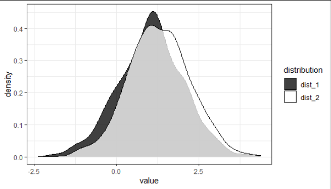
So in the above image, is there a way to add the grey section to the legend?