Adding a "Normal Distribution" Curve to a Histogramm (Counts) with ggplot2

Hi,

I have a Data Frame like this:

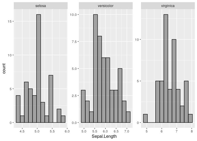
and i created facet wrap Histograms for the Lieferzeit related to Hersteller and Produktionsjahr. I would like to add an individual Normal Distribution Curve onto every facet.

How can i do that? Geom_Density doesnt work

You are not showing any dataframe, it seems like you forgot to add it to your post, could you pleas turn this into a REPRoducible EXample (reprex) including sample data on a copy/paste friendly format?

Sorry, unfortunately i forgot to add the code, but its like that:

ggplot(Iris, aes(x=Sepal.Length, fill=Petal.Length))
+scale_x_continuous(breaks=c(2,3,4,5,6,7,8,9,10,11,12,13))
+scale_y_continuous(limits=c(0,18000))
+geom_histogram(bins=12, alpha=.5, position="dodge", colour = "black")
+geom_vline(data=cdat, aes(xintercept=mean, colour=Hersteller),linetype="dashed", size=1)
+geom_vline(data=ddat, aes(xintercept=max, colour=Hersteller),linetype="dashed", size=1) + facet_wrap(~Species, scales = "free")
+geom_vline(data=edat, aes(xintercept=min, colour=Hersteller),linetype="dashed", size=1)

I would like to have a individual (each facet) Normal Distribution Curve for the x Argument

You example is not reproducible, since you are not providing cdat and eda dataframes, I have commented out those lines in case it is still useful.

library(ggplot2)

ggplot(iris, aes(x=Sepal.Length, fill=Petal.Length)) + 
    #scale_x_continuous(breaks=c(2,3,4,5,6,7,8,9,10,11,12,13)) + 
    #scale_y_continuous(limits=c(0,18000)) + 
    geom_histogram(bins=12, alpha=.5, position="dodge", colour = "black") + 
    #geom_vline(data=cdat, aes(xintercept=mean,  colour=Hersteller),linetype="dashed", size=1) + 
    #geom_vline(data=ddat, aes(xintercept=max,  colour=Hersteller),linetype="dashed", size=1) +
    facet_wrap(~Species, scales = "free") + 
    #geom_vline(data=edat, aes(xintercept=min,  colour=Hersteller),linetype="dashed", size=1) +
    NULL

cdat <- ddply(Iris, "Petal.Length", summarise, mean=mean(Sepal.Length))
ddat <- ddply(Iris, "Petal.Length", summarise, max=max(Sepal.Length))
edat <- ddply(Iris, "Petal.Length", summarise, min=min(Sepal.Length))

Sorry, its my first time here :wink: So now you can understand everything :wink:

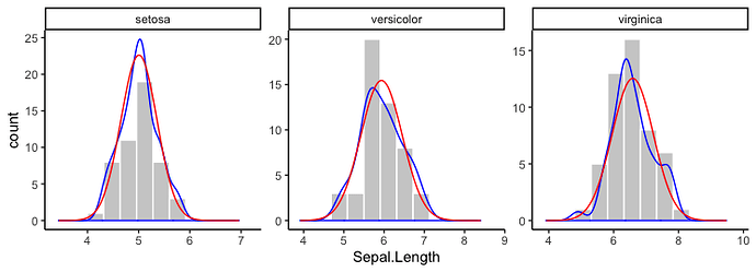
It might be possible to do this with stat_function, but I'm not sure how or if it's possible to pass the desired means and standard deviations for each Species into stat_function. Instead, I've just calculated the normal densities for each Species separately and then plotted them using geom_line. I've also added kernel density distributions using geom_density. I've used @andrescs's sample plot code as the starting point for my example.

library(tidyverse)

dens = split(iris, iris$Species) %>% 
  map_df(~ tibble(Sepal.Length=seq(0.8*min(.x[["Sepal.Length"]]), 1.2*max(.x[["Sepal.Length"]]), length=100),
                  density=dnorm(x=Sepal.Length, mean=mean(.x[["Sepal.Length"]]), sd=sd(.x[["Sepal.Length"]]))),
         .id="Species")
  
ggplot(iris, aes(x=Sepal.Length)) + 
  #scale_x_continuous(breaks=c(2,3,4,5,6,7,8,9,10,11,12,13)) + 
  #scale_y_continuous(limits=c(0,18000)) + 
  geom_histogram(bins=12, colour = "white", fill="grey75") + 
  #geom_vline(data=cdat, aes(xintercept=mean,  colour=Hersteller),linetype="dashed", size=1) + 
  #geom_vline(data=ddat, aes(xintercept=max,  colour=Hersteller),linetype="dashed", size=1) +
  facet_wrap(~Species, scales = "free") +
  geom_density(aes(y=..density..*20), colour="blue") +
  geom_line(data=dens, aes(y=density*20), colour="red") +
  theme_classic()

In the plot above, I scaled the densities by hand to be on a scale similar to the counts. Instead, you can plot the histogram as a density and everything will be automatically on the same scale. For example:

ggplot(iris, aes(x=Sepal.Length)) + 
  geom_histogram(aes(y=..density..), bins=12, colour = "white", fill="grey75") + 
  facet_wrap(~Species, scales = "free") +
  geom_density(aes(y=..density..), colour="blue") +
  geom_line(data=dens, aes(y=density), colour="red") +
  theme_classic()
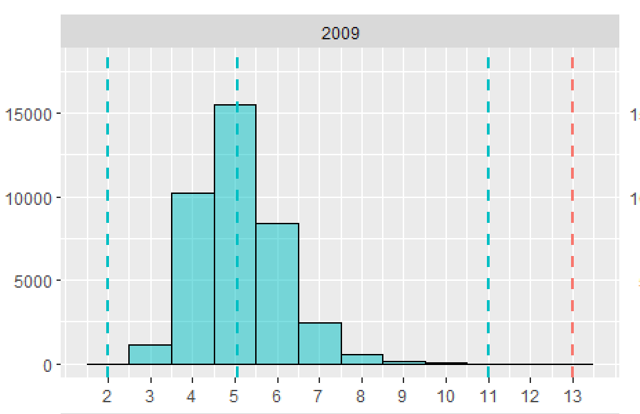
You have to consider that i have a side by side chart.

If I try your first code, i receive the error that the argument of ggplot(iris, aes(x=Sepal.Length, fill=Petal.Length)) is not found.

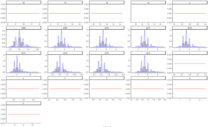
If I try your second method, the facet wrap doesnt work correctly:

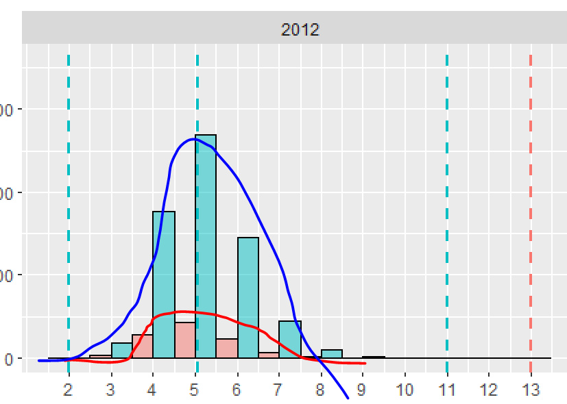
I need something like that...

I'd just like to make a point here that a density and histogram are not the same thing and in fact shouldn't be plotted on the same y-axis. I think that indeed, having the density estimate of the data compared to the normal density (with the same mean and standard deviation) is the correct way to go here.

@Valeri, yes you're right.

a) Can I add a second y-axis with the density which is related to my curve?

b) Can I create an independent Normal Distribution Curve without Density?

I removed the fill aesthetic, because Petal.Length is a continuous variable and doesn't really make sense as a fill mapping.

It seems to me a density plot with a dodged histogram is potentially misleading or at least difficult to compare with the histogram, because the dodging requires the bars to take up only half the width of each bin.

Regarding the plot, to add the vertical lines, you can calculate the positions within ggplot without using a separate data frame. For example (and loading the ggstance package before running any plot code):

library(ggstance)

  stat_summaryh(fun.x=max, geom="vline", aes(xintercept=..x.., y=0), 
                linetype="dashed", size=1, colour="grey50") +

If I knew how to do that, I would be very glad to share. The closest I got so far is to be able to plot a normal density to match one of the facets (I just chose setosa for this example).

As you can see the density estimate compared to the normal with the same mean and standard deviation kind of makes sense. However, as far as I can see one cannot pass aesthetics to the args parameter of the stat_function so I don't know how to make this work across the facets. (Also I don't know how to plot it on a second y-axis while keeping the histogram on the primary y-axis)...

ggplot(iris, aes(x=Sepal.Length, fill=Petal.Length)) + 
	#scale_x_continuous(breaks=c(2,3,4,5,6,7,8,9,10,11,12,13)) + 
	#scale_y_continuous(limits=c(0,18000)) + 
	geom_histogram(bins=12, alpha=.5, position="dodge", colour = "black") + 
	geom_density(colour = "blue") + 
	stat_function(fun = dnorm, args = list(mean = mean(subset(iris, Species == 'setosa')$Sepal.Length), sd = sd(subset(iris, Species == 'setosa')$Sepal.Length))) +
	#geom_vline(data=cdat, aes(xintercept=mean,  colour=Hersteller),linetype="dashed", size=1) + 
	#geom_vline(data=ddat, aes(xintercept=max,  colour=Hersteller),linetype="dashed", size=1) +
	facet_wrap(~Species, scales = "free")

That is my Data Frame. Lieferzeit is something like "Delivery Time", the values are 2 to 13. I would like to split the Bar in the Histogramm with the Hersteller(Manufacturer) the Values are 114 and 113, just two different. And in the end i would like to split the data with facet wrap with the Year of Production.

I am really sure that i can visualize the Normal Distribution Curve of the Delivery Time, but its really hard to do!

This topic was automatically closed 21 days after the last reply. New replies are no longer allowed.