Dear braintrust,
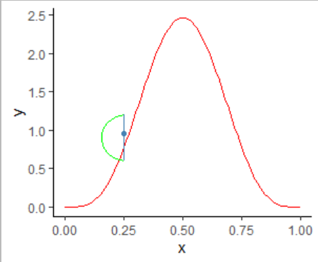
I want to illustrate uncertainty of measurement of a specific marker (theoretical example to illustrate the source of measurement errors).
I've drawn a beta distribution and then used a geom_point to illustrate the observed value adding a geom_segment to illustrate range of variability.
My question is to add a specific curve which would illustrate the density of the errors. For now I've used geom_curve() but I can't change the shape of the curvature to a specific distribution shape.
My code is as follows:
data_frame(
  x = seq(0, 1, .05)
) %>%
  ggplot +
  aes(x) +
  stat_function(fun = dbeta, args = list(shape1 = 5, shape2 = 5), color = "red") +
   geom_point(x=0.25, y=.95, color="steelblue")+
  geom_segment(x=.25, y=0.6, xend=.25, yend=1.2, color="steelblue")+
  geom_curve(x=.25, y=0.6, xend=.25, yend=1.2, color="green", curvature=-1)+ #I want this curve to be at least normal or with specific function shape (ex gamma or beta)
theme_classic()
