Dear all,
Thank you very much in advance for your help.
I've got the following dataset:
structure(list(Count = 1:14, GW = c(0.08, 0.04, 0.35, 0.54, 0.39,
0.94, 0.51, 0.01, 0.44, 0.63, 0.14, 0.79, 0.43, 0.73), Pz1 = c(-2.459826614,
-2.905007821, -2.241113224, -1.549264338, -1.761962438, -1.282612221,
-0.428828702, 1.659042479, 2.63518648, 3.076022461, 1.886216859,
0.124473561, -1.025720789, -1.969461882), Pz2 = c(-2.916090168,
-3.262459435, -2.455396094, -1.488106654, -0.417171756, -1.781014095,
-0.605012986, 1.037062685, 1.977265974, 2.587846362, 2.499228916,
1.0852274, -0.503736287, -1.829562138), Pz3 = c(-2.507944967,
-3.718722989, -2.812847708, -1.702389524, -0.356014073, -0.436223413,
-1.10341486, 0.860878402, 1.355286181, 1.929925855, 2.011052817,
1.698239458, 0.457017552, -1.307577636), Pz4 = c(-2.526729696,
-3.310577787, -3.269111262, -2.059841138, -0.570296943, -0.375065729,
0.241375822, 0.362476528, 1.179101897, 1.307946062, 1.35313231,
1.210063358, 1.07002961, -0.346823797), Pz5 = c(-3.284551238,
-3.329362517, -2.86096606, -2.516104692, -0.927748557, -0.5893486,
0.302533506, 1.70726721, 0.680700023, 1.131761778, 0.731152517,
0.552142851, 0.58185351, 0.266188261), Pz6 = c(-4.011896321,
-4.087184059, -2.87975079, -2.107959491, -1.38401211, -0.946800213,
0.088250636, 1.768424893, 2.025490705, 0.633359905, 0.554968233,
-0.069836942, -0.076066996, -0.221987839), Pz7 = c(-4.769878994,
-4.814529142, -3.637572331, -2.12674422, -0.975866909, -1.403063767,
-0.269200978, 1.554142023, 2.086648388, 1.978150587, 0.05656636,
-0.246021225, -0.698046789, -0.879908346)), class = "data.frame", row.names = c(NA,
-14L))
And I am running this code to automatically save the plots in a folder:
library(tidyverse)
library(ggplot2)
#~~~ step 1: transform the data from 'wide' format to 'long' format ~~~

my_data %>%
    pivot_longer(names_to = 'key', values_to = 'value',-c(Count, GW)) %>%
    {. ->> my_data_long}


#~~~ step 2: write a function to plot the data and save the plot ~~~

saveplot_function <- function(i){

     my_plot <- my_data_long %>%

      filter(
        key == i
      ) %>%

     ggplot(aes(x=Count)) +
       geom_line(aes(y = scale(GW)), color = "blue") +
       geom_line(aes(y = scale(value)), color="red") +
          ylab(i)
          ggsave(paste0('my_location/my_folder/', i, '.png'))
  }


#~~~ step 3: loop through all the values of 'key' (column names in the wide format data) ~~~

 for(i in unique(my_data_long$key)){

    saveplot_function(i)

  }
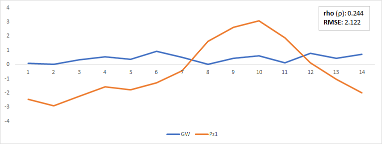
This code does the job, but I'd need to add a box (or just the text) showing the Spearman Correlation Coefficient and the RMSE for each plot (or better say for the two time series displayed within each plot).
Also, the plots are saved in a squared shape, and I would like them to be rectangular instead (See figure below. Something like this would be great!).
Could you kindly help me to rewrite the code accordingly? I am not an R expert at all and this code has been modified from an old code that someone kindly wrote for me ( and it took me ages to make it work for the purpose I am using it for ![]() ), so I would very much appreciate it if you could rewrite it (sorry!).
), so I would very much appreciate it if you could rewrite it (sorry!).
Additionally, as you can see from the code above, I used scale() . What I am trying to do is to standardise the plotted data using Z-Scores (i.e., Z = (x - mean(x)) / Standard_Deviation(x) ). Can you kindly confirm (or reject) that scale() standardises the time series using Z-Scores?
Thank you very much indeed for your help!
Simone


