#Hi there! I was making a simple geom_line plot, but I am getting stuck adding some features to it. My idea is putting a point on the TOP of the 3 lines, add the number of this point and draw a simple line that connect this point with the xlabel. Hope anyone can help me and I will send tons of thanks!
#CODE
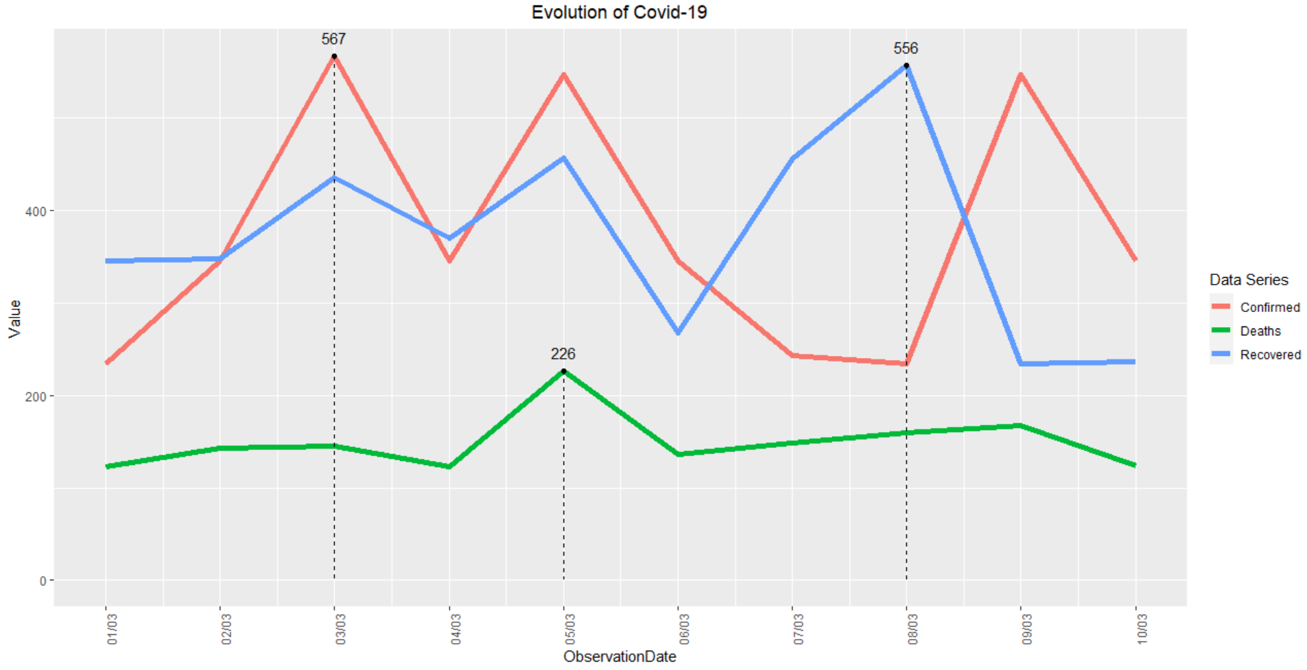
ObservationDate <- c("1/3", "2/3", "3/3","4/3","5/3","6/3","7/3","8/3","9/3","10/3")
Confirmed_per_day <- c(234,345,567,345,547,345,243,234,546,345)
Deaths_per_day <- c(123,143,145,123,226,136,148,160,167,124)
Recovered_per_day <- c(345,347,435,370,456,267,455,556,234,236)
coronavirus_daily_Spain <- data.frame(ObservationDate,Confirmed_per_day,Deaths_per_day,Recovered_per_day)
View(coronavirus_daily_Spain)
#GRAPH
library(ggplot2)
q <- ggplot(data=coronavirus_daily_Spain, aes(x=ObservationDate))+
geom_line(aes(y = Confirmed_per_day, group=1, color = "steelblue"), size=2) +
geom_line(aes(y = Deaths_per_day, group=1, color = "darkred"), size=2) +
geom_line(aes(y = Recovered_per_day, group=1, color = "green"), size=2) +
scale_color_discrete(name = "Data Series", labels = c("Deaths", "Recovered", "Confirmed"))
q + theme(axis.text.x = element_text(angle = 90, hjust = 1))
print(q + ggtitle("Evolution of Covid-19") + theme(plot.title = element_text(hjust = 0.5)))