Add legend corresponding to mean and median

Good Evening
I am trying to get line graph for mean and median of the numeric variable. We have two, lines corresponding to mean and median. Here is a sample data:

A tibble: 4 × 2
   year budget
  <dbl>  <dbl>
1  1981      2
2  1982      5
3  1983      2
4  1982      2

In the dataset, budget is a numeric variable. The goal is to get two line plots depicting the variation of mean and median of budget as a function of the variable year. Here is my attempt:

ggplot(data,aes(year,budget))+
 # geom_point(colour='blue')+
  stat_summary(fun.y=mean,size=1,geom='line',col='tomato',aes(group=1))+
  stat_summary(fun.y=median,size=1,geom='line',col='green',aes(group=1))+
  coord_cartesian(ylim=c(0,2))+
labs(title="Variation of Mean and Median of Budget vs. Time")

I was able to make this plot work. Here is my question; is there a way to add legend so that we can identify which line correpsonds to mean and which line coresponds to median. I plan to hide the code in html document, therefore the reader won't be able to see the R code.

Help/advice is greatly appreciated.
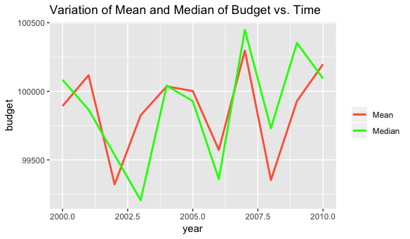
To get a legend, you need to map a data variable to an aesthetic inside aes (like aes(colour=budget)). Here, since you're calculating different statistics for a single variable, we can create "dummy" aesthetic mappings that will generate a legend. In the example below, colour="Mean" and colour="Median" create the dummy mappings:

library(tidyverse)

# Fake data
set.seed(2)
data = data_frame(year=sample(2000:2010, 1e4, replace=TRUE), 
                  budget=rnorm(1e4, 1e5, 1e4))

ggplot(data,aes(year,budget)) +
  # geom_point(colour='blue') +
  stat_summary(fun.y=mean,size=1,geom='line', aes(colour="Mean")) +
  stat_summary(fun.y=median,size=1,geom='line', aes(colour="Median")) +
  #coord_cartesian(ylim=c(0,2)) +
  labs(title="Variation of Mean and Median of Budget vs. Time",
       colour="") +
  scale_colour_manual(values=c("tomato", "green"))

Rplot28

Another option would be to pre-summarise and shape the data to get "natural" aesthetic mappings:

data %>% 
  group_by(year) %>% 
  summarise_all(funs(Mean=mean, Median=median)) %>% 
  gather(key, value, -year) %>% 
  ggplot(aes(year, value, colour=key)) +
    geom_line(size=1) +
    labs(title="Variation of Mean and Median of Budget vs. Time",
         colour="") +
    scale_colour_manual(values=c("tomato", "green"))

The data summary step could also be done as follows:

data %>% 
  group_by(year) %>% 
  summarise(Mean=mean(budget),
            Median=median(budget)) %>% ...
6 Likes

thanks for your prompt response. I got it and it works for me.