Add day/night color background band

I have this kind of df :

data.frame(
    stringsAsFactors = FALSE,
  sampling_date_time = c("2021-10-12 07:48:43",
                         "2021-10-12 08:05:23","2021-10-12 08:22:03",
                         "2021-10-12 08:38:43","2021-10-12 08:55:23","2021-10-12 09:12:03"),
   sunrise_date_time = c("2021-10-12 12:35:38",
                         "2021-10-12 12:36:07","2021-10-12 12:36:35",
                         "2021-10-12 12:37:05","2021-10-12 12:37:33","2021-10-12 12:38:05"),
    sunset_date_time = c("2021-10-12 21:11:54",
                         "2021-10-12 21:11:26","2021-10-12 21:10:55",
                         "2021-10-12 21:10:25","2021-10-12 21:09:54","2021-10-12 21:09:25"),
              period = c("night", "night", "night", "night", "night", "night"),
                 depth= c(236.660054398857,
                         263.628220939748,248.269863472482,143.411453432879,
                         118.336918769495,184.596392521635),
             Value= c(3.81517529411765,
                         4.09484308571429,3.06502731428571,2.76729708571429,
                         2.65774266666667,2.72782291891892)
)

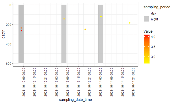
I did this plot and what I would like it's to have colored band (background) depending of the periode (day or night).
Like have a grey band for night and nothing for the day, something like that

data.frame %>%
  ggplot(aes(sampling_date_time, depth)) +
  geom_point(aes(colour = Value)) + 
  scale_colour_gradientn(colours = c("yellow","red")) +
  scale_y_reverse()
axis.POSIXct(side=1, at=cut(data.frame$sampling_date_time, "days"), format="%m/%d")

Thanks !
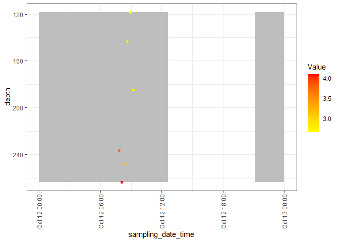
I think you can get what you want with something like this, using the {lubridate} package (see here for a book chapter with details):

library(tidyverse)
library(lubridate)
#> 
#> Attaching package: 'lubridate'
#> The following objects are masked from 'package:base':
#> 
#>     date, intersect, setdiff, union

df <- data.frame(
  stringsAsFactors = FALSE,
  sampling_date_time = c("2021-10-12 07:48:43",
                         "2021-10-12 08:05:23","2021-10-12 08:22:03",
                         "2021-10-12 08:38:43","2021-10-12 08:55:23","2021-10-12 09:12:03"),
  sunrise_date_time = c("2021-10-12 12:35:38",
                        "2021-10-12 12:36:07","2021-10-12 12:36:35",
                        "2021-10-12 12:37:05","2021-10-12 12:37:33","2021-10-12 12:38:05"),
  sunset_date_time = c("2021-10-12 21:11:54",
                       "2021-10-12 21:11:26","2021-10-12 21:10:55",
                       "2021-10-12 21:10:25","2021-10-12 21:09:54","2021-10-12 21:09:25"),
  period = c("night", "night", "night", "night", "night", "night"),
  depth= c(236.660054398857,
           263.628220939748,248.269863472482,143.411453432879,
           118.336918769495,184.596392521635),
  Value= c(3.81517529411765,
           4.09484308571429,3.06502731428571,2.76729708571429,
           2.65774266666667,2.72782291891892)
)


# Helper functions

day_start <- function(datetime){
  hour(datetime) <- 0
  minute(datetime) <- 0
  second(datetime) <- 1
  datetime
}
day_end <- function(datetime){
  hour(datetime) <- 23
  minute(datetime) <- 59
  second(datetime) <- 59
  datetime
}


# Convert everything to proper datetime objects
df <- df %>%
  mutate(across(ends_with("date_time"), as.POSIXct))

df %>%
  ggplot() + theme_bw() +
  geom_rect(aes(xmin = day_start(sampling_date_time), xmax = sunrise_date_time,
                ymin = min(depth), ymax = max(depth)),
            fill = "grey") + 
  geom_rect(aes(xmin = sunset_date_time, xmax = day_end(sampling_date_time),
                ymin = min(depth), ymax = max(depth)),
            fill = "grey") +
  geom_point(aes(sampling_date_time, depth, colour = Value)) + 
  scale_colour_gradientn(colours = c("yellow","red")) +
  scale_y_reverse() +
  theme(
    axis.text.x = element_text(
      angle = 90,
      hjust = 1,
      vjust = 0.5
    ))

Created on 2022-07-11 by the reprex package (v2.0.1)

Isn't it a bit weird though that you have (slightly) different sunrise and sunsets for the same day? Here the grey blocks are overplotted, so the earliest sunset and latest sunrise are the only one visible, but if the values of sunrise and sunset are supposed to depend on depth (for example), you'll have to change y to something appropriate.

2 Likes

Sorry for this kind of dataset, I didn't see I sent only the same date.
On my original dataset I have many date and for those dates I have many different sampling time.
One point = 1 sampling time for one date
So why can I have different sunrise/sunset time for the same day ? Because some of the sampling are not in the same lat/lon so it why there is some seconde difference.

For your plot it's exactly what I want but I want to do it according to my "period"column, according if it's written day or night

df <- data.frame(
  stringsAsFactors = FALSE,
  sampling_date_time = c("2021-10-12 07:48:43",
                         "2021-10-12 08:05:23","2021-10-13 18:44:13",
                         "2021-10-13 07:12:49","2021-10-14 03:24:01","2021-10-14 19:12:03"),
  sampling_period = c("night", "night", "day", "night", "night", "day"),
  depth= c(236.660054398857,
           263.628220939748,248.269863472482,143.411453432879,
           118.336918769495,184.596392521635),
  Value= c(3.81517529411765,
           4.09484308571429,3.06502731428571,2.76729708571429,
           2.65774266666667,2.72782291891892)
)

Thanks a lot for your time !

It wouldn't be hard to make grey bands centered on the measures, but what width should they have?

For example:

# Convert everything to proper datetime objects
df <- df %>%
  mutate(across(ends_with("date_time"), as.POSIXct))

df %>%
  ggplot() + theme_bw() +
  geom_tile(aes(x = sampling_date_time,
                y = median(depth),
                alpha = sampling_period,
                width = 10000,
                height = 2*diff(range(depth))),
            fill = "grey") + 
  geom_point(aes(sampling_date_time, depth, colour = Value)) + 
  scale_colour_gradientn(colours = c("yellow","red")) +
  scale_y_reverse() +
  scale_alpha_manual(values = c(0, .8)) +
  theme(
    axis.text.x = element_text(
      angle = 90,
      hjust = 1,
      vjust = 0.5
    ))
1 Like

Thanks a lot,
For the width I don't really know which is the best but what I have rn is good for me !
But my y axis is from -200 to 600 and I just want to have from 0 to 600... I tried to add :

  scale_y_continuous(limits = c(0, 600))

but doesn't work..

Do you know if it's possible to also have the time between the date ? Like have 00:00:00 - 06:00:00 - 12:00:00 - 18:00:00 - 00:00:00 etc

Thanks a lot !!

This is because of the way I set y and height in the aes() for the geom_tile(). If you want more control, you can use geom_rect() and specify manually the xmin, xmax, ymin and ymax.

You can have a lot of fine control using scale_datetime() (see the man page to see all the options).

So, for example:

df %>%
  mutate(across(ends_with("date_time"), as.POSIXct)) %>%
  ggplot() + theme_bw() +
  geom_rect(aes(xmin = sampling_date_time - 5000,
                xmax = sampling_date_time + 5000,
                ymin = 0,
                ymax = 600,
                alpha = sampling_period),
            fill = "grey") + 
  geom_point(aes(sampling_date_time, depth, colour = Value)) + 
  scale_colour_gradientn(colours = c("yellow","red")) +
  scale_y_reverse() +
  scale_alpha_manual(values = c(0, .8)) +
  theme(
    axis.text.x = element_text(
      angle = 90,
      hjust = 1,
      vjust = 0.5
    )) +
  scale_x_datetime(date_breaks = "6 hours")

1 Like

Thank you very much for your help !
I didn't know the scale_datetime function ! I'll read more about it thanks

This topic was automatically closed 7 days after the last reply. New replies are no longer allowed.

If you have a query related to it or one of the replies, start a new topic and refer back with a link.