Add annotations and axes only to plots in the edges of a plot matrix

Hi,

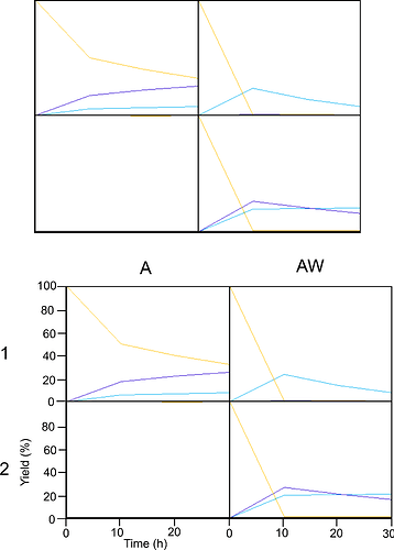
I would like to create a matrix of plots using ggplot2. I could obtain all the plots close together by removing margin, axes and so on... However, I would like to have some axes and titles on the edges. Here is the 2x2 plot matrix I get. At the bottom is what I would like it to look like. I know there is the possibility to add annotation. However, as I am applying the same ggplot functions for all plots I cannot choose to apply different parameters for the one on the borders. Is there a way to do so whilst still being able to use the code for other size of matrix? Also, I am open to any suggestions concerning my code, as I am a beginner.

Best

#-------------------------------------------------------------------------------
library(dplyr)
library(tidyr)
library(ggplot2)
library(gridExtra)

# generating example data
Compound<-c('A','B','C','D','A','B','C','D','A','B','C','D','A','B','C','D',
            'A','B','C','D','A','B','C','D','A','B','C','D','A','B','C','D',
            'A','B','C','D','A','B','C','D','A','B','C','D','A','B','C','D',
            'A','B','C','D','A','B','C','D','A','B','C','D','A','B','C','D')
Sample  <-c('140A1','140A1','140A1','140A1','140A1','140A1','140A1','140A1',
            '140A1','140A1','140A1','140A1','140A1','140A1','140A1','140A1',
            '140AW1','140AW1','140AW1','140AW1','140AW1','140AW1','140AW1','140AW1',
            '140AW1','140AW1','140AW1','140AW1','140AW1','140AW1','140AW1','140AW1',
            '140A2','140A2','140A2','140A2','140A2','140A2','140A2','140A2',
            '140A2','140A2','140A2','140A2','140A2','140A2','140A2','140A2',
            '140AW2','140AW2','140AW2','140AW2','140AW2','140AW2','140AW2','140AW2',
            '140AW2','140AW2','140AW2','140AW2','140AW2','140AW2','140AW2','140AW2')
Time    <-c(0,0,0,0,10,10,10,10,20,20,20,20,30,30,30,30,
            0,0,0,0,10,10,10,10,20,20,20,20,30,30,30,30,
            0,0,0,0,10,10,10,10,20,20,20,20,30,30,30,30,
            0,0,0,0,10,10,10,10,20,20,20,20,30,30,30,30)
Area    <-c(187.77,1.41445,2.94158,914.76,203.196,58.5594,174.663,490.947,193.526,65.828,209.102,
            375.491,200.875,75.1088,252.319,315.408,151.246,5.67439,7.00333,930.658,182.185,269.221,
            20.7183,6.67913,168.81,150.134,14.8289,8.76722,170.37,88.3018,12.5605,8.51715,184.348,
            3.76239,17.4488,899.331,183.332,3.71532,18.7058,899.331,182.192,3.90458,18.5483,884.261,
            191.143,3.38503,16.9406,934.068,170.954,2.13313,3.62187,960.455,171.759,188.635,254.459,
            8.01105,164.464,186.912,193.351,7.50136,188.963,219.482,167.927,9.90597)
df1 <-data.frame(Compound,Sample,Time,Area)

list<-list("140A1","140AW1",
           "140A2","140AW2")

cn <- unique(df1$Compound)

# for loop calculation done on the data to obtain "Yield" from "Area"
for (i in list)
{  
  r1 <- filter(df1,Sample==i,Compound %in% c("A","D") &  Time == 0) %>% arrange(desc(Compound))
  r2 <- r1$Area[[1]] / r1$Area[[2]]
  
  assign(paste0("df", i),
         pivot_wider(filter(df1, Sample==i), id_cols=c("Sample","Time"),
                     names_from = "Compound", values_from="Area") %>%
           arrange(Sample,Time) %>% group_by(Sample) %>%
           mutate(across(.cols=all_of(unique(filter(df1, Sample==i)$Compound)),
                         .fns =~{./A/r2})) %>%
           mutate(across(.cols=all_of(setdiff(unique(filter(df1, Sample==i)$Compound),"D")),
                         .fns =~{.-first(.)})) %>%
           select(-A) %>% ungroup() %>% 
           pivot_longer(cols = -c("Sample","Time")) %>% 
           select(Compound=name,Sample,Time,Yield=value) %>%
           mutate(Yield=Yield*100) %>%
           
           arrange(Sample,Compound))
}

# ggplots functions
b <- theme(axis.line=element_blank(),axis.text.x=element_blank(),
           axis.text.y=element_blank(),axis.ticks=element_blank(),
           axis.title.x=element_blank(),axis.title.y=element_blank(),
           legend.position="none",panel.background=element_blank(),
           panel.border=element_rect(colour = "black", fill=NA, size=1),
           panel.grid.major=element_blank(),panel.grid.minor=element_blank(),
           plot.background=element_blank(),plot.margin = unit(c(-0.05,-0.05,-0.05,-0.05),"cm"))
c <- scale_x_continuous(expand = c(0, 0))
d <- scale_y_continuous(expand = c(0, 0))
e <- coord_cartesian(xlim = c(0, 30),ylim=c(0,100))
colour<-c("#01b0f1","#2800d0","#ffc000")
f <-  scale_color_manual(values=colour)

# for loop to create each plot
for (i in list)#annotate("text", x = c(2,4,6,8), y=10, label = c("two", "ship", "six", "boat"))
{
  assign(paste0("df2", i), ggplot(get(paste0("df", i)), aes(x=Time, y=Yield, group=Compound)) + geom_path(size =0.5,aes(color = Compound)) + b + c + d + e + f )
}

# assemble all the plots
grid.arrange(df2140A1,df2140AW1,df2140A2,df2140AW2,nrow=2)
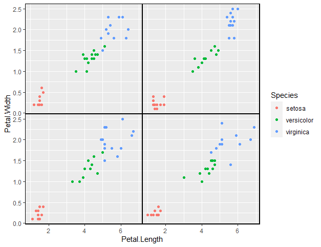
I think your approach may be overcomplicated, it seems that you want to facet_wrap your data but then to theme() its appearance beyond the default.
Something like


(data_of_4_g <- iris %>% mutate(grpnum = row_number() %% 4))

ggplot(data_of_4_g) +
  aes(
    x = Petal.Length,
    y = Petal.Width,
    colour = Species
  ) +
  geom_point() +
  facet_wrap(~grpnum) +
  theme(
    panel.spacing = unit(0, "mm"),
    strip.text = element_blank(),
    panel.border = element_rect(colour = "black", fill = NA, size = 1)
  )

image

1 Like

Indeed, this method is much easier!

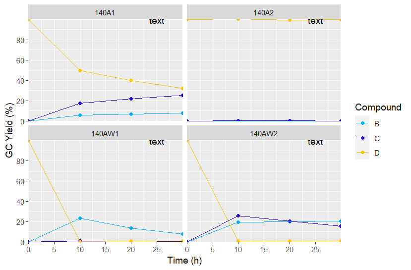
Using rbind I merged the dataframes from the loop. Is there a possibility to have each plot appear in a certain order? In the example below I made visible the "text strips" to show that whatever order I rbind them, they always appear in the alphanumerical order. Simply transposing the plot matrix would solve my problem, as I want the same number for one row (140A1 and 140AW1 in first row) and the same letters per column (140A1 and 140A2 in first column).

Also, annotate(), annotation_custom() and geom_label() adds text to each plots (as shown below). Is there a way to add annotations outside the data coordinates and for the whole plot matrix?

Thank you for your help

#-------------------------------------------------------------------------------
library(dplyr)
library(tidyr)
library(ggplot2)
library(gridExtra)

# generating example data
Compound<-c('A','B','C','D','A','B','C','D','A','B','C','D','A','B','C','D',
            'A','B','C','D','A','B','C','D','A','B','C','D','A','B','C','D',
            'A','B','C','D','A','B','C','D','A','B','C','D','A','B','C','D',
            'A','B','C','D','A','B','C','D','A','B','C','D','A','B','C','D')
Sample  <-c('140A1','140A1','140A1','140A1','140A1','140A1','140A1','140A1',
            '140A1','140A1','140A1','140A1','140A1','140A1','140A1','140A1',
            '140AW1','140AW1','140AW1','140AW1','140AW1','140AW1','140AW1','140AW1',
            '140AW1','140AW1','140AW1','140AW1','140AW1','140AW1','140AW1','140AW1',
            '140A2','140A2','140A2','140A2','140A2','140A2','140A2','140A2',
            '140A2','140A2','140A2','140A2','140A2','140A2','140A2','140A2',
            '140AW2','140AW2','140AW2','140AW2','140AW2','140AW2','140AW2','140AW2',
            '140AW2','140AW2','140AW2','140AW2','140AW2','140AW2','140AW2','140AW2')
Time    <-c(0,0,0,0,10,10,10,10,20,20,20,20,30,30,30,30,
            0,0,0,0,10,10,10,10,20,20,20,20,30,30,30,30,
            0,0,0,0,10,10,10,10,20,20,20,20,30,30,30,30,
            0,0,0,0,10,10,10,10,20,20,20,20,30,30,30,30)
Area    <-c(187.77,1.41445,2.94158,914.76,203.196,58.5594,174.663,490.947,193.526,65.828,209.102,
            375.491,200.875,75.1088,252.319,315.408,151.246,5.67439,7.00333,930.658,182.185,269.221,
            20.7183,6.67913,168.81,150.134,14.8289,8.76722,170.37,88.3018,12.5605,8.51715,184.348,
            3.76239,17.4488,899.331,183.332,3.71532,18.7058,899.331,182.192,3.90458,18.5483,884.261,
            191.143,3.38503,16.9406,934.068,170.954,2.13313,3.62187,960.455,171.759,188.635,254.459,
            8.01105,164.464,186.912,193.351,7.50136,188.963,219.482,167.927,9.90597)
df1 <-data.frame(Compound,Sample,Time,Area)

list<-list("140A1","140AW1",
           "140A2","140AW2")

cn <- unique(df1$Compound)

# for loop calculation done on the data to obtain "Yield" from "Area"
for (i in list)
{  
  r1 <- filter(df1,Sample==i,Compound %in% c("A","D") &  Time == 0) %>% arrange(desc(Compound))
  r2 <- r1$Area[[1]] / r1$Area[[2]]
  
  assign(paste0("df", i),
         pivot_wider(filter(df1, Sample==i), id_cols=c("Sample","Time"),
                     names_from = "Compound", values_from="Area") %>%
           arrange(Sample,Time) %>% group_by(Sample) %>%
           mutate(across(.cols=all_of(unique(filter(df1, Sample==i)$Compound)),
                         .fns =~{./A/r2})) %>%
           mutate(across(.cols=all_of(setdiff(unique(filter(df1, Sample==i)$Compound),"D")),
                         .fns =~{.-first(.)})) %>%
           select(-A) %>% ungroup() %>% 
           pivot_longer(cols = -c("Sample","Time")) %>% 
           select(Compound=name,Sample,Time,Yield=value) %>%
           mutate(Yield=Yield*100) %>%
           
           arrange(Sample,Compound))
}

df2<-rbind(df140A1,df140AW1,df140A2,df140AW2)

colour<-c("#01b0f1","#2800d0","#ffc000")

ggplot(df2) +  aes(x = Time,y = Yield,colour = Compound) +  
  geom_point() +
  
  annotation_custom(grid::textGrob("label 1"), 
                    xmin = 10, xmax = 10, ymin = 10)+
  geom_path(size =0.5,aes(color = Compound))+ 
  facet_wrap(~Sample) +
  scale_x_continuous(name="Time (h)",expand = c(0, 0),breaks=seq(0,29,5))+
  scale_y_continuous(name="GC Yield (%)",expand = c(0, 0),breaks=seq(0,99,20))+
  coord_cartesian(xlim = c(0, 30),ylim=c(0,100))+
  scale_color_manual(values=colour)+
  annotate("text", x = 25, y = 100, label = "text")
  theme(
    axis.text.x= element_text(colour="black"),axis.text.y= element_text(colour="black"),
    panel.spacing = unit(0, "mm"),
    #strip.text = element_blank(),
    panel.background=element_blank(),
    panel.border = element_rect(colour = "black", fill = NA, size = 1)
  )

order of facet_wrap would be controlled by using factors which can define the order.
To apply text differing per face use geom_text on an annotation data.frame you construct for the task.


df2<-rbind(df140A1,df140AW1,df140A2,df140AW2) %>% 
  mutate(Sample=factor(Sample,
                       levels=c("140AW2",
                                "140A1",
                                "140AW1",
                                "140A2")))

colour<-c("#01b0f1","#2800d0","#ffc000")

#custom text for each chart

(ctext_df <- distinct(df2 ,Sample))
ctext_df$txt <- c("some text",
                  "other text",
                  "text 2",
                  "more text")
ctext_df$Time <- mean(df2$Time)
ctext_df$Yield <- c(70,60,40,20)
ctext_df

ggplot(df2) +  aes(x = Time,y = Yield,colour = Compound) +  
  geom_point() +
  geom_path(size =0.5,aes(color = Compound))+ 
  geom_text(data=ctext_df,
            aes(label=txt,colour=NULL)) + 
  facet_wrap(~Sample) +
  scale_x_continuous(name="Time (h)",expand = c(0, 0),breaks=seq(0,29,5))+
  scale_y_continuous(name="GC Yield (%)",expand = c(0, 0),breaks=seq(0,99,20))+
  coord_cartesian(xlim = c(0, 30),ylim=c(0,100))+
  scale_color_manual(values=colour)+
theme(
  axis.text.x= element_text(colour="black"),axis.text.y= element_text(colour="black"),
  panel.spacing = unit(0, "mm"),
  #strip.text = element_blank(),
  panel.background=element_blank(),
  panel.border = element_rect(colour = "black", fill = NA, size = 1)
)

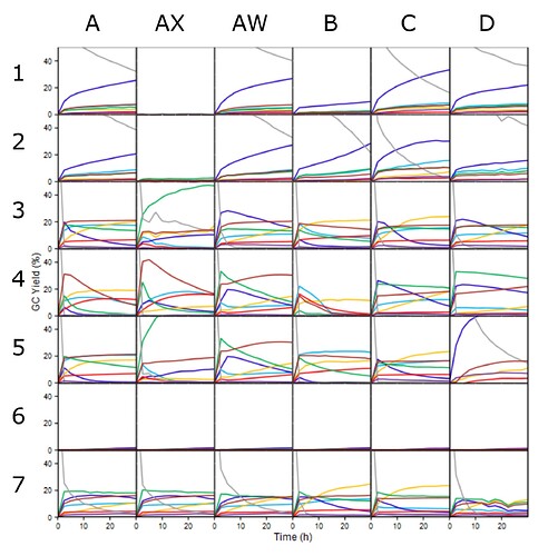
Thank you very much for your help. However, I will stick to using inkscape to add annotations. I think it is easier.
Here is the result with my actual data:

1 Like

This topic was automatically closed 21 days after the last reply. New replies are no longer allowed.

If you have a query related to it or one of the replies, start a new topic and refer back with a link.