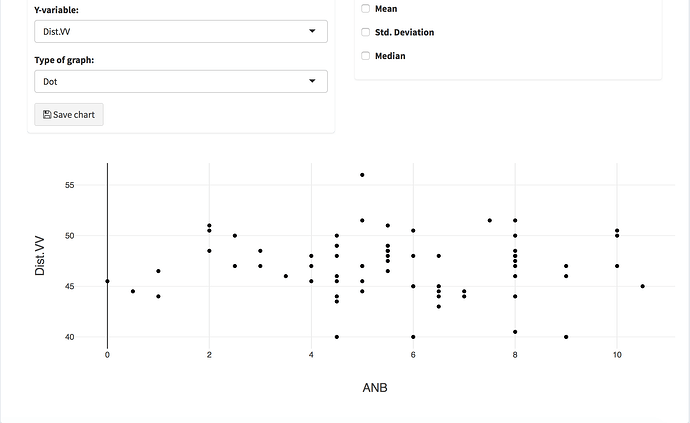
I would like to add a vertical line to my chart corresponding to the mean, median or standard deviation using plotly. I was able to do it with ggplot2 and then transformed it to plotly with ggplotly but didn't work as I expected. Anyone knows how to do it with just plotly?
From plotly's API, the function I think you want is add_segments()
If you check Carson's plotly book, there's a section where he talks about how you can extend ggplotly() to accomplish this--just scroll down a bit and you'll see a section where ggplotly() pipes into an add_function() call where you can use add_segments()--hope that helps!
edit: I think that it's worth the time to learn how plotly's API works--it can be really rewarding!
Thank you so much! I'm going to try this.
Yes, my real problem is that I don't know how this API really works  but I'm certainly going to take some time and study how plotly works =)
It can be really intimidating; so don't worry! You got this!
This SO post has some more relevant advice -- https://stackoverflow.com/a/34097929
