Accessibility Atlas
Authors: Kaue Braga, Rafael Pereira
Working with Shiny more than 1 year
Abstract: The Accessibility Atlas is a Shiny App that allows people to interactively explore the results of the Access to Opportunities Project. It contais maps and charts that allow users to visualize estimates of people’s access to employment, education and health services at a high spatial resolution and disaggregated by socioeconomic groups according to income level and color/race.
Full Description: Dear all, We present you the Accessibility Atlas. This is a Shiny App that allows people to interactively explore the results of the Access to Opportunities Project. The project is a research initiative led by the Institute for Applied Economic Research (Ipea - Brazil) with the aim to study transport accessibility and inequalities in access to opportunities in Brazilian cities.
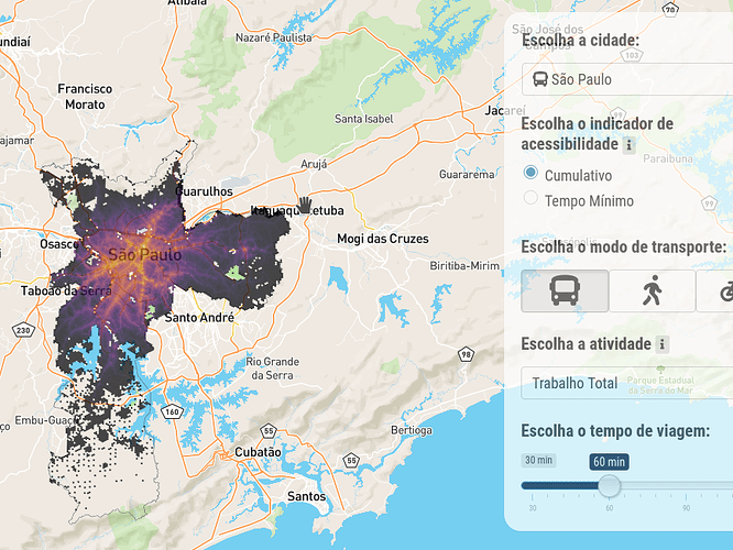
Through the Accessibility Atlas app, users can navigate the results of the project with maps and charts to visualize estimates of people’s access to employment, education and health services at a high spatial resolution and disaggregated by socioeconomic groups according to income level and color/race. These estimates are presented separately by walking and cycling for the 20 largest cities in Brazil, and by public transport for 7 major cities. Accessibility levels are presented using two simple and intuitive metrics: the number of opportunities accessible under a given time threshold, and the travel time to the closest school or healthcare facility. The app is embedded in the website of the Access to opportunities project, where one can find more information about the methods and the data used in the app.
The app is divided in two panels: Maps, where users can visualize and explore the spatial distribution of access to opportunities in each city, and Charts that allow users to visualize and get a grasp of how large are inequalities in access to opportunities in Brazilian cities.
On a more technical side, the Accessibility Atlas has at least three important features:
-
The app scales well with large spatial data sets. Accessibility estimates are presented in a high-resolution spatial grid of Uber H3 hexagons with a short diagonal of 357 meters. Large cities like São Paulo or Rio de Janeiro have more than 10,000 spatial units, making traditional map exploration tools unsuitable. Our app uses the mapdeck R package, which leverages on the deck.gl library, a really fast open source platform for large-scale WebGL data visualization. mapdeck makes editing attributes in the app and exploring the data easy like a walk in the park.
-
The Accessibility Atlas app has a friendly and yet comprehensive user interface (UI) that allows users to easily extract a lot of information from the data. In the map tab, for instance, the user can choose different options in five different attributes: city, accessibility indicator, transport mode, activity type and time threshold. The menu is also responsive in that these options automatically update when the user chooses a city for which there is no public transit data, for example.
-
Finally, the app is bilingual. It is available in both Portuguese and English to reach Brazilians a wider global community; this includes bilingual content in all tabs, tiptools, modals, legends, titles, and exported graphs and data. The package shiny.i18n made this translation process much easier;
Category: Public Sector
Keywords: spatial, transport, interactive, maps, mobility, accessibility
Shiny app: https://rafa-pereira-br.shinyapps.io/accessibilityatlas/
Repo: GitHub - ipeaGIT/acesso_app: Shiny App do Projeto Acesso a Oportunidades
RStudio Cloud: Posit Cloud
Thumbnail:
Full image:

