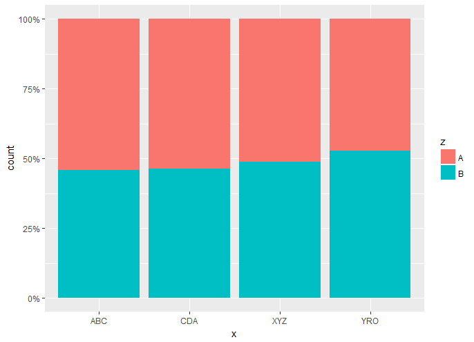
I want to sort a stacked ggplot bar chart by the relative frequency of a subset in the fill.
    library(ggplot2)
    library(tibble)
    library(scales)

    factor1 <- as.factor(c("ABC", "CDA", "XYZ", "YRO"))
    factor2 <- as.factor(c("A", "B"))

    set.seed(43)
    data <- tibble(x = sample(factor1, 1000, replace = TRUE),
                   z = sample(factor2, 1000, replace = TRUE))
One answer is to use tapply, provided by a stack overflow answer here.
lvls <- names(sort(tapply(data$z == "B", data$x, mean)))

ggplot(data = data, aes(factor(x, levels = lvls), fill = z)) +
  geom_bar(position = "fill") +
  scale_y_continuous(labels = percent)
This is a correct answer but I am wondering if there is another more tidy way to do this?
I am primarily interested in a way to do this that does not involve dplyr, but any suggestions are welcome.
You can use forcats::fct_reorder in a mutate call like this:
set.seed(1234)
data <- tibble(x = sample(factor1, 1000, replace = TRUE),
               z = sample(factor2, 1000, replace = TRUE))

data %>%
  mutate(x = forcats::fct_reorder(x, as.numeric(z), fun = mean)) %>%
  ggplot(aes(x, fill = z)) +
    geom_bar(position = "fill") +
    scale_y_continuous(labels = percent)
which gives you this:

If you you want to avoid the mutate call then you can put the fct_reorder call inside your ggplot call like this:
ggplot(data, aes(forcats::fct_reorder(x, as.numeric(z), fun = mean), fill = z)) +
  geom_bar(position = "fill") +
  scale_y_continuous(labels = percent)
This gives you the same graph except your x axis label is now pretty ugly. IMO it is better to put this refactoring in the mutate call because it makes your code much more readable and explicit as to what you are trying to accomplish.
6 Likes
That's great. I suspected that fct_reorder would be involved. I tried this but didn't specify z as.numeric. Thanks a lot!
1 Like
