Hello,
I am still learning R. I was working on a census data in wide format, name as houseassets2. See the data in wide format below.
| Id | County...Sub.County | Conventional.Households | Stand...alone.Radio | Desk.Top.Computer..Laptop..Tablet | Functional.Television | Analogue.Television | Internet | Bicycle | Motor.Cycle | Refrigerator | Car | Truck..Lorry..Bus..Three.Wheeler.truck | Tuk.Tuk |
|---|---|---|---|---|---|---|---|---|---|---|---|---|---|
| 105 | IKUTHA | 16,579 | 54.6 | 1.9 | 10.7 | 1.9 | 6.4 | 30.5 | 13.8 | 1 | 1.9 | 0.6 | 0.6 |
| 106 | KATULANI | 12,166 | 56.5 | 3.2 | 22.4 | 3.4 | 7 | 25.8 | 12.5 | 3 | 4.5 | 0.7 | 0.4 |
| 107 | KISASI | 10,860 | 49 | 2.3 | 15 | 2.7 | 4.4 | 27.2 | 10.3 | 1.2 | 2.8 | 0.6 | 0.5 |
| 108 | KITUI CENTRAL | 29,026 | 55.7 | 8.7 | 37.2 | 5.1 | 15.5 | 13.3 | 12.1 | 8.6 | 6.3 | 1 | 0.7 |
| 109 | KITUI WEST | 17,465 | 60.3 | 3.8 | 27.3 | 4.5 | 7.3 | 28.7 | 15.5 | 2.8 | 5.4 | 0.7 | 0.7 |
| 110 | KYUSO | 15,969 | 49.4 | 2.4 | 13.2 | 1.9 | 6 | 21.8 | 14.7 | 1.1 | 2.7 | 0.8 | 0.4 |
| 111 | LOWER YATTA | 15,021 | 60.6 | 2.6 | 16.1 | 2.3 | 4.6 | 26.8 | 14 | 1.4 | 3.5 | 1 | 0.9 |
| 112 | MATINYANI | 11,497 | 60.7 | 3.4 | 25.7 | 3.1 | 4.7 | 23.3 | 14.9 | 2.8 | 3.9 | 0.6 | 0.8 |
| 113 | MIGWANI | 18,843 | 65.2 | 3.6 | 25.9 | 4.1 | 7.2 | 36.2 | 16.2 | 2.3 | 5.2 | 0.9 | 0.4 |
| 114 | MUMONI | 6,451 | 47.9 | 2.1 | 12.2 | 2.2 | 3.4 | 11.5 | 12.6 | 0.8 | 2.6 | 0.6 | 0.4 |
| 115 | MUTITU | 11,490 | 55.4 | 1.5 | 9.3 | 1.2 | 3.3 | 13.3 | 10.9 | 1 | 2.1 | 0.5 | 0.7 |
| 116 | MUTITU NORTH | 4,929 | 57.2 | 2.5 | 13.1 | 3 | 3.4 | 26.2 | 15.1 | 2 | 2.6 | 0.4 | 0.7 |
| 117 | MUTOMO | 23,034 | 52.1 | 2.5 | 10.4 | 1.9 | 5.5 | 24.3 | 13 | 1 | 2.1 | 0.6 | 0.5 |
| 118 | MWINGI CENTRAL | 26,745 | 54.1 | 4.5 | 24.7 | 3.7 | 8 | 17.6 | 13.2 | 3.7 | 4.6 | 0.8 | 0.5 |
| 119 | MWINGI EAST | 18,725 | 50.7 | 1.8 | 11 | 1.5 | 4.6 | 16.6 | 11.7 | 1.2 | 2.4 | 0.7 | 0.5 |
| 120 | NZAMBANI | 11,276 | 55.4 | 4 | 22 | 3.4 | 5.7 | 16.1 | 11 | 3.9 | 4.2 | 0.7 | 0.5 |
| 121 | THAGICU | 3,289 | 54.8 | 1.2 | 8.2 | 1.3 | 3.6 | 9.1 | 13.5 | 0.3 | 1.6 | 0.3 | 0.2 |
| 122 | TSEIKURU | 8,449 | 42.8 | 1.3 | 9.1 | 1.5 | 2.5 | 17 | 11.2 | 1 | 1.9 | 0.4 | 0.4 |
I used the melt function to convert the above table to long format in R studio. It is very large to past it here but it's accessible here
However, I run into problems trying to use a specific formula to select the values I wanted for my study from the variable column of the melted table. That is, the house assets refrigerators and internet. More like variables = c (Refrigerators, Internet) and other attempts was not working using ggplot.
##example
ggplot(assets.melt, aes(County...Sub.County, value, fill = assets.melt$variable[variable == 'Refrigerator', 'Internet'])) + geom_bar(stat = 'identity', position = 'dodge2') + scale_fill_manual(values = c('turquoise', 'rosybrown')) + theme(axis.text.x.bottom = element_text(size = 9, angle = 90, colour = 'blue'), legend.position = 'bottom' ) + xlab('Sub counties of Kitui')
I used the following steps to create the desired grouped bar plot:
- select the specific columns you want to display from the wide table (in this case only three - Sub county, refrigerator, internet). ie.
houseassets.kitui5 <- houseassets2 [(c(1, 7, 10))] - Used the
meltfunction to transform the resulting table with just three columns above to a long format dataset. The melted table was assigned the nameassets.melt2 - Used
ggplotto create a grouped bar chart with just the two variables displayed on the x axis for each County...sub county. Here is the code used after this long process:
#three step process worked but after a long process
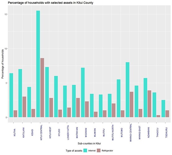
ggplot(assets.melt2, aes(County...Sub.County, value, fill = variable)) + geom_bar(stat = 'identity', position = position_dodge2(width = 0.5)) + scale_fill_manual(values = c('turquoise', 'rosybrown')) + theme(axis.text.x.bottom = element_text(size = 9, angle = 90, colour = 'blue'), legend.position = 'bottom' ) + xlab('Sub-counties in Kitui') + ylab ('Percentage of households') + labs (title = 'Percentage of households with selected assets in Kitui County') + guides(fill = guide_legend(title = 'Type of assets'))
The resulting bar chart after this 3 step process is shown below.
So to sum it up, I am just wondering if there is a way I could write in a single code, just after melting the entire wide table, a code that choses the specific values from a column to display in the bar chart like the one above without going through the detailed 3 step process.
ggplot(assets.melt2, aes(County...Sub.County, value, fill = <what do I fill here or some other way)) + geom_bar(stat = 'identity', position = position_dodge2(width = 0.5))
I prefer using ggplot than the plot() defaults. Thanks
